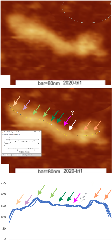
A single image (from Arroyo et al, 2020, that I named trimer 1) with bar marker and nm value was plotted nine times. This means tracings right to left, in original images and images mirrorred and image rotated 90 ccw. These plots were traced in ImageJ opened in excel without adjustments (so the x and y values were not changed) and the multi-blue-line plot at the bottom of the graphic below is the result of superimposition without any editing. The plots are virtually identical. The peaks counted from individual plots was 10.5 peaks, ranging from 9 to 12, there was no mode. The top image is the original image, screen printed from the publication. The dotted line in the upper right is where I cut and pasted background over an identifier in the original publication (just to clean up the image). The image was filtered with a gaussian blur of 5 px.
Some of the tracings were made with a 1 px line, and others a 5 px line. There are slight differences, but 1 px line was chosen for hundreds and hundreds of tracings in this study.
The image of the trimer just below is an example of the tracing, which I began at about a medium grayscale into the molecule and ended similarly at the other end of the molecule. The tracings varied from right to left, and right to left and each plot was also transformed in excel when applying peak finding. Plots were mirrored so that the N term is on the left, the “tiny” peak and the large glycosylation peak(s) are next. As yet unidentified peaks have arrows pointing to them, and where peaks were detected in the plots but not by “eye” i put a question mark. The two peaks on the right are the CRD peak(s). I have kept colors of peak identifiers consistent throughout all the posts in the last two years, so previous blog entries can be compared. I am convinced that little variation exists in the way I execute these tracings, or in the way (direction, mirrorred or rotated) ImageJ processes them.
