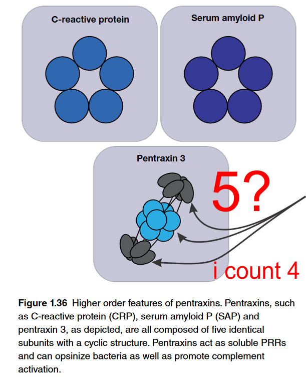
Here is why i wonder if scientists in general have much in the way of “visual capacity”. Here is a terrific example of a diagram which i find totally confusing. Please determine if i am the confused one or if this author and/or their diagrammer? The figure is part of an chapter: Fundamentals of Immunology – which is really a nice chapter but this just is funny. Figure below is cut and pasted from their pdf file, I added the red text and the arrows pointing to an attempt at perspective for 5 semi-spherical structures…. at the top, bottom and the two rows of 4, making 8 in the middle (which apparently should have been two rows of 5, with 10 total. So this is not a dig at the chapter as there is lots of great information there and the molecular reconstructions sare very nice. Its just this one, on pentraxin… pent for five, shows four structures in the lower half of this diagram. Too cute. I would have to call this a visual typo. I read this great article on the cost of typos…. it is nicely written and makes me wonder whether not capitalizing the letter I when i type is keeping my websites from doing well in google searches (not so LOL). At any rate, most expensive typo blog is worth reading and it is kind of funny. What is below though is something that doesn’t often get “proofed” sadly, I don’t know why. Scientific publications get substantial review… but so many scientific diagrams go to press with blatant mistakes that it is alarming. These have significant impact on understanding principles and concepts yet are not really even investigated as “typos”. So i get that the side view might just show two bumps, but there is 3Dimensions to the lowest diagram below, and in this perspective, five round areas shojld have shown up somewhere. Again, what is a great name for a diagrammatic mistake? BTW i am not listing the authors of this chapter, that just isn’t the point.