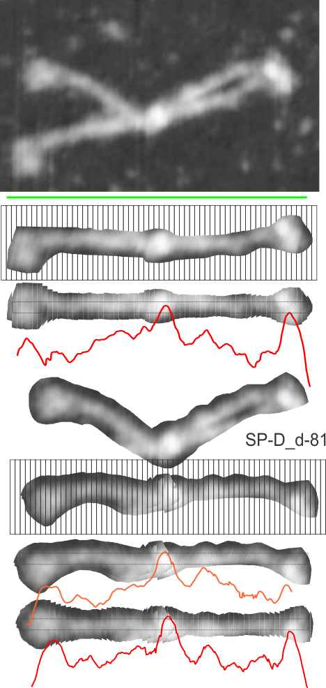
This set of figures makes it reasonably clear that cutting and centering horizontally 40 or 50 segments of an SP-D dodecamer destined to be analyzed for grey scale densities along its arm makes for a smoother plot. Compare the bottom red and orange plots, the orange one made without cutting but after orienting the arms more or less to allow for a horizontal line or rectangle to be drawn, and the red plot, where the cuts have been centered. The results show a smoother and more informative plot in the latter process.
It seems now that the procedure just uses CorelDRAW to produce the images and then imports an RGB (these were just 72ppi — and the input and output image size was not changed) into ImageJ to provide the LUT numbers and dataset to export to excel. It seems to work well and is easy.
This particular image (not mine) is AFM, and produces a smooth plot with about half the number of bright peaks as a shadowed molecule. Determining how many blips are present, and perhaps distances between them, from the N terminal to the carbohydrate recognition domains is a goal.
Top red plot superimposed upon the dimer arm of SP-D is shown (i named it d-81a) and the bottom red plot is the dimer of SP-D from the same dodecamer (i named d-81b). I am not sure how to combine plots. ha ha.
