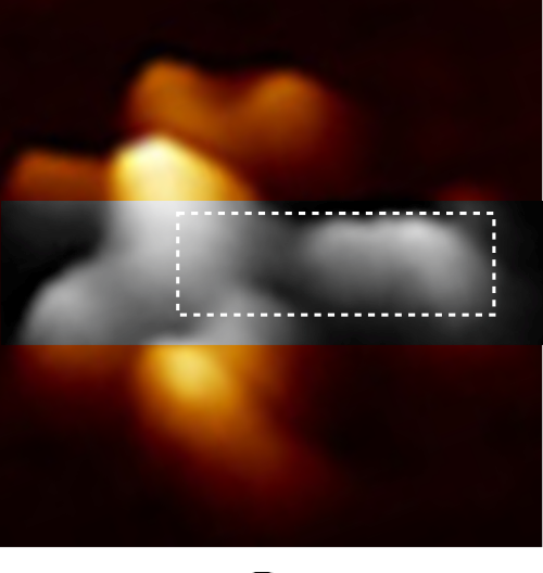
I continue to look for verification that the LUT tables of TEM and FM images can provide information on molecular structure. This TOP ILLUSTRATION is an AFM image (from a paper by Czajkowsky DM, and Shao Z) from which I retrieved one image and examined a single arm (from the center of the Nterminus ???) to the Fab domains. Greyscale image within the original is the area digitized and within that area (within the dotted box is the area that was outline to guide the plots.
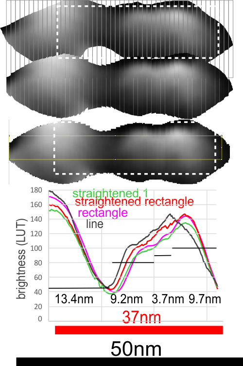
Plots definitely show that it makes little difference whether the plots are made with a minimal amount of difference whether the line, rectangle, original or straightened arm was used… the plot just show the Fab segment (right) and the N terminus and a second slope or slow peak which blends into the Fab segment. But they also show three very repeatable peaks in the “arm” part, which when calculated back to the original magnification (black bar) the arm becomes about 37nm long, and half of the central Ntermini becomes about 27nm and the first peak 9.2nm, second 3.7nm and third 9.7nm all of which are easily visible just with the “eye”. Some out there can look at the AA sequences and determine what makes the brightness peaks.
CONCLUSION:
1) it makes precious little difference how the plots are made… whether as line or rectangle, opportunely found arms or straightened arms.
2) that said: I like the shape and smoothness of the plots which have been derived from ImageJ using the rectangle (see yellow lines where the rectangle was in the plots — pink and green plots). Line used, not shown but goes straight through the image.
3. This post is not to investigate IgM but to just try to establish the best way to use AFM images to quantify SP-D.