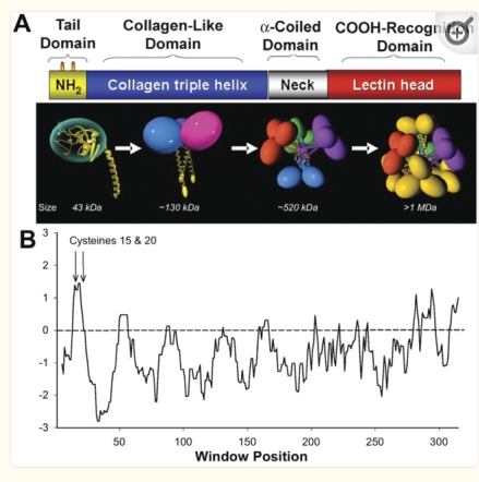
An original hydrophilicity plot (C-J-Guo et al, PLoS Biol. 2008 Nov; 6(11): e266, their Fig. 1 ) shown here  startled me with its similarity to the grayscale plots that seem to be pretty well established for trimers (and the trimer portion of hexamers and dodecamers) of SP-D. The plot seemed to me to be divided into into three distinct peak patterns, one where the N term domain is located (in this case on the right as a very tall peak), a stretch of four large peaks regularly spaced with deep valleys (the collagen-like-domain and with the glycosylation site — the first peak to the right of the N term peak — which they did not identify), and then a dozen irregular low peaks in a stretch reaching the large irregular area where the CRD domain is. In the legend by Guo et al, they do mention that the dimensions of their 3D models have been changed (shortened collagen-like-domain) for “esthetic” purposes (which for me is an error in judgement and means looking at that part of the figure allows for confusion).
The label above this original figure that names these four domains and shows their approximate length in terms of aa sequence.
One issue with this depiction is that it does not take into consideration the considerable folding that occurs in the CRD domain. This causes the CRD domain part of the hydrophilicity plot to be disproportionately long and the proportion of the straight collagen like domain is disproportionately short. The actual AFM images of SP-D these domains are not that close in nm of length.
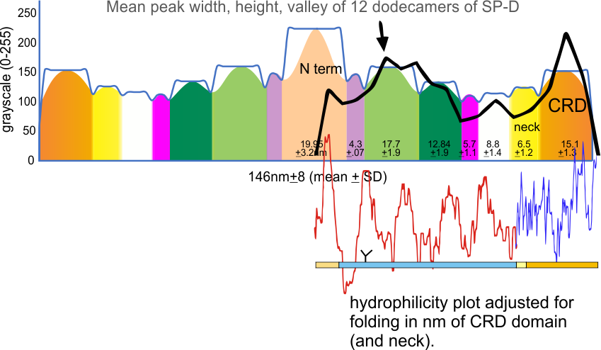
But the possibility of hydrophilicity/hydrophobicity (peaks being hydrophobic AA) being important in the peaks that appear in AFM images was sufficiently similar to compare the grayscale plots with the hydrophilicity plot directly. There is only one plot here (meaning there is going to be variation in the plots from various trimers and thus is to be seen as just an n of 1, unlike the plots of AFM images, but like the grayscale plots, a definite pattern is recognizable).
The main problem in comparing the hydrophilicity/hydrophobicity plot and the grayscale plots is that the latter is measured in nm and the former is measured in amino acid residues. This means the folding and twisting of the carbohydrate recognition domain would be much longer relative to the the CRD domain which is very convoluted so the whole molecule in the hydrophilicity plots need to be adjusted for nm in the grayscale plots, thereby making a good match for peaks difficult. ( In the hydrophilicity plot since it is measured in amino acids the CRD domain plot would be disproportionately long because it does NOT show its typical folding, and the collagen-like-domain (which is basically straight) would appear to be relatively short.)
It would be an easy task to just go adjust the hydrophilicity plot which shows hydrophobic AA as peaks, to “my liking”, which is sort of what I did quickly in the image below. It would be more accurate (and a better fit) if I actually stretched and shrunk the hydrophilicity plot by the actual number of amino acids in each domain, then translated that into nm. Have not done this yet, but here is the jist of what I am pretty sure will show up. Y in the thin bar for the x axis legend at the bottom of the figure is the glycosylation site, which does correspond to the green peak (glycosylation peak) in the AFM plots.
