In thinking about signal processing programs for analyzing plots of grayscale peaks and valleys from traces (made in ImageJ) of SP-D molecules (AFM, an image published by Arroyo et al) I was sort of surprised to see that sometimes what I would call “nonsense” peaks and valleys showed up, and others i thought should have been counted were left out. This only surprised me because I dont understand the algorithms that are used to predict peaks…. i understand that. But I am not willing to let go of what my eyes see as a peak, to some that doesn’t understand the greater symmetry in biology, and in particular, in the dodecameric structure of SP-D. I took one image, and plotted both hexamers in both directions.
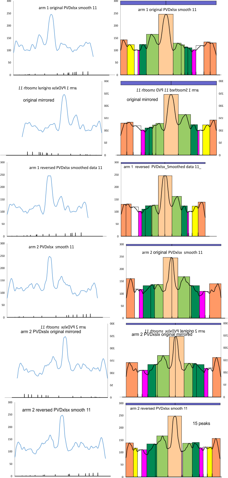
Previously when plotting in Gwyddion it was evident that the plots were not reproducible when the image was rotated 45 degrees, so these plots were made in ImageJ, and those replicates seem to look pretty much the same. (see figure below) the original tracing in imageJ (1px line) left to right through both hexamers. The reverse plot went from right to left (but the arms were given the same names (1, and 2).
This first set of images is processed (5px gaussian blur), plotted in ImageJ, exported to excel. Peaks and valleys were selected by hand. Top set (original plot), second line, those plots mirrorred, third line, plots in reverse direction. Colors: peach (N term junction); purple, tiny peak so far undescribed; light green peak is likely the glycosylation area; dark green, pink and white peaks not yet defined; yellow and orange, neck and CRD in varying orientations. The hexamer is allegedly bilaterally symmetrical so peak heights and widths and numbers should be consistent. BUT in at least two instances they wont be, that is at the neck and CRD since there is a host of different ways that those three CRD can fall and be arranged during processing; and the glycosylation peak area may reflect different heights widths and lumpiness depending how many sites are glycosylated. In the arm 1 below, one glycosylation peak is considerably lower than the other and this likely is meaningful.

The second set of images (not shown yet) will be made using the same arrangement, but an excel template PeakValleyDetectionxlsx (Thomas O’Haver) arranged in the same way.-, with same color arrangements. While I would have liked to see the valley markers at the beginning and end of the valley-plot produced (black line at bottom shows where valleys are calculated), cropping the valley series at the bottom of the plots at the same point as the length of the plot of the peak series helps make the last peak an appropriate width. The forward and reverse plots (compare the reverse plots at the bottom with the middle set (mirrored plots), show quite similar data. In fact, where I draw the segmented line accounts for the greatest differences in peaks size and number as that line grabs the grayscale values. Such differences in peaks/valleys occur in the plots of the N terminal junctions (center peak, peach color).