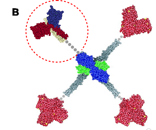
More confusion in the literature surrounds diagrams (in my opinion) than text. Here is a diagram which I am not quite sure how to interpret, however, this publication states that the grey dots represent an as-yet-undefined collagen-like domain in mannan binding lectin (protein) (MBP 1HUP – MBL2, and 1KWT) and I have read countless times and tried to determine its structure myself for both SP-A and SP-D and not found anything of high confidence. Yet the grey dots to infer “no yet determined” works for acknowledging that the molecular structure of the collagen like sequence in MBP (or the other C-type lectins) just hasn’t been worked out.. no that is not the problem, but it is that in my interpretation of this illustration, the grey dots are where the “coiled coil neck” is located NOT the collagen-like domain. So in the RCSB, 1KWt) entry, (shown against the original diagram published by Teillet et al, 2005, I have pasted the image from the RCSB (which includes the high confidence structure of the CRD and the coiled coil neck) against the CRD and the “grey dot collagen like domain” they drew. You can easily see my dilemma. My overlay is three color-for three chains in the trimer – of the CRD and neck, and grey dots for what I would have thought would be designated as the collagen-like domain, which then stops at the N terminus juncture (they show models of the serine proteases at the N terminus). The lower left and right and upper right arms of this cross-shaped mulecule have the dots (which they claim are collagen-like domains — where i think the coiled coil neck should have been drawn.
Category Archives: Lectins
Variations in slicing and analyzing LUT tables: arms of an SP-D dodecamer
The best LUT plots for greyscale are not easy to obtain for curvy molecules. This particular set of images and plots shows how the plot can be improved by some easy steps, none of which alter the data (the original image) but which produce cleaner results in terms of the LUT plot. (my name = #46 _SP-D, AFM from someone elses publication.)
Top image is the actual arm of the SP-D dodecamer just quickly isolated from the whole image using the eraser tool in CorelDRAW x5, and then cut into 10nm widths (vertical grid as shown), then ungrouped and centered horizontally and exported as a tif at 300ppi (next image down). Getting the LUT plot using a rectangle did not show the peaks well, and a plot for a single line was obtained as well (with worse results). Since ImageJ does not have the potential to bend the lines at nodes, then some other technique for further straightening the area to be plotted helps. The third image from the top is a manual vertical adjustment so the bright spots are aligned horizontally. All those slices are groupd and recropped, and a grescale rectangle is placed behind with a medium greyscale color (125) to minimize the lines at each 10nm slice, and then it is exported as a tif (as above) and imported into ImageJ. THe resulting LUT plot is somewhat better. Number of peaks on each side of the N terminus is countable in both. In this particular set of two trimeric molecules the N terminus peak is not the brightest, but the leak on the left hand side (peak which would be the C1 portion of the collagen-like domain) (most medial peaks (right and left of the N terminus peak, the latter being central. The plots still seem to me to have three peaks in the collagen-like domain which might be born out on the left, not so much on the right half.
Here are two plots, red line is adjusted per bottom image, blue line is original (second image from top).
The other two trimeric arms are here (labeled c and d) were plotted with rectangle 500pxx@15px) blue plot line is a 1px line through center of the sliced and centered image. There is little difference. Three peaks between the CRD and the N terminus (which is in this case just a little to the right of center and only the tallest peak in the sampling of the rectangle) are found on the right. Three peaks are on the left as well, but they are grossly misshapen compared to the right hand plots.