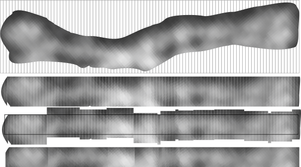
The best LUT plots for greyscale are not easy to obtain for curvy molecules. This particular set of images and plots shows how the plot can be improved by some easy steps, none of which alter the data (the original image) but which produce cleaner results in terms of the LUT plot. (my name = #46 _SP-D, AFM from someone elses publication.)
Top image is the actual arm of the SP-D dodecamer just quickly isolated from the whole image using the eraser tool in CorelDRAW x5, and then cut into 10nm widths (vertical grid as shown), then ungrouped and centered horizontally and exported as a tif at 300ppi (next image down). Getting the LUT plot using a rectangle did not show the peaks well, and a plot for a single line was obtained as well (with worse results). Since ImageJ does not have the potential to bend the lines at nodes, then some other technique for further straightening the area to be plotted helps. The third image from the top is a manual vertical adjustment so the bright spots are aligned horizontally. All those slices are groupd and recropped, and a grescale rectangle is placed behind with a medium greyscale color (125) to minimize the lines at each 10nm slice, and then it is exported as a tif (as above) and imported into ImageJ. THe resulting LUT plot is somewhat better. Number of peaks on each side of the N terminus is countable in both. In this particular set of two trimeric molecules the N terminus peak is not the brightest, but the leak on the left hand side (peak which would be the C1 portion of the collagen-like domain) (most medial peaks (right and left of the N terminus peak, the latter being central. The plots still seem to me to have three peaks in the collagen-like domain which might be born out on the left, not so much on the right half.
Here are two plots, red line is adjusted per bottom image, blue line is original (second image from top).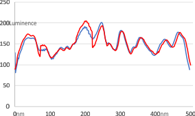
The other two trimeric arms are here (labeled c and d) were plotted with rectangle 500pxx@15px) blue plot line is a 1px line through center of the sliced and centered image. There is little difference. Three peaks between the CRD and the N terminus (which is in this case just a little to the right of center and only the tallest peak in the sampling of the rectangle) are found on the right. Three peaks are on the left as well, but they are grossly misshapen compared to the right hand plots.