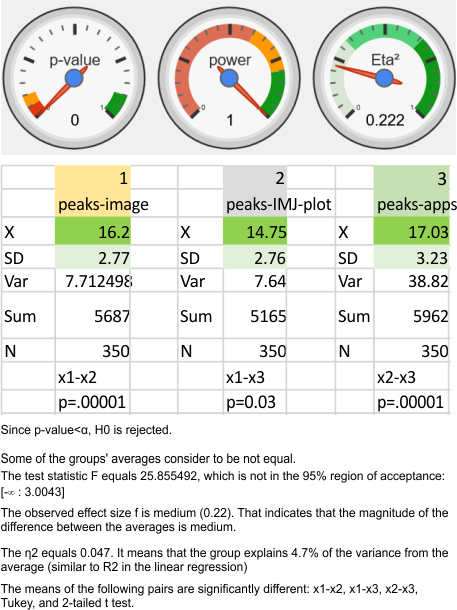
Nice online ANOVA caltulator (i like the colors and graphics especially, even though I have not ever tried to grasp statists). To me it looks like there are significant differences between what “I” see initially on the image, what “I” count as peaks on the plots generated from the images in ImageJ, and what the various signal processing apps that detect as peaks on those same excel plots. Top image. These data are for all 14 dodecamers, the most current set of peak counting data so far.
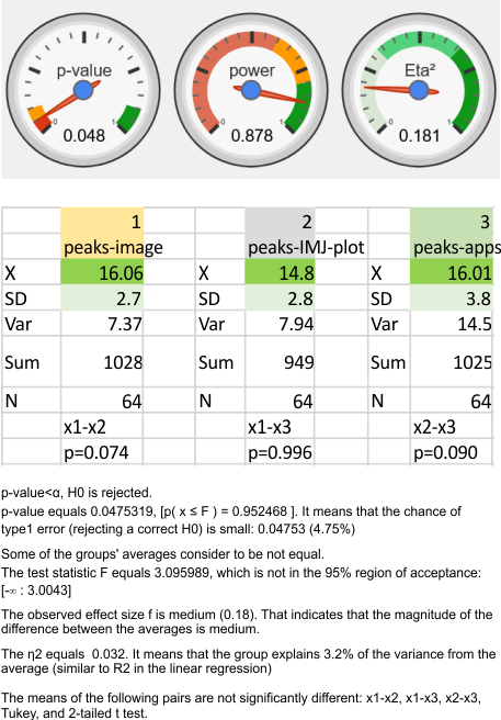
When I separate out JUST MY peak counts of the images (before and/or after image processing filters) and then just MY counts on the initial plot images in ImageJ, and then my recounts of the peak separation when adding up the sub-peaks into the preset 15 peaks (found previously by an average of hundreds of plots)…. I personally am pretty consistent in how i see the peak number in each image. Bottom image.

