I find it interesting how peak finding apps and programs (in this case an xlsx function) differ from what I count. There are variations in what the apps find and in what i count as well. This is all just a dive into what is the “best way” to count grayscale (brightness) peaks along a plot from an AFM micrograph. At this point, it is still up to the researcher to make determinations. I dont see a single app that does what “i think” is right, and I dont do what “i think” is right all the time either.
It might appear that the more measures the better the outcome, kind of like “crowd sourcing”. When querried, “Exploratory data analysis is a technique data scientists use to identify patterns and trends in a data set. They can also use it to determine relationships among samples in a population, validate assumptions, test hypotheses and find missing data points.” So there you have it, just exploratory.
Case in point, variations below in my counts, mostly identical, yet slightly different plots from image in different programs produce different results in the PVDT.xlsx program, just small, and then there are my erros in judgement too. More assessments may mean a more accurate outcome.
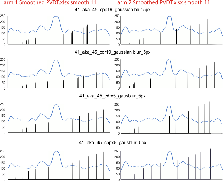
Graphs for peaks found below: ONE surfactant protein D dodecamer, as TWO hexamer arms (15 peaks per hexamer)(found as the mean from 1000 plots) divided in the middle, mirrorred, into FOUR trimers with the center peak as the tallest widest peak. Top image has the PVDT program for detection of peak divisions, and the colors in those divisions are my choices as to the identity of the 15 peaks.
The name of the program which applied the 5 pixel gaussian blur is given: cpp19=corel photopaint 19; cdr19=coreldraw 19; cppx5=coreldraw x5; cdrx5=coreldraw x5. Differences are slight, and one must keep in mind that there is a separate trace through each hexamer for each arm and for each program. This is more likely the cause of differences, than differences in the way each program executes its gaussian blur. Each was traced with a 1 pixel line using ImageJ. Each was exported with the same y axis to .csv, then opened and plotted in excel. Diagrams were made using CorelDRAWx5.
I did a similar assessment of the same SP-D dodecamer using the Octave function iPeak. Find those data here.
I need to redo two of the plots for the second hexamer (arm 2) … I did redo a couple of them once to see why the last peak on arm 2 wasnt detected. I know it was bothersome.
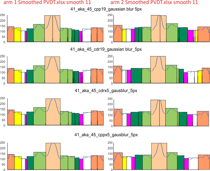
Center peak(s) peach color=N term joined peak, composed of all four N term domains; light green peak(s), glycosylation peak(s); orange peak(s) at the ends of both hexamers, CRD that account for the known 5 peaks per hexamer. All other peaks routinely found bring the more realistic peak count to 15 per hexamer. These are color coded, but consistenly not found in the literature as “real” entities though clearly they are.