How could we think for one second that our writing could be more beautiful than this.

How could we think for one second that our writing could be more beautiful than this.
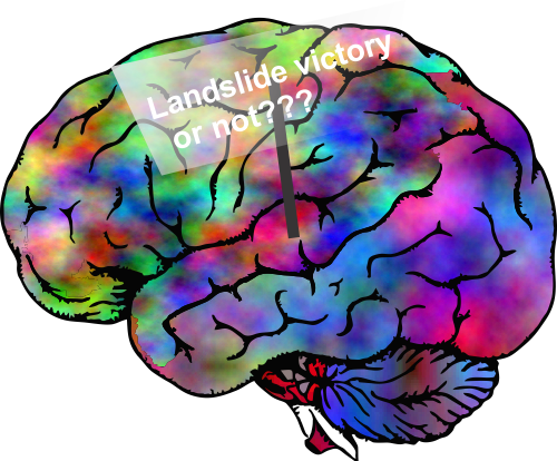
When a president elect says something like “I won in a landslide” when he lost the popular vote and there were states that were too close for analysts to call the outcome for, then there is something amiss.
One has to consider the facts: wikipedia says (and wikipedia is a voice from millions of independent minds, perhaps the greatest collection of information ever created, free, and editable to all) — Memory gaps and errors refer to the incorrect recall, or complete loss, of information in the memory system for a specific detail and/or event. Memory errors may include remembering events that never occurred, or remembering them differently from the way they actually happened.
Wikipedia index goes on to list 13 different types of bias in memory, making it abundantly clear that we all fit into some of those categories, many quite deeply, others just barely. BUT not only is it intellectually dishonest to even begin to assume that one’s own memory is untainted, but it is also shows a total lack of understanding about biology and the mind, and how we store, retrieve and re-retrieve data.
What is just laughable (and also a serious problem for a country about to embark on a 4 year journey with a marginally fit mind at the helm) is that the comments, like the one above, fly out of a mouth with absolutely no frontal lobe editing. That is a scary thing.
I was reading a publication by M Ochs, The Closer we Look the more we See? Quantitative
Microscopic Analysis of the Pulmonary Surfactant Sustem, Cell Physiol Biochem 2010;25:27-40 and I could not help be renew my awe for how the lung works, its fantastic biology, chemistry, order, and continued unknowability. I am cutting and pasting from his introduction, a beautiful ode to the lung.
“Each day a human being inhales and exhales more than 10,000 liters of air. Within the lungs, the exchange surface for the diffusion of gases is distributed over about 300 to 500 million alveoli and is as large as 120 – 140 m² (nearly the size of a tennis court). At the same time, the thickness of the exchange barrier is only about 2 ìm (50 times thinner than a sheet of air-mail stationary). This large and delicate surface has to be protected against collapse as well as against invasion of pathogens. For both, biophysical and immunomodulatory, functions, the pulmonary surfactant system is principally responsible. Thus, the integrity of the pulmonary surfactant system is essential for normal lung function. Basically, surfactant helps to keep the large alveolar surface of the lung open, dry, and clean”. To reiterate this ode, graphically, here is my Andy Warhol-style diagram of an alveolar type II cell (failed cover submission to Microscopy Today, sob sob).
 More info on alveolar type II cells from Ochs, M: In humans, a single type II cell contains about 200-500 lamellar bodies, whereas in mice one finds about 50-100 lamellar bodies per type II cell.
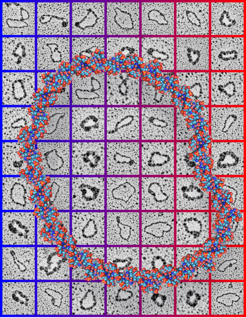
One more submission for a scientific cover failed but none the less really informative and very interesting. 63 awesome little electron micrographs cut and pasted from data from my friend Jack Griffith, assembled into a collage of images behind a circular recreation of ball and stick DNA. Love the colors. This was a pretty guts submission, maybe pushing the envelope for those graphically challenged editors. haha.
I have had so much fun making covers for/with my friend Jack Griffith. Not always successful submissions, but always fun to work on. His data went into the concept of this submission, with my famous chromosome in the background and a mockup of molecules over his micrograph. Also a variation on that submission group.

Little did I know when I made this for a friend of a friend that it would be for a Nobel Laureate. This image is about biological clocks. I did several different styles, but this one was accepted and published July 22 2011: Vol. 286, Num. 2. I have no clue what made me swirl the clock faces into the columns. Ha Ha. But I am glad someone thought it was a good visual representation. If I am not mistaken, this was a freebie, and in addition JBC didn’t put my name in for credits…. so much for fame and glory in the world of scientific illustrating.
 So here is one submission for the same journal cover place as above, which was obviously rejected. I agree with their choice.

And… here is yet another cover submitted to JBC in competition for the same article.

This was a cover that I had hoped would be published with an article that I helped to co-author that described a pro-survival gene, or otherwise functioning as an anti-apoptotic gene. Playing with the images of apoptotic cells in culture I did manage to submit the image to Microscopy Today, and they published it in 2008.
I thnk what amazes me is that I really made a whole lot more cover submissions than were successfully published (LOL). I find a similar statistic in publishing data, where really only a small part of what is studied, learned, documented, and put out there in the world of science, makes it into print. Good things have to get strained through the teeth of overworked and sometimes not that interested peer-reviewers. Who, I wonder, thinks so highly of themselves that they have the right, and/or mission, to exclude the works of others. Notwithstanding the well know fraud in science, the great majority of individuals working to find “truth” in all its glory, are honest and well-intentioned.

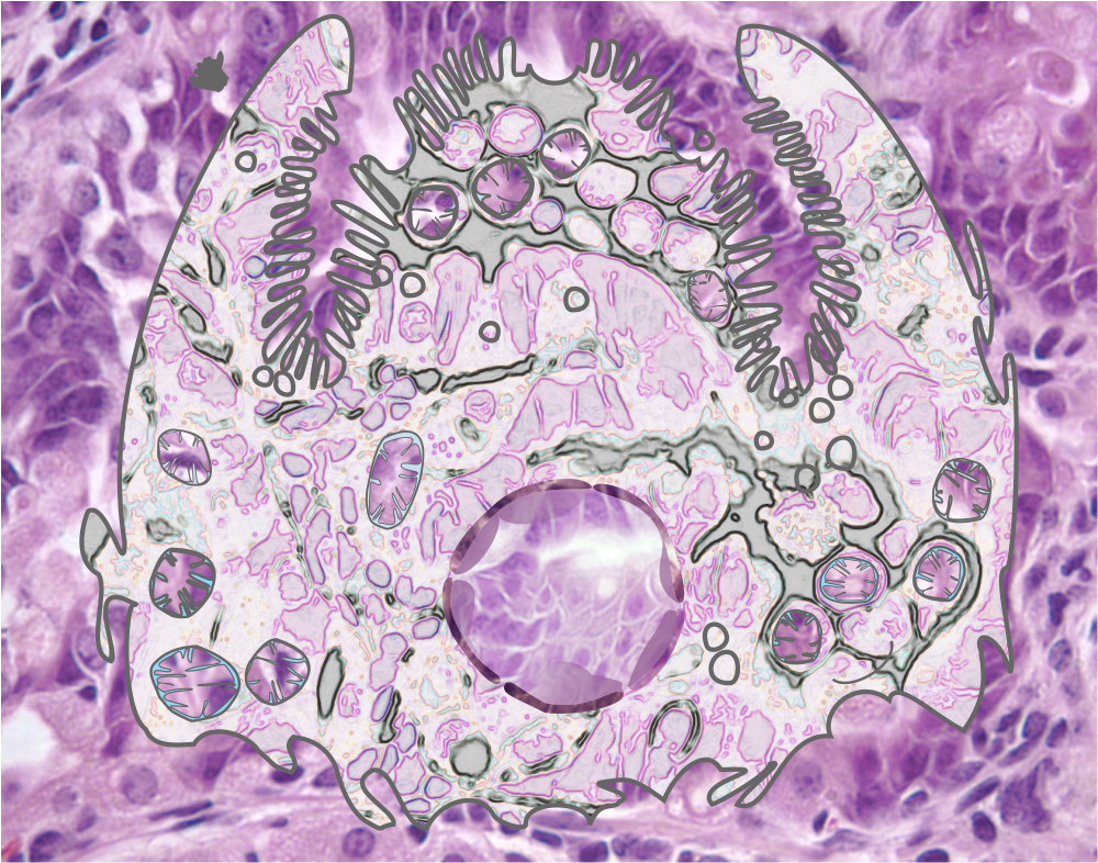
How awesome is this composite of gastric epithelium (light micrographs) put together in a collage of images with the forestomach images in the upper right outside, and the glandular stomach on the outside lower left and bottom and all the glandular stomach epithelium at lower magnification with light microscopy surrounding two higher magnification (100x at least) images within the center. Too bad this didn’t make it on the cover of JBC. Here is a mockup of what could have been. LOL. Still a great image. I have to consider these cover rejections as just part of the competition in scientific illustration.

More images of gastric epithelium in the mouse, onto which is layered some vector graphics of mitochondria, vesicles, nucleus (pale condensed chromatin areas within, nuclear membrane (inner and outer membrane and perinuclear space — but no nuclear pores are identified here specifically but the places where outer and inner nuclear membrane come together nuclear pores would be found. This is color and information together, for the 21 century and the digital age.
The microvillar (highly microvillar) apical membrane is shown, the lateral membrane and basal membrane are not distinguished from each other except as the bottom of the diagram is basal.
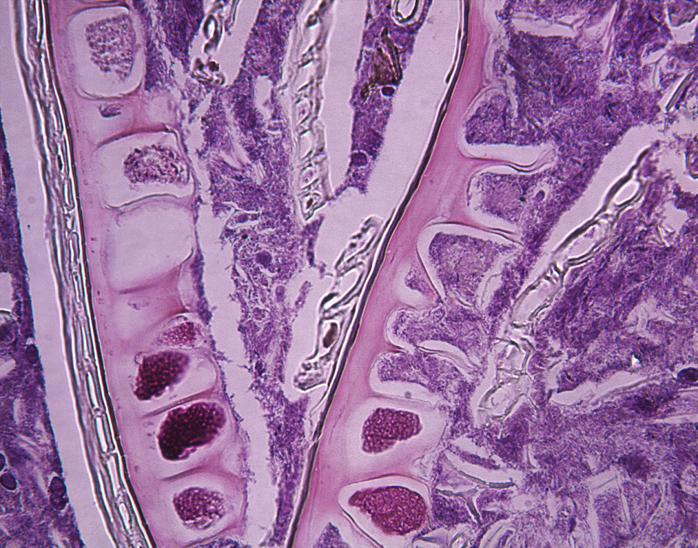
Yes, this is what I explained in the title. It can be beautiful as seen here in this hematoxylin and eosin stained light micrograph of the contents of a mouse intestine. The order comes from remains of plant fibers, ha ha. A totally awesome image, nice enough to put this c**p on any wall as artwork. Don’t you love science.