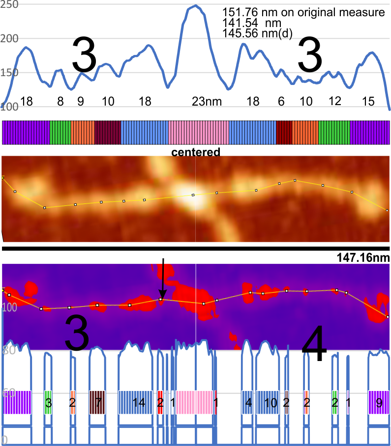
The same well used image from arroyo et al was opened in gwyddion and to the image a 20 minimum 90 maximum mask was applied (red portions inside a purple mask). image was saved then and opened in ImageJ and plot line for the original and the masked images on one and the same arm of a SP-D dodecamer.
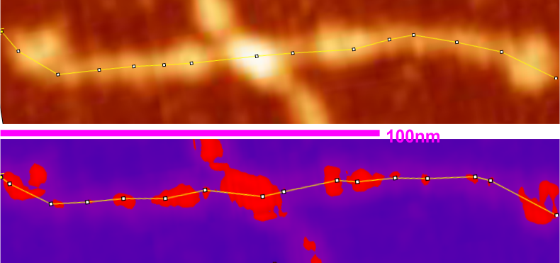
(I tried to find black mask but was unable to do so, thus the purple portions of the plots underlying the mask are changed to 0 – which introduces some selection bias). This particular setting gave what i thought was the best representation of the high luminance peaks along the arm of the original AFM (top). It did remove some of the background vibrations from the peaks, but and identified most of them along the arm. What is interesting is that the very small “new” peak found between the N termini junction and the alleged glycosylation site (the proximate and typically the “highest” peak along the collagen like domain) where the original scan did not (black arrow on the purple and red masked image).
Bottom line: I guess both methods need to be used as they show differing results. 15nm for the N termini peak in the lower image got lost somewhere. Compare with 23nm for the original LUT plot. Large black numbers identify number of prominent peaks along the collagen-like-domain in the original and the masked image.
The measured size of the dodecamer remained very close, regardless of the application of the mask, but slightly smaller due to the loss of shading in the AFM image. The clearest difference from the original AFM and the masked portion is the difference in the peak widths.
I am leaning toward the simplest and quickest evaluation of these peaks…. and straight from the original, with a little HSL adjustment in CorelDRAW will be the best and least variable way to see peaks.
COMMENT: i wonder how many times this will be searched currently for the words MASK and peak totally unrelated to anything about the coronavirus and now having typed in the latter it will be a given.