How awesome is this composite of gastric epithelium (light micrographs) put together in a collage of images with the forestomach images in the upper right outside, and the glandular stomach on the outside lower left and bottom and all the glandular stomach epithelium at lower magnification with light microscopy surrounding two higher magnification (100x at least) images within the center. Too bad this didn’t make it on the cover of JBC. Here is a mockup of what could have been. LOL. Still a great image. I have to consider these cover rejections as just part of the competition in scientific illustration.
Monthly Archives: September 2016
Parietal cell (stomach, mouse) with some organelles diagrammed
More images of gastric epithelium in the mouse, onto which is layered some vector graphics of mitochondria, vesicles, nucleus (pale condensed chromatin areas within, nuclear membrane (inner and outer membrane and perinuclear space — but no nuclear pores are identified here specifically but the places where outer and inner nuclear membrane come together nuclear pores would be found. This is color and information together, for the 21 century and the digital age.
The microvillar (highly microvillar) apical membrane is shown, the lateral membrane and basal membrane are not distinguished from each other except as the bottom of the diagram is basal.
Parietal cell diagram with some of important ion transporters
This is a left over diagram, also intended for a scientific journal cover illustration but never finished or submitted, I don’t believe, or at least never accepted. It is a light micrograph of gastric epithelium of a mouse, stained with alcian blue, outline of a parietal cell in diagram form, with ion transporters (arrows and ions indicated).
Don’t give me that c**p, haha
Yes, this is what I explained in the title. It can be beautiful as seen here in this hematoxylin and eosin stained light micrograph of the contents of a mouse intestine. The order comes from remains of plant fibers, ha ha. A totally awesome image, nice enough to put this c**p on any wall as artwork. Don’t you love science.
Cardiac muscle cell and ion pumps diagram
This illustration, a background of cardiac muscle cell (mitochondria blue; myofilaments, myofibrils, purple) with an overlay of a rectangle representing a cell (no plasmalemma distinctions on this box) showing some of the ion pumps that are responsible for homeostasis and function in cardiac muscle. This was a cover submission to Journal of Biological Chemistry, years ago, and unfortunately I had two cover submissions for the same month…. this one lost to my other one (ha ha). That was a banner month for me. Two submissions to the same journal but I just wish that either one or the other of the first authors on those manuscripts would have opted to delay publication one month, as I thought this was a pretty good graphic.
Too crazy to submit as a cover illustration of an alveolar type II cell diagram
Ha ha…. There are few things in life that I love more than illustrating science. I don’t belong to any group of medical illustrators though this was the dream that began my career in science. I do wish I could send well wishes to long-ago-deceased Lucille Castle Innes who lived next door to me (and the family) at 5252 Windermere in Los Angeles California. It is to her that I give credit for introducing me to scientific illustration.
I remember showing her a diagram of a muscle cell, which apparently I was proud of, and that was likely a school assignment (Eagle Rock High School in the class of a woman whose name I have forgotten (I do, ha ha, think she was the archetypal spinster scientist lady-high school teacher)), but Mrs. Innes mentioned to me that I has not spelled “striated” muscle correctly. Never since have I missed that word. Ha Ha. Mrs Innes not only gave me instructions, inspiration, but also landed me my first job at White Memorial Hospital in LA where I helped sort 2×2 slides of diseases and stuff, watched my first autopsy (lordy, I remember nearly passing out) and watching her work, and receiving guidance when wanting to enroll in a medical illustration degree course (which I did, at the University of Toronto, under the directorship of Nancy Joy).
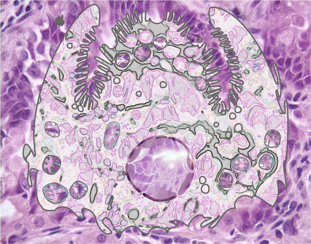
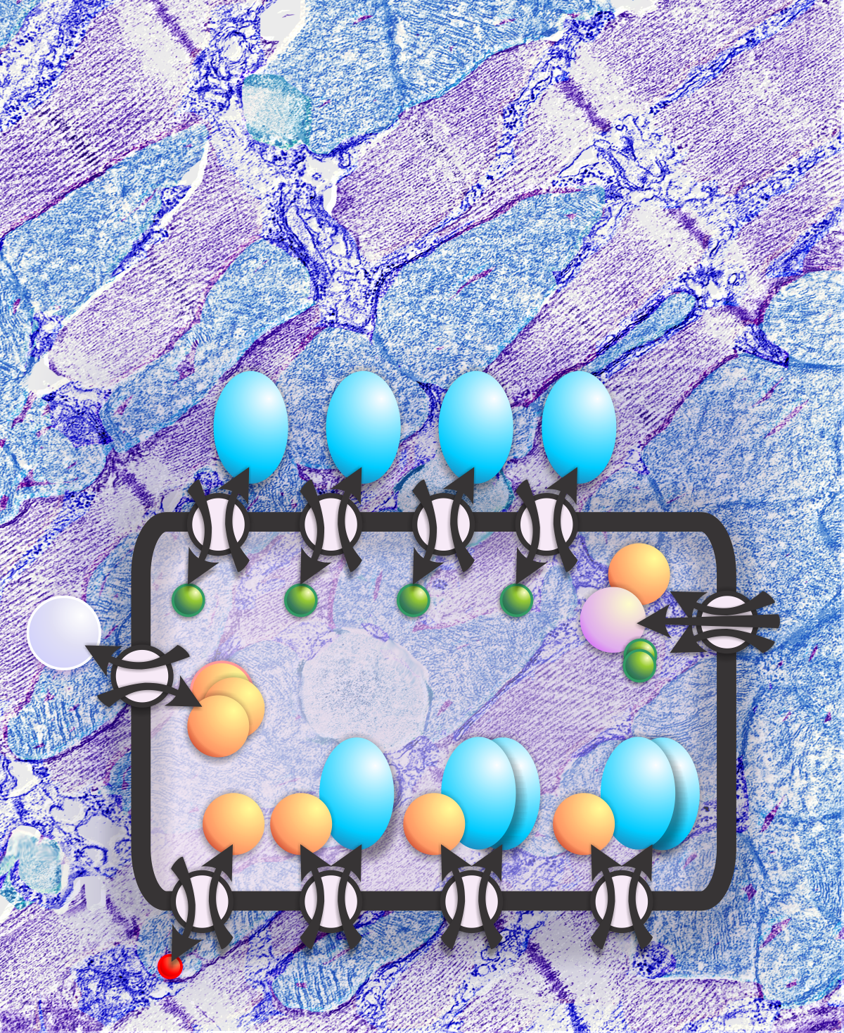
As life would have it, those aspirations of being a medical illustrator were derailed and I ended up at the University of Cincinnati, in Anatomy, but always illustrated and worked up my own graphics, earning the not so wonderful title from a less than supportive Director of Toxicology during my time in the Department of Environmental Health where I did electron microscopy aka, comparative anatomy and pathology — the Queen of Corel. By way of admission to absolutely loving a program, I have to say CorelDRAW just works for me…. ever since the very first version on 11 little pink floopies, downloaded (probably not legally) from a local print store. Since then, CorelDRAW (versions 4, 6, 10, X3 and 15 have been a life-mainstay). So very different from the hand made stippling and little circles in the first scientific illustrations I did decades ago, now it is diagrams like this one below, of an alveolar type II cell. Just loads of fun, and color appeal but still full of good scientific information.
This particular andy-warhol-style-diagram of a parenchymal cell in the lung was just a little too wild as a cover submission to submit along with my editorial on the ANATOMY OF AN ALVEOLAR TYPE II CELL DIAGRAM .