TOPIC: desmosomal diagrams
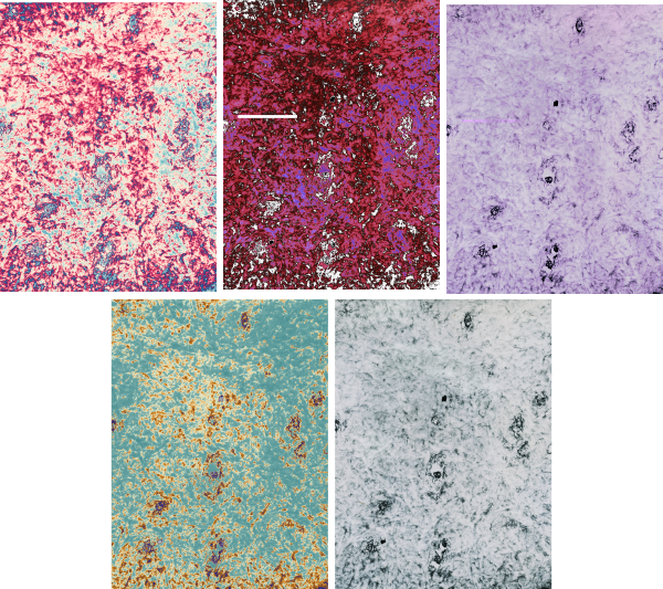
BACKGROUND: Desmosomes are cell-cell adhesion spots (not spot welds, but more like removable rivets, or bolts with phylanges, meshed with extracellular velcro-like (Ca dependent) intercellular hooks. Desmosomes are very specialized and highly ordered areas that incorporate many of these types of commercial connection devices. Velcro=desmocollins,desmogleins, double headed bolts or rivets=desmoplakin connectivity with the outer dense plaque proteins, and lock washers in particular the plakoglobin and plakophilin portions of the outer plaque proteins. Desmosomes are commonly found in epithelialia, and I have seen them in particular right at the borders of the bile canaliculi in liver, at the apex of gut epithelial cells, and in kidney, and thyroid. I don’t think they are plentiful in lung, but I have not specifically searched for them there. Of course desmosome-like junctions in heart, and muscle cells are unique adaptations of desmosomes. Others researchers have found them in thymus, cornea, and the central nervous system. Desmosomal protein isoforms and connections with filament proteins understandably are different in each cell type, and even with maturation state and location within the same tissue (e.g. different levels of epidermis). Electron microscopy (with electron tomography) remains the gold standard for studying desmosomes. Finding a good diagram of the desmosomal complex, identification of the desmosomal proteins and visual correlations with electron micrographs is not easy. HENCE the following post.
COMMENTS on one diagram: I realize it is always risky to critique a diagram when on has not made a diagram for counter-critique. So please understand this is not a hostile critique, but a learning critique… it is the way I reinforce what is reasonable science and what is regarded generally as “fake data” (ha ha… no deliberate reference to the current state of government and news reporting is made), it is instead an honest attempt to come up with something which is informative, and accurate. The source of the diagram is irrelevant, since the purpose is to examine the content, not to criticize. I will just list the issues i have in bullet format.
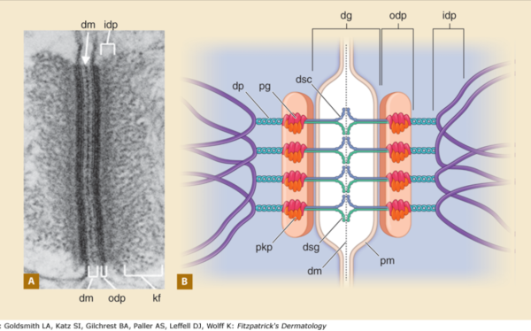
1) the area marked dg, desmoglein, includes the plasmalemma from both adjacent cells…. this probably is not accurate, I would not have commented had the bracket stopped at the outer leafelet of each plasmalemma.
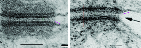
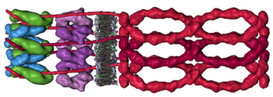
2) dsg and dsc, desmocollin and desmoglein dont really connect in their N terminals as pictured here…. but seem (if one examines the electron microscopy) to be staggered. Even the staggered relationships between cell 1 and cell 2 in their own micrograph have the densities staggered (or alternating).
3) I havn’t seen any reports that say the desmocollin and desmoglein run as a single unit together in the intercellular space which is shown in this diagram.
4) given that desmocollin and desmoglein have a single-pass transmembrane domain and an extended portion into the intracellular space (in the outer and possible the inner dense plaques) it would have been nice to see a little bit of that passing through the red and orange twists that they have labeled pkp and pg = plakophilin and plakoglobin.
5) Since desmoglein does extend into the intracellular space and in this diagram is colored blue, it might have been a better idea to color the dp = desmoplakin some other color, since the continuity of those two molecules as the same color is confusing.
6) it is not tough to make things in relative ratios — a kind of internal scale and when something like the plasmalemma in the diagram is so tiny compared to the other drawn blobs, somehow it speaks to “inattentiveness” or lack of real perception than the need to fit a publication dimension or pixel level. AND, it provides bad data to those who look at the diagram and learn visually.
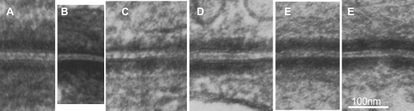
7) it is actually kind of cute, the common copying mistake that diagrammers make when they try to depict something that someone else has committed an error on. This particular error is soooo obnoxious that it makes me wonder if the scientists who requested the diagram know any more than the diagrammers who diagrammed the diagram. The intermediate filaments in their own micrograph (left part of the image) are not these hairpin wired things darting in to connect with the desmoplakin molecules but they are seen as dots, or pretty much cross sections with a few that look like arcs. Their diagram shows hairpin curved lines (purple) as intermediate filaments as they connect with desmoplakin but shows NONE of the intermediate filaments in cross section, ha ha, but 100% as arcs… this is just an error.
8) the periodicity of the outer dense plaque proteins (that would be a combination of desmoglein, desmocollin, plakophilin and plakoglobin and whatever portion od desmoplakin sticks in to connect as well is not defined in their electron micrograph. I do think one exists, and it has been reported to be the same dimensions (same number of nm between densities), but certainly can’t be borne out in their own TEM.
9) the central dense line (extracellular) where desmocollin and desmoglein attach, in the diagram they present would surely show a lucent dot, where they have their molecules coming together… NOT as is typically seen, a definite density, and regular periodicity.
10) The desmoplakin twisted glue lines has two prominent areas at the N and C terminals which some have depicted as
So this if fun for me, again, not to aggravate anyone, but to identify which diagrams can be used to educate, and which need to be pitched as fake news.