Monthly Archives: December 2021

Visual aid: image processing without, or in addition, to signal processing grayscale plots

The graphics below are visual aids that I prepared for myself, just to help me visualize the value of image processing -with and without- subsequent signal processing of the grayscale (LUT) plots for peak detection. The goal is to determine what signal processing of plots offers in terms of determining structure within the images (molecules).

The graphic to the left: A crop of the same image, saved from three different published figures, is from a set of about 100 images of surfactant protein D (SP-D) I have used in all the previous posts about SP-D. This particular trimer a SP-D dodecamer I named 97, and it has been shown elsewhere on this blog, on numerous occasions, and individuals have been credited for it in previous posts.

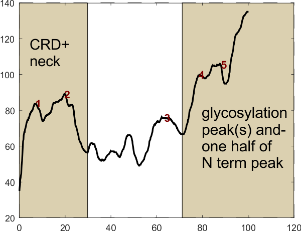
Summary of the image to the left: Three screen shots were made of one dodecamer (this is just a portion of that image),  from published articles, each of a different resolution (i.e. digital resolution). One can see the gradation of pixelation of these cropped images (just the carbohydrate recognition domain of a trimer) best resolution at the top, worst at the bottom. The three images were resampled to 8in wide, 300ppi, bit depth 32, but the graphic to the left shows that the original pixellation is present in each even after resampling. The least pixelated image is 97-1,  then 97-2, and particularly 97-3, is pixelated.  These same three images were then image-processed using two filters, both applied in Gwyddion and exported as tif files. The filters were, 97-1 – gaussian blur 5px, limit range 130-255;  97-2 gaussian blur 10px, limit range 130-255; and 97-3 gaussian blur 15px, limit range 130-255.  Greater degrees of gaussian blur were used to reduce the pixellation in the images 97-2 and 97-3. The resulting images were plotting using a 1px segmented line through the center of the trimer in ImageJ to determine brightness (grayscale, 0-255) and plots were exported to excel.

In addition, using ImageJ, a duplicate of each of the three processed images was also resampled, one set at 5000px and the other set at 50px. The benefit from a second resampling to 5000px wide can be seen in the graphic below, but the 50px images were basically useless, but amazingly, some signal processing programs could find peaks in the appropriate places.

As a summary of image-processing, sets of the three images (97-1, 2 and 3) were treated as follows: 1) the originals were resampled at 300ppi;  2) resampled images were subjected to gaussian blur – limit range filters, 3) duplicates of the second set were resampled in ImageJ, at a5000px or at 50px to become the third and fourth sets. The plot below  reflects the mode of the peaks found in each plot, that is, a count of the number of peaks derived from each image as it is subjected to various signal processing algorithms.  Overall, something between 8 and 10 peaks are present in plots of most most images, whether processed just with image processing, or both image and signal processing algorithms.

The most pleasing data come from the column (far right), and surprisingly it was from 97-3 the most pixelated original image, which was compensated for by a 15px gaussian blur. It may however be an undercount of the actual number of peaks along a trimer of SP-D.  Very likely the mode, which is 9 peaks is most reflective of this trimer, and others I have seen.

The ImageJ plots were subjected to 29 different algorithms to determine peak number per trimer. That list is in a post HERE and listed again at the bottom of this blog.  Excel was used to create a graphic with the number of peaks found in the 299 resulting plots. It has been color coded according to the number of peaks that each signal processing program produced for each of the 3 images and their 3 variations (remember the 50px set was discarded).  Color coding:  blues and greens represent the smaller number of peaks along a trimer, and reds and browns represent the higher number (sometimes “off the charts” depending on the settings on the Octave and xlsx template functions) of peaks that the algorithms produced. It doesnt take much looking to see that the greatest gaussian blur and 5000px resampling make for the best signal processed peak results (columns 2, 6,7 and 8,9 regardless of algorithms used for signal processing (bottom image). On the vertical legend on the right, bold numbers are counts of peak with numbers corresponding to the most right row, e.g.  2 image-signal processed plots came up with 2 peaks, etc, or you can count them yourself.  My subjective counts, pink columns most left, lag threshold influence settings 8 tan collumns, ImageJ find peaks, brown columns, light blue, PeakValleyDetection xlsx, PeakDetection xlsx medium blue, darker blue was Octave, findpeaksplot.m, and most 2 right columns, Octave AutoFindPeaksPlot.m. values for the two Octave .m sets are listed in below, as are settings for the xlsx peak finding templates. LTI settings given as well.

list of image/signal processing.  beginning with top left on graph above, list of all the signal  processing  used on the 10 images. RED indicates which ones I thought were best.

my count of peak number from the image
my count of peak number from ImageJ plot
LagThresholdInfluence 1, 0.5 0.025
LagThresholdInfluence 1, 0.7 0.05
LagThresholdInfluence 1, 0.1 0.01
LagThresholdInfluence 5 0.5 0.5
LagThresholdInfluence 5 0.5 0.05
LagThresholdInfluence 10, 0.1 1
LagThresholdInfluence 10 0.5 0.5
LagThresholdInfluence 10 0.5 1
ImageJ find maxima 0.5
ImageJ find maxima 1
ImageJ find maxima 2
PeakValleyDetection xlsx smooth width 1
PeakValleyDetection xlsx smooth width 3
PeakValleyDetection xlsx smooth width 5
PeakValleyDetection xlsx smooth width 7
PeakValleyDetection xlsx smooth width 9
PeakValleyDetection xlsx smooth width 11
PeakDetection xlsx amp t 0.6 slope t 2.5- M6=-4,N6=-3
PeakDetection xlsx amp t 1 slope t 1 -M6=-3,N6=-4:
PeakDetection xlsx amp t 0.6 slope t 2.5 -M6=-3,N6=-4
findpeaksplot x,y,0.0001,80,9,16,3
findpeaksplot x,y,0.0003,0,11,21,4
findpeaksplot x,y,0.0008,40,9,16,3
findpeaksplot x,y,0.0003,0,11,35,4
findpeaksplot x,y,0.005,5,7,7,3
autofindpeaksplot.m x,y,0.00041228,63.5713,16,16,3
autofindpeaksplot.m x,y,0.00039524,74.8105,17,17,3

Using just the results for the algorithms above in “red”

9 peaks in a trimer of SP-D  (n-1 trimer…LOL) but it is a start.
N 11
Sum 99
Mean 9+/-1.3
Var 1.8

Summary of 175 measurements of a single trimer of SP-D: image processing, signal processing

Summary of 175 measurements of a single trimer of SP-D (photo taken by Arroyo et al: an image that I call 97): image processing, signal processing:

The aim was/is to determine whether image and signal processing, either combined with each other or each alone, can determine the number of brightness peaks along a plot line of an AFM image of any molecule, with any accuracy.  The answer is maybe not!….inspite of the attempt to take an unprocessed image (three different captures), making my own assessment of how many brightness peaks there are, as well as counting peaks from the ImageJ plot, and after using many image manipulation programs, as well as signal processing programs for peak detection ( Matlab/Octave, a Z-score peak detection algorithm and xlsx templates), it is clear that it is a “choice”, simply a choice of what one decides the number of peaks should be.  That is not what I had hoped for.

Image here shows the three different unprocessed images used (different degrees of pixelation are evident). These three images were then processed using gaussian blur (5px for 97-1, 10px for 97-2, 15px for 97-2 — which gave them more or less equivalent “look” in my own eyes.  Each of those blurred images was also processed with a limit range 130-255 in Gwyddion. Those processed images were resampled in ImageJ at 5000px and 50px (the latter, after some plotting, were discarded as they were just not usable (but i needed to check).  Bar marker=100nm.

Center image below shows the ImageJ typical trace to obtained the plots, which go from CRD to mid N termini junction.  You might be able to see the difference in pixellation in these images as well.  It certainly showed up on plots.  Plots made in ImageJ were normalized for X, and peak detection parameters for each program is shown by the list at the bottom of this post.

The chart above shows every measurement. The number of images plotted is the top row, that is 1-12.  The images were number coded so that the investigator did not know which processing was used on which image.  Peak counts varied from about 2 to 39.

My own determination(s) were somewhere between 8 and 9 peaks, so clearly the parameters for detecting peaks by some algorithms I used was too sensitive.  I decided to use the highest and lowest values for what I personally determined the peak number to be (which ranged from 6 to 11) and remove all values from all signal processing results below and above that cutoff.  (chart above on right is the result).  Peak detection values (from chart on right above) were summed (green insert at left) and the result of the many peak detections (outside of my own estimates) come together in something that is very close to what I had hoped.  Yes, i introduced bias by selecting the initial range (someone out there knows a way to do this in an unbiased manner I am sure).

If you are at all curious about the color coding for the charts above, here is a crib sheet.  The greatest number of eliminations came from some values in the Z-LagThresholdInfluence algorithm (8 settings used, some of which sould be eliminated), and the PeakValleyDetection xlsx program where every setting from 1 to 11 was tried (and many could be eliminated there).  The Matlab/Octave functions (which I did not write, and have basically no clue about – but listed the specifics below) did not produce as many outliers as other algorithms.  Bottom line…. my eyes are best. LOL,  sorry, thats just the way it came out.

I thank my son, AEMiller, for the batch processing program for the Z-LagThresholdInfluence program.

Each original, and and each image-processed image was also processed by each signal processing algorithm below.

97-arm 1a
my count of peak number from the image
my count of peak number from ImageJ plot
LagThresholdInfluence 1, 0.5 0.025
LagThresholdInfluence 1, 0.7 0.05
LagThresholdInfluence 1, 0.1 0.01
LagThresholdInfluence 5 0.5 0.5
LagThresholdInfluence 5 0.5 0.05
LagThresholdInfluence 10, 0.1 1
LagThresholdInfluence 10 0.5 0.5
LagThresholdInfluence 10 0.5 1
ImageJ find maxima 0.5
ImageJ find maxima 1
ImageJ find maxima 2
PeakValleyDetection xlsx smooth width 1
PeakValleyDetection xlsx smooth width 3
PeakValleyDetection xlsx smooth width 5
PeakValleyDetection xlsx smooth width 7
PeakValleyDetection xlsx smooth width 9
PeakValleyDetection xlsx smooth width 11
PeakDetection xlsx amp t 0.6 slope t 2.5- M6=-4,N6=-3
PeakDetection xlsx amp t 1 slope t 1 -M6=-3,N6=-4:
PeakDetection xlsx amp t 0.6 slope t 2.5 -M6=-3,N6=-4
findpeaksplot x,y,0.0001,80,9,16,3
findpeaksplot x,y,0.0003,0,11,21,4
findpeaksplot x,y,0.0008,40,9,16,3
findpeaksplot x,y,0.0003,0,11,35,4f
findpeaksplot x,y,0.005,5,7,7,3
autofindpeaksplot.m x,y,0.00041228,63.5713,16,16,3
autofindpeaksplot.m x,y,0.00039524,74.8105,17,17,3

Finding the number of (bright) peaks along the collagen-like domain of a trimeric arm of SP-D

Octave P=autofindpeaksplot(x,y,0.00039524,74.8105,17,17,3);(Thomas O’Haver).

Peaks labeled 1 and 2 above are part of the carbohydrate recognition domain and neck domain. Peaks in the light central rectangle (including peak 3) are four presumed-predictable peaks in the collagen like domain. Peaks 4 and 5 represent the glycosylation site  and the last and tallest peak on the right is “half” of the N termini junction peak. This plot represents just one trimer of a SP-D dodecamer. Xaxis is normalized to 100pc, actual length of a trimer is around 135nm. (NB, this plot and peak detection does NOT show the tiny peaks beside the N term, one each trimer which I do believe is important).

In the above image (number 97), the yellow tracing line on the image (and thus the beginning of the plot (left hand side of the plot, labeled CRD and neck) begins at the bottom and terminates in the N term.

Abbreviations: CRD, carbohydrate recognition domain; SP-D, surfactant protein D; neck; coiled coil domain just beside the carbohydrate recognition domain; LUT, look up tables, the name for brightness plots in ImageJ.

New approach to finding number of peaks along the trimeric arm of SP-D could involve just counting those peaks that are between the alleged glycosylation site and up to the neck and CRD.  After having looked at this molecule for three years to try to figure it out i thought today that one possible reason for variability in the number of peaks in a trimer (LUT plots from CRD to the center of the N termini junction ) is not variability in that collagen like region but actually is attributable to variations in the number of peaks in the CRD itself, and the glycosylation (peak group).  The reasoning is that when I look at the AFM image (processed by dozens of different filters and masks and by many different programs, i can actually see the glycosylation peak variability, and the CRD variability…. even to the point of seeing each of the three lumpy CRD bending and squeezing each other at the end of a trimer.  I can also see a rotational lumpiness to the alleged glycosylation site which likely represents one, two, or three carbohydrates attached to the one, two or three molecules of the SP-D trimer.  The three large and predictable lumps at the CRD are well known, but whether there is a lumpiness to the peak at the alleged glycosylation peak has to my knowledge not been described before, but in the numerous plots of trimers, it becomes evident that it may exist, and relevant to that point is the variable absence of the glycosylation peak (not complete absence) in un-glycosylated SP-D reported in Arroyo’s paper.

Therefore — the most meaningful peak analysis would take into account the variable peaks in the CRD and in the alleged glycosylation area… and focus just on counting peaks in the area of that trimer beginning at the valleys on left and right sides of those two areas.

A little bit of a snag is the gradual slope (up to… depending upon whether the plot begins at N, or CRD (LOL) from what i suspect is the neck.

Figures above: (1) is the processed image and ImageJ plot and it is especially easy to see that the CRD and the alleged glycosylation peak have their “own” smaller peaks; (2) is this same image which has been signal processed in Octave with a finding peaks plot program (link above and the peak finding parameters). To the resulting signal processed plot I added vertical boxes to the valley after the presumed CRD peak on the left, and before the alleged glycosylation peak on the right which includes the upslope of “half” of the N termini peak.  This segmentation box in the center has just the right amount of peaks that I have perceived, in my mind, after lots of “looking” along the collagen like domain of dozens and dozens of images.  This is obviously just one plot of one trimer here…. but it is certainly representative… i will continue collecting plots to verify.

Image processing and Signal processing: one trimeric arm of a dodecamer of SP-D

OK,  before anything…. the bottom line of this post is — if i can dial in smoothing, threshold, amplitude characteristics into a signal processing program, and if i can dial in blur and filtering and threshold in image processing…. how do i come up with a value for the peak detection along a plot of a trimer of a dodecamer of SP-D and not have it reflect my bias and preconceived notion of how many peaks should be there.

All the time i spent searching out the best image processing programs corelDRAW(x5, and 19), corelPhotopaint (x5, and 19), Photoshop 6, and Photoshop2021. GIMP, Paint.net, Gwyddion, ImageJ, Octave, Inkscape (i am sure there are dozens more i could have tried) i kept wondering how I would describe each of the filters and masks in terms of reproducible science.  There are so many variations in contrast and focus and resolution and magnification in each image (I am grateful for the AFM images of SP-D, produced mostly by Arroyo et al, but also other authors to use to investigate this problem) that there was no single approach that leveled the “image processing” field. Each image was its own unique entity, therefore each processed to meet what I felt was a visual concensus, aka, my personal bias (not that my bias is bad, or out of line, or wrong…. i just was looking for some way to provide meaningful and honest results).

I began thinking about signal processing as an alternative to my manipulating the images in imaging programs (which btw produced some rather spectacular results in enhancing detail and removing unwanted background etc… this is not new information) but it wasn’t what I was looking to do). So after some help from Thomas O’Haver, and my two sons (both programmers), I have come to conclude that signal processing is actually no closer to producing unbiased data than image processing.  In fact… its pretty clear that they do similar things, and if i were any kind of a whiz at numbers… i would be able to find the algorithms for image and signal processing both, and compare how similar they really are.

One difference I will say, is that I have not been able to find an image processing program that will increase the number of peaks in a plot of a trimeric arm of SP-D plotted in imageJ no matter how much i have processed it from 9 or 10 peaks to 35 peaks, which some signal processing will do.  This kind of dramatic increase in peak numbers with signal processing is probably not a relevant application for looking at peaks along a tracing of a micrograph.

There is an excel template (Thomas O’Haver) called PeakDetection which I have used to analyze just a single trimer of a dodecamer.  images below are from that process beginning with the specifics that are used to detect the peaks — (Amplitude Threshold 0.6, Slope Threshold 2.5. (0 0 0 -3 -4 -3 -2 -1 0 1 2 3). Here is the plot of my excel data using those parameters.   This figure shows you the plot, with the peak markers in that excel template with my data. The box shows the line as 1000 little circles, so the first thing for a usable plot for vector manipulation is to change string of circles to a single line. I added the peak positions above the “squares” that mark the peak.


I have not found where the area, height and peak width are in this program, but it is an easy move to take the excel file and paste it into CorelDRAW as a metafile and change parameters, drop down the valley to valley margins. The peak at the left was not read as a peak but certainly is one (as it marks the highest peak, the center N termini junction of the dodecamer, but i traced just to the center of that high peak. So the pink area at the right is the other “half” of the N termini junction of the four trimers that make up one SP-D dodecamer.  I do not kno why the initial peak (representing the CTD portion of the trimer on the right) was not numbered, it is added as pink as well.

The evaluation of peak area i also did in CorelDRAW using the entire rectangle that bounds valley to valley in each peak.  The center “smoothing” area is just a dragdown from the original plot in excel and matches the orange boxes that are produced using the PeakDetectionTemplate.

Two more edits, and a reasonable assessment of peak area can be produced, i should have done peak height and peak width at this time as well… and will do. Next step will be to compare what i find here (my pedestrian method of finding peak area that I got from the excel template), with what I can get automatically from Octave programs (also Thomas O’Haver’s  peak finding functions written for Octave and Matlab).

Here i manually deleted the corner grid squares and changed the area number to match… it is not a perfect solution, but I bet it will be close. The far right peak has been doubled to accomodate the downslope on the other side of the N termini junction of the four SP-D trimers.  Peak on the far left is the CRD, peaks on the right (270 and 308) are my best estimate of the glycosylation site (where the little blip in the plot which produces two peaks is the result of the twisting of the trimer, which would displace the glycosyl groups from each other just a little –perhaps (just thinking outloud here).  This particular plot shows really nicely that there are likely four peaks between the glycosylation site, and the neck and CRD.  One missing peak is a tiny one that I expect to show up on the upslope to the N termini junction peak at the four places that the trimers join.  The large red 1 and the +9 represent the peak count total, with the red 1 being a peak not counted in this xlsx template -likely just because I don’t know how to set it up, no fault of the template.

and just for laughts here is a link to the first attempt at calling out the number of peaks along a hexamer and measuring peak area.  NB, plot above is HALF a single hexamer…. . I hope i have improved.

One additional plot — same ImageJ tracing and plot as SP-D arm above, no image processing and no signal processing. Looks pretty similar doesnt it.  Last image is a whole hexamer….  the green peak is whole, corresponding to the right hand orange peak in the image above it, which needs a mirror peak to complete it.

Comparison of plots after both image and signal processing: A single trimer of a SP-D dodecamer

Comparison of plots from image and signal processing SP-D trimers has taken some effort. After comparing many types of image processing and wanting some comparison with signal process, I found a great site for the latter in the website of Thomas O’Haver.  His resources have been a great help in looking into the less obvious, but quite predictable, peaks along the collagen like domain of SP-D, and in gathering data on variations in the height of peaks at the glycosylation site (near the N term junction peak of dodecamers) and also of the N terminus junction peak itself.

The initial purpose was to find out whether morphometry of AFM images (specifically  dodecamers and other multimers of SP-D (images of Arroyo et al)) were equal (or at least similar) when processed with image processing algorithms and signal processing algorithms. This is an effort to identify the most efficient and best estimate of the total number of peaks along each trimeric arm of SP-D to substantiate the idea that there are 3 or more peaks, predictable, regular in size and shape, exclusive to the collagen-like domain, and an additional tiny peak on the upslope of the N terminus peak of each trimer. And, as well, find and compare values for peak position, height, width and area for each.

My plotting the arms (hexamers) of SP-D began early on using corelDRAW to count, straighten and establish sq nm for peak width, height, area,  but this method morphed into a using plots made from segmented 1 px lines using ImageJ. Output from ImageJ for plot and hexamer arm length went to excel spreadsheets. Those plots were normalized for X and Y in a “batch processing” program written by Aaron Miller. Normalized plots were then subjected to as many signal processing scripts and/or functions… i as I could get to work in BatchProcess, Octave, ImageJ, and Excel.

It became clear that plotting just the CRD to the center N termini peak as a trimer (part of the hexamer) ended up undercounting the number of peaks, 1) because the segmented line was drawn from the CRD to the center of the N termini, and thus a “down” slope was not plotted at the N termini spot….  and I added that last peak to the total count manually.

A solution to that problem was tried, that is making the last row of the Y data the same grayscale value as the first row, and plots did get counted, but areas were halved (more or less depending upon where I terminated my line). A better approach to plotting a single trimer now traverses the entire N termini junction, which enables signal processing programs to do what the “eye” did automatically, and the peaks get counted in signal processing programs. By the time all four trimers are plotted individually, there will be four values (very likely NOT identical) for the width, height and area of the N termini peak for any dodecamer.  It puts to rest the dilemma of where to end the plot line, at the center of the brightest part of the N termini junction is, so while it means replotting… It is probably more accurate in the long run. A distinct benefit of this new approach is that it also will provide data on whether the N termini junction has the N termini of the four trimers attached side by side, or end to end, or maybe a combination of both.  This latter information can be matched with the bright center N termini junction of multimers of greater number than the dodecamer, and provide more evidence as to how N termini are joined.

Just for now and marking the end of the mid-N-termini junction plots in the center (not with the downslope) are four figures below.

Top figure is an unprocessed image of an SP-D dodecamer that was plotted in ImageJ. Plot overlaid is what resulted from ImageJ plot (screen print).  Then plots of figure 1 and the number of peaks found in the plots using signal processing programs (data shown as a list) to which many signal processing algorithms were applied and shown in Figure 3 (list and results are given in text).

The second figure is the same initial unprocessed image but opened in Gwyddion, processed with a 5 pixel gaussian blur, and a limit range 130-255 filters. This image-processed image was also subjected to the same signal processing algorithms as the image in the first figure.

Plots for comparison of the effect of signal processing on top of an unprocessed image (orange and brown) and  that image processed (black and red) are given in the 3rd and 4th figures. I think, humbly, that the mind’s eye is a powerful tool.

I see little difference in my visual input and the results of much labor (LOL). But verification is important. I do think that image processing can achieve nice plots without subsequent signal processing, and even better plots are achieved when used in conjunction with some minimal signal processing.

Plots in the series below are outputs from an excel file called PeakAndValleyDetection.xlsx by Thomas O’haver, and the last plot in each series below is from a function writen by him for Octave/Matlab.
Peaks along the arms of SP-D dodecamers image and signal processing


Unprocessed image (counts by eye-row 1, and counts by eye of ImageJ plots row 2, counts as processed with signal processing, 3-12)

peaks from image (figure 1): 9
peaks from ImageJ plot:9
LagThresholdInfluence 1, 0.5 0.025: 6
LTI 1, 0.7 0.05: 10
LTI 1, 0.1 0.01: 6
ImageJ find maxima 0.05: 8
IJ find maxima 1: 8
IJ find maxima 2: 6
PeakandVvalleyDdetection.xlsx smooth width 1: 13
PVDxlsx sw 5: 19
PVDxlsx sw 9: 13
Findpeaksplot.m (x,y,0.0001,80,9,16,3)(Octave): 10

Image processed in Gwyddion, 5px gaussian blur, limit range 130-2
(counts by eye-row 1, and counts by eye of ImageJ plots row 2, counts as processed with signal processing, 3-12)

peaks from image (figure 2): 10
peaks from ImageJ plot: 10
LagThresholdInfluence 1, 0.5 0.025: 6
LTI 1, 0.7 0.05: 8
LTI 1, 0.1 0.01: 4
ImageJ find maxima 0.05: 10
IJ find maxima 1: 9
IJ find maxima 2: 5
PeakandVvalleyDdetection.xlsx smooth width 3: 15
PVDxlsx sw 5: 15
PVDxlsx sw 9: 9
PVDxlsx sw11: 9
Findpeaksplot.m (x,y,0.0003,0,11,21,4)(Octave): 9

A flat below middle C

I have a bad Aflat key below middle C.  I don’t know how to fix it, but i might try. But while bemoaning the fact I said to myself… it probably has a bad butt screw. I just laughed and said…. OK — i looked it up, more likely called a butt spring.

Verge of a Dream: abandoning the question

He places the gold
Banded watch from
His father on the dresser
Top.
People don’t have to
Be bad.
Her crescent
ear rings
Unclipped. The rest
Are in
The soft pink box, some
Gold trim left, though
Like Childhood,
now parts
have rubbed away.
People can be
Kind, with a smile and
An unambiguous okay.
Saturday on the main
Street, the felt fedora
The cashmere scarf,
They stroll before
Store windows,
With Christmas coming
next
The manikins are cold.
So was said, give
of yourself, it never
Will grow old.
But in the game
of freeze tag
some never heard
the word to go.
The kids will bring
Their kids tomorrow.
They ask to light
The dinner table’s
Candles and why
The bed’s so high.
Abandoning the
Question before
Can come an answer.