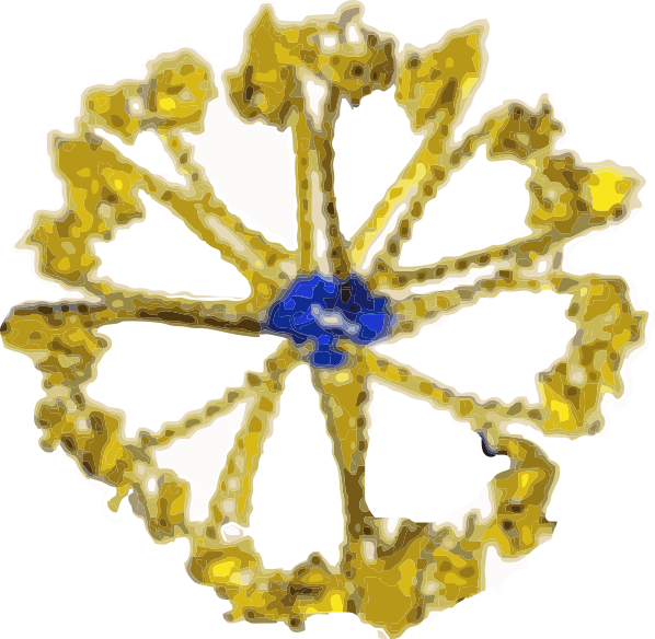
The diagrams which frequent scientific publications on surfactant protein D (SP-D) are countless. I have gathered more than 27 diagrams of the SP-D dodecamer and some multimers (fuzzyballs) to see if there is conscensus in the literature about the angle between the arms of the SP-D trimers (of which there are 4) that comprise these oligomers. I have also gathered many more images of actual micrographs from publications (various methods for TEM) to see how closely the diagrams might approximate what is see in various preparations of isolated SP-D. I will mention one publication (which I have linked before) by Arroyo et al, that measures some of the angles of various multimers of SP-D and reports them in a continuous bar graph by anglular dimension. I have done a similar kind of measurement (measuring the acute and obtuse angles of the dodecamers and less often diagrammed fuzzyballs in chart, and have also measured the dimensions suggested for the center N terminal associations. Sometimes there is no indication of the N terminal associations in diagrams, other times there is an indication, either a straight line, or lumps or circles, and in one (unfortunate diagram) as a square. The N terminal area is typically represented at about 10nm. From the beginning of this assessment, it was obvious that some investigators tried to incorporate some actual structural elements of SP-D into their diagrams, others just copied what had been used before. In almost all cases, the arms (composed the three SP-D molecules) have the carbohydrate recognition domains shown in a (pitiful) oval, mostly oriented at a 90 degree angle opposite of what is seen in actual protein modeling of the CRD. So this is visually confusing, and added to this is the fact that the CRD domains are frequently not accurately sized compared to the whole of the SP-D molecule. The only explanation I can come up with, in light of very nice DRD data in the RCSB PDB, that this is just a matter of the author’s disregard for using correct graphics in scientific illustration. Two diagrams in particular are just way off base (easily found in the collection above).
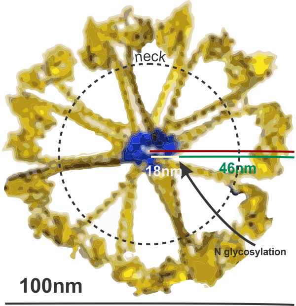
Most of the literature gives the measurement of a dodecamer at about 100nm diameter, and this is the “green” circle in images below. I have placed a red dot over the images where CRD are positioned. In the diagrams above it is obvious, however, in the actual TEMs of prepared SP-D multimers it is not always obvious. But I did this for the sake of continuity between the diagrams and the actual SP-D images (a chart of images will come later). Angles (both acute and obtuse) were calculated using an anglular dimension tool. Each angle in a multimer was measured as well as the center distance designated as the N terminal.
After calculating all values, I removed the values for two diagrams (above bottom row) that just didn’t pay any attention to the real TEMs and made their SP-D diagrams with four 90 degree angles. There was a definite trend in the diagrams (haha… copying the first guy to post a diagram likely) to have acute angles (something close to what was measured by Arroyo et al), and here measured at 45o (their SP-D dodecamer images were prepared in the pH ranges of near 7.4 and 5.5 and had acute angles of something less than 40-50o and a corresponding obtuse angle. The latter for some reason was more variable than the former. The actual measured mean in these diagrams above was in fact 45o which surprised me being so close to what is reported to the real TEMs. Each diagram on its own seemed not very representative of what has been reported, but collectively, if one spends the time to view them all. The significance obtaining measurements of angles between the arms of SP-D oligomers relates to the possibility of using such measurements for the construction of nano-particles with SP-D as components. The most efficacious placement of the CRD needs to be calculated. And while it seems unnecessary task to use diagrams as a beginnig point…. I was hoping to point out the sometimes obvious flaws of careless diagramming, before making a similar chart of actual molecular images.