Monthly Archives: November 2019

Love this list

Geometric values all related to DNA according to wikipedia, and a cute hand drawn diagram.
For each base pair, considered relative to its predecessor, there are the following base pair geometries to consider:

Shear: a force acting in a direction parallel to a surface
Stretch: a one-way stretch
Stagger: an eclipsed conformation is a conformation in which X and Y on adjacent atoms A, B are in closest proximity, implying that torsion angle X–A–B–Y is 0°.
Buckle:
Propeller: rotation of one base with respect to the other in the same base pair.
Opening:
Shift: displacement along an axis in the base-pair plane perpendicular to the first, directed from the minor to the major groove.
Slide: displacement along an axis in the plane of the base pair directed from one strand to the other.
Rise: displacement along the helix axis.
Tilt: rotation around the shift axis.
Roll: rotation around the slide axis.
Twist: rotation around the rise axis.
x-displacement:
y-displacement:
Inclination:
Tip:
Pitch: the height per complete turn of the helix.
I will work on a diagram that is an improvement over the one found on wikipedia.
A review of methods of analyzing TEM, AFM, negative stained images etc.

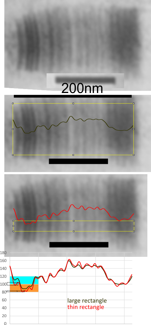
Beginning with this very old early PTA stained image of collagen, I was wondering whether the analysis by this person (Manley, 1969) would still work well using the methods that i have available to me, that is CorelDRAW and ImageJ.

Below is the graph that represents images plotted with large rectangle spanning the height of one of the best stained portions of a micrograph from his publication, using a combination of those two software programs. The tall rectangle and small selected rectangle examine with grayscale LUT plots are virtually identical with the shorter rectangle being a little better and it shows peaks on the plot line that are as fine as 3 grayscale values (1-100 could be restated as 0-255 but is left as 100 here). So the peaks and valleys of almost anything down to one percent change in grayscale is discernable, and can be repeated.

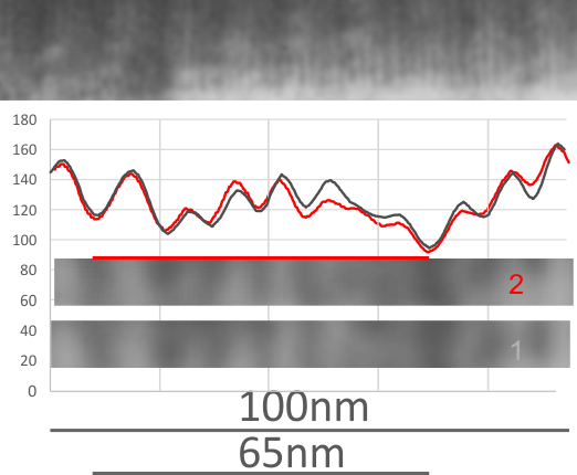
Cropping out two small (same size) areas from the picture at the top of this lower image produced LUT charts also very similar. Bar markers are 65 (Manley said the repeats were between 600A and 700 angstroms I put in a bar marker of 65nm.) The two segments are difficult to equate in terms of grayscale peaks and valleys, though one thing is clear: Even three pixel difference in grayscale will produce a peak.

Utterly disappointing LUT plots of TMV

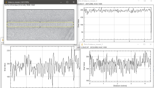
There were some really outstanding images of negatively stained tobacco mosaic virus in this publication. While reading the materials and methods it was like a throw-back ten years to staining grids for TEM.  The disappointing part is not with their images but in my trying to use ImageJ to plot out the very obvious patterning, and the central “hole”, but this did not happen.  Upper left is their TMV image (screen print), and three plots, one central line, lower left, one line at the edge of the structure, upper right, and one rectangular selection, lower right and also shown as the yellow-rectangle in the upper right image,  in ImageJ.

Since the pattern is so obvious, i expected something much more informative in the plots.

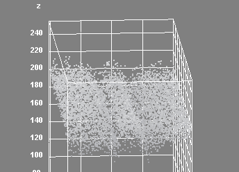
Interactive surface plot in ImageJ shows up center much better.

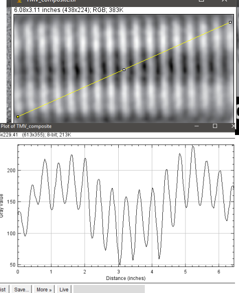
The best plot is perhaps the angle line drawn over their composite TMV image.

“tolerance to breaks”

“tolerance to breaks” — love it, as a wake-me-up phrase regarding changes in the G-X-Y repeats that occur in collagen, and in collagen-like domains in many of the proteins involved in innate immunity (why this post…. SP-D, SP-A, MBP, C1q, conglutinin and dozens of others). Immediately on reading this quote my thought was “tolerance” ha ha, rather wonderful refinements, or adjustments or mutations resulting in more flexibility, which then allows CRD to move more freely. Not tolerance, but utilizing change. Paper with this quote is HERE, and a nice paper in my humble and non-protein scientist opinion, but that phrase just made me smile.

They also state ” The structure suggests a role for Gly–X–Gly interruptions as defining regions of flexibility and molecular recognition in the other wise relatively uniform repeating collagen conformation.” so this might correlate with the bumps and kinks in SP-D collagen-like domain. Further down they state ” The 59-residue triple helix of the host-defense mannose binding lectin (MBL) contain some Gly–Gln–Gly site, 30which is considered to provide the unique kink in the collagen triple helix necessary for the“bouquet of flowers” oligomeric assembly of this protein.”
Just nb, there is no break in the G-x-y group in human SP-D, according to the sequences i have found online.
The repeats (well conserved) of leucine might be fun to examine. MLLFLLSALVLLTQPLGYLEAE

GIRTGIQ

GIRTGIQ – sequence in C1q to which is attributed the “kink” in the collagen like domain of C1q (Pfliegers et al) . They write “The two following interruptions in the Gly-Y-Z triplet repeats are involved in the kink of the collagen-like region,i.e.the insertion of a threonine at position 39 in the A chain and the replacement of a glycine by an alanine at position 36 in the C chain”. Also they suggest three lysines (58,59 and 61in A,B and C chains) along the collagen-like domain are likely where interaction sites with C1r and C1s proteases becoming the C1 complex. Their pictures are wonderful.

IgM pentamer atomic force microscopy image examined

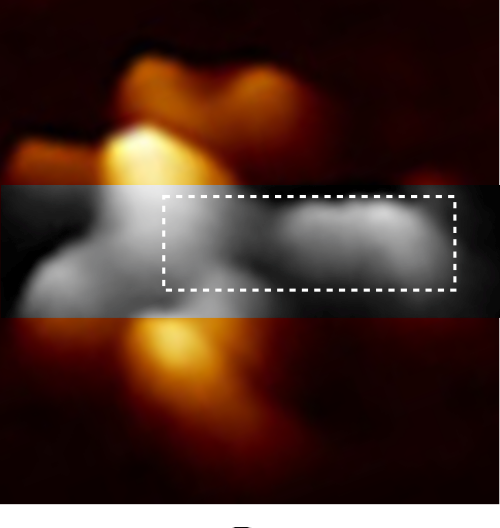
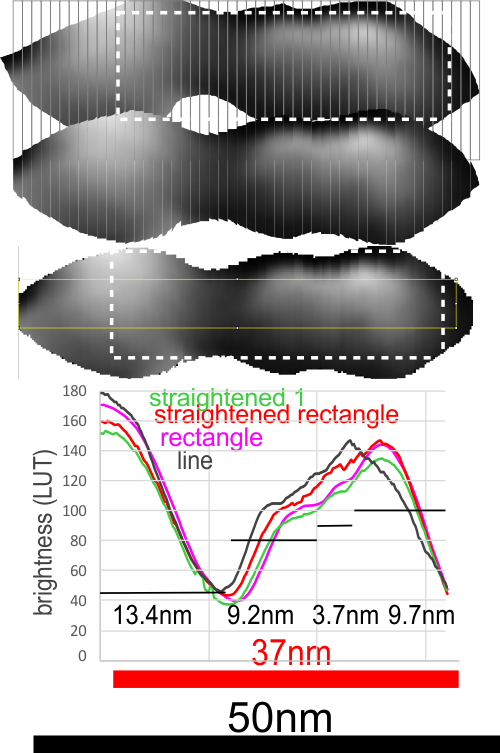
I continue to look for verification that the LUT tables of TEM and FM images can provide information on molecular structure. This TOP ILLUSTRATION is an AFM image (from a paper by Czajkowsky DM, and Shao Z) from which I retrieved one image and examined a single arm (from the center of the Nterminus ???) to the Fab domains. Greyscale image within the original is the area digitized and within that area (within the dotted box is the area that was outline to guide the plots.


Plots definitely show that it makes little difference whether the plots are made with a minimal amount of difference whether the line, rectangle, original or straightened arm was used… the plot just show the Fab segment (right) and the N terminus and a second slope or slow peak which blends into the Fab segment. But they also show three very repeatable peaks in the “arm” part, which when calculated back to the original magnification (black bar) the arm becomes about 37nm long, and half of the central Ntermini becomes about 27nm and the first peak 9.2nm, second 3.7nm and third 9.7nm all of which are easily visible just with the “eye”. Some out there can look at the AA sequences and determine what makes the brightness peaks.

CONCLUSION:
1) it makes precious little difference how the plots are made… whether as line or rectangle, opportunely found arms or straightened arms.
2) that said: I like the shape and smoothness of the plots which have been derived from ImageJ using the rectangle (see yellow lines where the rectangle was in the plots — pink and green plots). Line used, not shown but goes straight through the image.

3. This post is not to investigate IgM but to just try to establish the best way to use AFM images to quantify SP-D.

Verge of a Dream: Make up my Mind About You

After I have a drink
with you, I’ll make up my
mind whether or not
your eyes are blue. Ill
make up my mind about
you. After I get to know
though, it won’t be
someone else to tell
me what might be true, I’ll
make up my mind about you.
You can narrow down your
eye and look at me askance,
Is it you and is it me and will
this be a burn, and not be, romance.
I’ll take the chance and make
up my mind about you.

RLB 11-04-2019