 Forgive – LOL: While working on an image of surfactant protein D plot (from a screen print of an AFM image of a surfactant protein D dodecamer (Arroyo et al’s image) plotted in ImageJ) applying an image processing filter (specifically CorelDRAW’s Photopaint lowpass_100percent_10px setting) to establish peak height and peak width (with the overal purpose of establishing which image processing filters and signal processing algorighms work best for smoothing AFM images without distorting, removing or increasing the number of peaks along a plot line) i noted that this was a particularly pixelated image. While marking the peak height I came up with this very silly word and laughed to myself — “peaxelated” where pixelated images create more peaks. Too silly for more effort. That said, gaussian and median and limit range filters are really nice for this process.
4 tiny brighness peaks before the N termini junction of SP-D dodecamers
It is going to take a lot of convincing to persuade me that these four small peaks don’t exist: each I found in the trimers between the mostl unified peak of the N termini junction and the 4 glycosylation peaks on each of the trimers. It stands to reason that they will not all 4, always show up, in all AFM images, but then little does show up in every image, so thats not going to be a sufficient rebuttal.
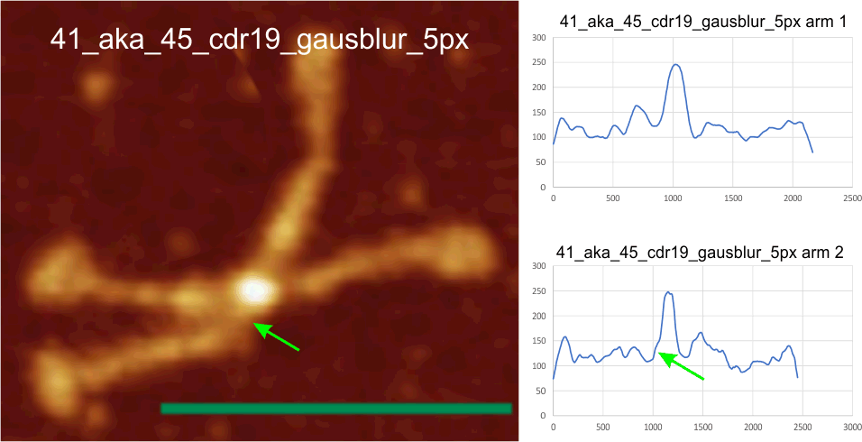
Here is an image from Arroyo et al, (which I call 99a). While three obvious tiny peaks can be seen in this image that has been processed (not signal processed, but image processed), the 4th one is there as a tiny bump on the downslope of the presumed glycosylation peak. Image on left shows tiny peaks pointed to by yellow in what i traced as “arm 1” and the green arrows show the tiny peaks in what I traced as “arm 2”. The image processing filters applied to this image was contrast enhancement in photoshop and limit-range in gwyddion. Relative peak heights in the plots to the right are skewed by the limit-range filter which eliminates all but a narrow range of brightness, but that does accentuate nicely the tiny peaks between the glycosylation peaks and the N termini junction (which on the plots lie above the arrows. Different dodecamers are seen for top-most image and the bottom 4 images. Image proessing does not seem to alter where and when the tiny peaks by N are found.


My style purkinje cell: ‘its a joke
I must have drawn this quick sketch of a purkinje cell decades ago, while cleaning out junk I found it and decided it was artistic enough to be a post. Clearly, I have a fascination with this cell type, remarkable, for sure. I think about my cerebellum when i jog (for exercise), as some of my best ideas spring to mind during that jogging…. thank you to these magnificient cells, and here is my rendition. You can see the tips of the dendrites have a lot of human things going on… hearts, smiley faces, peace signs. I wonder what mood i was in when i sketched it. LOL.


Brightness peaks (LUT peaks) around the N termini junction of a dodecamer of SP-D
For a long time I have wondered if there was any way i could determine whether the four trimers of an SP-D dodecamer could be attached not-end to end, but side to side. The images below show the first attempt to use image and signal processing to determine whether the N termini junction shows any indication of a side to side binding by showing differences in brightness within the broader scope of the N termini junction image as found with AFM. These four plots (directions are crux 1 (shortest side to side of the N termini peak, that is, a line drawn from the widest angle of the dodecamer peak to the other wide angle); crus 2 (long direction of the peak (the narrow angle between the trimeric arms to the opposite side (also the narrow angle), as well as just the center N termini junction peak in each of the two hexamers (arm 1 and arm 2 (the latter two being two trimers each). With just this ONE dodecamer being analyzed so far, this is just a quick view…. but it seems that there are tiny peaks before the rising peak of the N termini in the arms, but not in the crux 1 and 2 measurements (see purple arrows on the images). It also seems that there is no flat place or depression in the plot of crux 1 (side to side from wide angle to wideangle), but there might be indication of a divot in the crux 2 and arm 1 and 2 plots. This might indicate that the N termini junction has characteristics not normally described that might shed light on its structural nature. Images below – top to bottom are, crux 1, crux 2, arm 1, arm 2, covering just what is plotted as the yellow line at the N termini junction.


Square nm for peak areas: one hexamer of SP-D compared using CorelDRAW and Octave
 The very pedestrian calculation of nm sq using a graphics program (which takes a few minutes) versus using Octave autofindpeaks.m is compared. The values (except for a couple) are pretty close. If i use the graphics program cut and pasting i can choose my own vertical lines for counting sq nm, but the data from octave are returned in a nice excel file. The problem is that If i disagree with the count and positions of the peaks then that is disconcerting (eg, the peak i colored green in the octave plot (peak 5) has a nm sq that looks totally out of line. Why would it be 1105 while the peak beside it is only 922. So there is a calculation based on slope and stuff that i dont understand and would like not to use.
In addition, what i have not figured out how to do is to average in a baseline which is a predictable arch, going from CRDs on each end of the plot upwards just slightly to be at its highest under the N termini junction. I can delete grid from that part of the plot in the graphics program quite easily….. but have no clue how to do that in Octave.
I think i am going to step away from the peak area and just count peaks on either side of the N. (which btw, i am predicting a small peak between the N termini junction and the glycosylation peak (in this case peaks 4 and 7 would be the latter, peaks 5 and the peak to the right side of N termini junction that i chose to count.
The double peaks of the CRD are so clearly a result of different positions of the intividual trimer CRD, and so easily predictable as a tall peak before the tiny peak in the adjacent presumed (probably not neck) collagen-like domain that I would not give those individual numbers. Octave wont separate them. Peaks 10 and 11 in Octave should be counted as a single peak.
Purpose: to find reliable ways to use image and signal processing together to suggest structural characteristics for proteins.
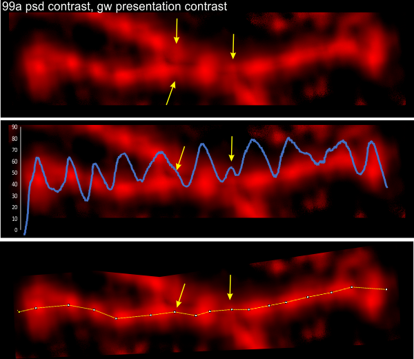
Small peaks in the grayscale plots of SP-D dodecamers: Between N term and the glycosylation site
Small peaks in the grayscale plots of SP-D dodecamers include some that occur between the N term juncture and the glycosylation site. They happen with regularity. I have not counted the number of times they show up the grayscale plots, but this dodecamer has three, and they are prominent, easily seen after image processing. See arrows pointing to three small peaks. (likely a fourth exists, but did not show up here as a random artifact). This dodecamer has been image processed (but not signal processed) and the molecule number is in the left corner of the top image, i.e. 99a. The tiny peak shows up three times out of four, but is missing from the other hexamer where there is only one peak. Just as an aside, the CRD (carbohydrate recognition domains) are nicely shown with this image processing protocol, sometimes all three CRD can be seen. Also of note, the N terminus does not look like it has any valleys in the center.
 I continue to thank Arroyo et al for the AFM images which I have processed the …. out of.
Looking for peaks along the arms of an SP-D dodecamer
Here is a high contrast approach to image processing an AFM image of surfactant protein D (number 97 in this series). The processing is shown at the top of the image and it entailed altering contrast in both photoshop and gwyddion. The plot actually is less informative than limiting the range (gwyddion) and applying the gaussian blur filter. The increased contrast takes the N termini junction off the scale in brighness (255) and reduces the opportunity to compare peaks sizes (particularly with the adjacent glycosylation (alleged) peak which can vary. Comparison with previous posts on this blog shows different image processing, also concurrent signal processing and resulting LUT plots of the same SP-D molecule.
 The advantage is however, a great visualization of the number of bright spots alone each of these arms of a dodecamer, clearly suggesting that there are regular structural elements. Per two previous posts… it looks like a hexamer (one line from carbohydrate recognition domain (the ends) to the other has a consistently visible more than 15 peaks. Typically two peaks in the carbohydrate recognition domains, often two peaks in the glycosylation area (which might represent a level of glycosylation from 1, 2 to 3, one spot for each molecule of the trimer) and the stepwise peaks from the glycosylation site towards the neck region.
I dont really “like” this level of image processing (there has been no signal processing here), but it is informative. It is easy to see peaks and compare them with underlying bright areas along the arms. Graphic made in CorelDRAW.
abbreviations: AFM – atomic force microscopy; LUT – look up tables (grayscale plots from ImageJ); gw – gwyddion software for AFM; photoshop – in this case, photoshop 6; CRD – carbohydrate domain;
Best English Jokes I have seen: haha kudo’s to the authors
Best English Jokes I have seen: haha kudo’s to the author. here is a link to his/her/their wit. Click to download the pdf.
English
Visual aid: image processing without, or in addition, to signal processing grayscale plots
The graphics below are visual aids that I prepared for myself, just to help me visualize the value of image processing -with and without- subsequent signal processing of the grayscale (LUT) plots for peak detection. The goal is to determine what signal processing of plots offers in terms of determining structure within the images (molecules).
The graphic to the left: A crop of the same image, saved from three different published figures, is from a set of about 100 images of surfactant protein D (SP-D) I have used in all the previous posts about SP-D. This particular trimer a SP-D  dodecamer I named 97, and it has been shown elsewhere on this blog, on numerous occasions, and individuals have been credited for it in previous posts.
Summary of the image to the left: Three screen shots were made of one dodecamer (this is just a portion of that image), from published articles, each of a different resolution (i.e. digital resolution). One can see the gradation of pixelation of these cropped images (just the carbohydrate recognition domain of a trimer) best resolution at the top, worst at the bottom. The three images were resampled to 8in wide, 300ppi, bit depth 32, but the graphic to the left shows that the original pixellation is present in each even after resampling. The least pixelated image is 97-1, then 97-2, and particularly 97-3, is pixelated. These same three images were then image-processed using two filters, both applied in Gwyddion and exported as tif files. The filters were, 97-1 – gaussian blur 5px, limit range 130-255; 97-2 gaussian blur 10px, limit range 130-255; and 97-3 gaussian blur 15px, limit range 130-255. Greater degrees of gaussian blur were used to reduce the pixellation in the images 97-2 and 97-3. The resulting images were plotting using a 1px segmented line through the center of the trimer in ImageJ to determine brightness (grayscale, 0-255) and plots were exported to excel.
In addition, using ImageJ, a duplicate of each of the three processed images was also resampled, one set at 5000px and the other set at 50px. The benefit from a second resampling to 5000px wide can be seen in the graphic below, but the 50px images were basically useless, but amazingly, some signal processing programs could find peaks in the appropriate places.
As a summary of image-processing, sets of the three images (97-1, 2 and 3) were treated as follows: 1) the originals were resampled at 300ppi; 2) resampled images were subjected to gaussian blur – limit range filters, 3) duplicates of the second set were resampled in ImageJ, at a5000px or at 50px to become the third and fourth sets. The plot below reflects the mode of the peaks found in each plot, that is, a count of the number of peaks derived from each image as it is subjected to various signal processing algorithms. Overall, something between 8 and 10 peaks are present in plots of most most images, whether processed just with image processing, or both image and signal processing algorithms.
The most pleasing data come from the column (far right), and surprisingly it was from 97-3 the most pixelated original image, which was compensated for by a 15px gaussian blur. It may however be an undercount of the actual number of peaks along a trimer of SP-D. Very likely the mode, which is 9 peaks is most reflective of this trimer, and others I have seen.
 The ImageJ plots were subjected to 29 different algorithms to determine peak number per trimer. That list is in a post HERE and listed again at the bottom of this blog. Excel was used to create a graphic with the number of peaks found in the 299 resulting plots. It has been color coded according to the number of peaks that each signal processing program produced for each of the 3 images and their 3 variations (remember the 50px set was discarded). Color coding: blues and greens represent the smaller number of peaks along a trimer, and reds and browns represent the higher number (sometimes “off the charts” depending on the settings on the Octave and xlsx template functions) of peaks that the algorithms produced. It doesnt take much looking to see that the greatest gaussian blur and 5000px resampling make for the best signal processed peak results (columns 2, 6,7 and 8,9 regardless of algorithms used for signal processing (bottom image). On the vertical legend on the right, bold numbers are counts of peak with numbers corresponding to the most right row, e.g. 2 image-signal processed plots came up with 2 peaks, etc, or you can count them yourself. My subjective counts, pink columns most left, lag threshold influence settings 8 tan collumns, ImageJ find peaks, brown columns, light blue, PeakValleyDetection xlsx, PeakDetection xlsx medium blue, darker blue was Octave, findpeaksplot.m, and most 2 right columns, Octave AutoFindPeaksPlot.m. values for the two Octave .m sets are listed in below, as are settings for the xlsx peak finding templates. LTI settings given as well.

list of image/signal processing. beginning with top left on graph above, list of all the signal processing used on the 10 images. RED indicates which ones I thought were best.
my count of peak number from the image
my count of peak number from ImageJ plot
LagThresholdInfluence 1, 0.5 0.025
LagThresholdInfluence 1, 0.7 0.05
LagThresholdInfluence 1, 0.1 0.01
LagThresholdInfluence 5 0.5 0.5
LagThresholdInfluence 5 0.5 0.05
LagThresholdInfluence 10, 0.1 1
LagThresholdInfluence 10 0.5 0.5
LagThresholdInfluence 10 0.5 1
ImageJ find maxima 0.5
ImageJ find maxima 1
ImageJ find maxima 2
PeakValleyDetection xlsx smooth width 1
PeakValleyDetection xlsx smooth width 3
PeakValleyDetection xlsx smooth width 5
PeakValleyDetection xlsx smooth width 7
PeakValleyDetection xlsx smooth width 9
PeakValleyDetection xlsx smooth width 11
PeakDetection xlsx amp t 0.6 slope t 2.5- M6=-4,N6=-3
PeakDetection xlsx amp t 1 slope t 1 -M6=-3,N6=-4:
PeakDetection xlsx amp t 0.6 slope t 2.5 -M6=-3,N6=-4
findpeaksplot x,y,0.0001,80,9,16,3
findpeaksplot x,y,0.0003,0,11,21,4
findpeaksplot x,y,0.0008,40,9,16,3
findpeaksplot x,y,0.0003,0,11,35,4
findpeaksplot x,y,0.005,5,7,7,3
autofindpeaksplot.m x,y,0.00041228,63.5713,16,16,3
autofindpeaksplot.m x,y,0.00039524,74.8105,17,17,3
Using just the results for the algorithms above in “red”
9 peaks in a trimer of SP-D (n-1 trimer…LOL) but it is a start.
N 11
Sum 99
Mean 9+/-1.3
Var 1.8
Amerithon Challenge: 998.1 miles left
Amerithon Challenge: 998.1 miles left. Yippie.
