Monthly Archives: July 2020

Pretty amazing result from 2D CWT using Gwyddion

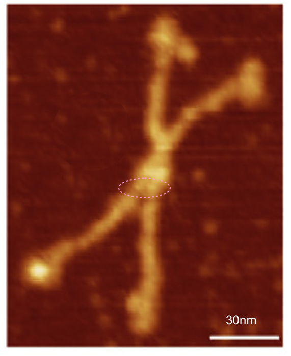
In trying to find the actual magnification for some early publications using negative staining and rotary shadowing to delineate the structure of surfactant protein D and also a closely-resembling member of the C type lectin group I ran into some images of bovine conglutinin (Strang et al, in the mid 1980s) that had images which were highly pixelated probably from the type of printing used in that era.  I did a screen print of one of the negatively stained images (screen print of original here) and opened it in photoshop to play with different filters to reduce the noise.  Gaussian blur and smart blur in photoshop did provide some improvement in the image but I decided to see what Gwyddion could do with the image in terms of processing out the noise.

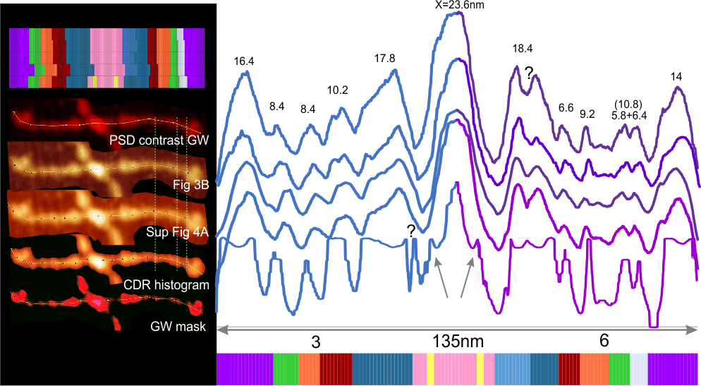
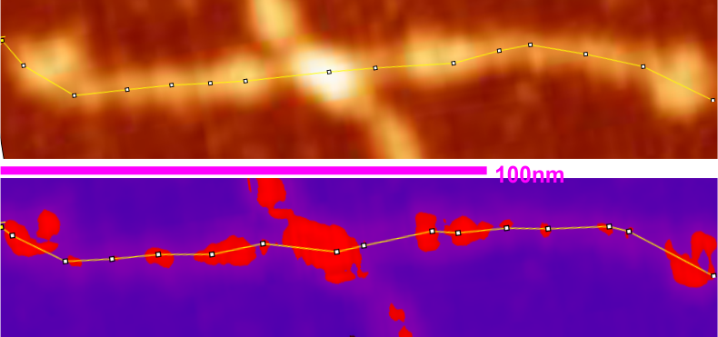
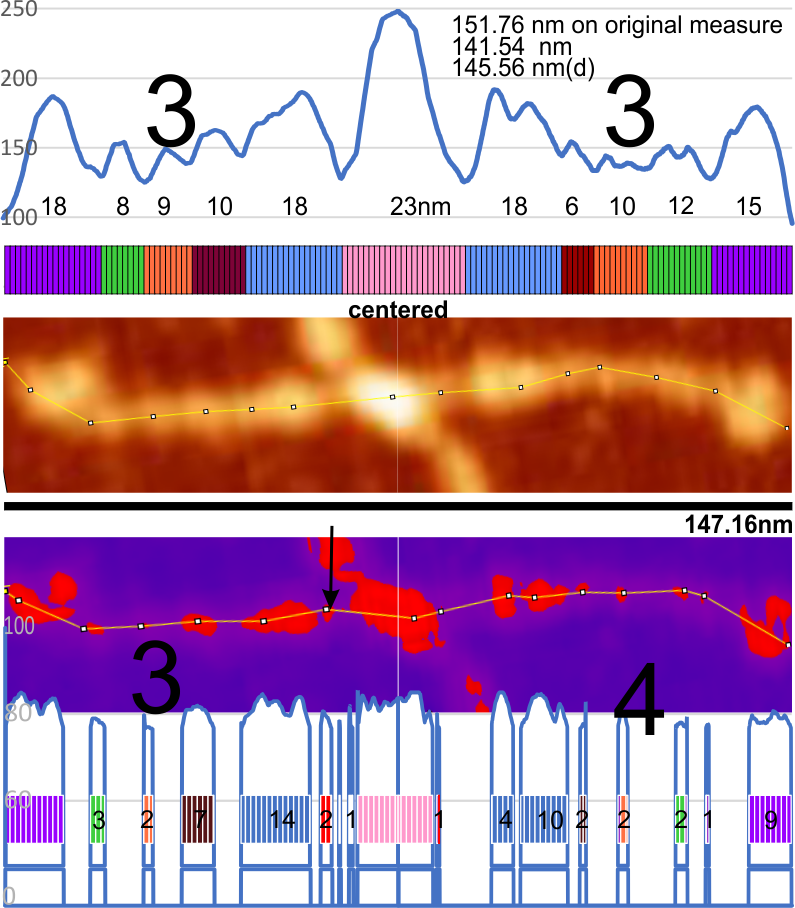
Much to my surprise, a marvelous image emerged after applying “integral transform> 2D CWT with 10px gaussian blur.  The imported image in gwyddion, and the transform are shown here.  Upper right, screen print (on the computer keyboard) of a screen-printed (the technique for printing – likely and less expensive than offset printing) from the original article. (the pixels are not from the screen print of the image, as i did it at full screen capacity, they are from the screen used in the printing process).  The image is poor quality at best. Image to the right of that is opened in Gwyddion as RGB, and image below on the left is a 2Dcontinuous wavelet transform of the image above, with gaussian blur set at 10px.  The image on the bottom right is smart blur performed in photoshop.  Each of these has had ImageJ used to mark a line through the molecule (by chance this bovine conglutinin molecule had just one arm that could be marked with a segmented line), and beside it is the plot generated in ImageJ.  There is a tremendous difference in the information obtained from the 2D CWT processed image.  Plots show the Ntermini junction, the CRD at either end and several plots along the collagen-like domain, so similar, yet so different from surfactant protein D.  A great comparison.  Nothing short of amazing.

Measuring the size of SP-D

One of the early publications about surfactant protein D (Ed Crouch, et al, circa 1994) that had wonderful pictures of this particular protein did not, however, have the best descriptions of measurements and this causes problems in comparing those images (results) with current measurements. All this in an attempt to help define the molecular modeling of the collagen-like domain of SP-D.  The techniques were inventive for the time (lettraset grayscale screens — I used lettraset rub on letters for many publications from that era). Photoshop would be used today of course with comments in the materials and methods stating such.

The description of arm measurement goes like this “..tip of the globule on one arm to the tip of the globule on the apposing arm”. Notice the word apposing…. which might really need to be opposing?  The apposing arm of an SP-D dodecamer would be a line drawn down an arm from the CRD with an acute angle coming at the N termini junction, and a line drawn back up the “same side of the molecule” arm.  This would make a V shape, and a sharp angle in what has to be arbitrarily chosen as the center of the N termini junction.  My guess is they did not measure that way, but went across the N termini to the opposing (not apposing) arm.

I have to assume that their measurements went “straight” across, and did not curve to accommodate the increase in arm length that adding that few nm of distance would provide, but again, it is not clear.

There is no really accurate way (not that bar micron markers are accurate for they notoriously are not) to remeasure the dodecamer arm lengths, either as individual trimers or as hexamers.

One approach, howver, might be to compare arm lengths they measured against their measurements for the diameters of the CRD themselves.

Just for fun image of SP-D

This is definitely fake news, and while highly processed from an image by Arroyo et al, for surfactant protein D dodecamer, it still has lots to say about the structure of the protein. This was image processed in Gwyddion, exported, opened in Photoshop, cut and feathered, exported to CorelDRAW where it was rotated as 6 dodecamers. The background was a “canned” texture made with contrasting colors, converted to bitmap, vectorized and outline added.  OK, its artsie…. but then what microscopist doesn’t do art.  None that I know.

Great example of dodecamer with two new tiny peaks

Arroyo, fig 2C second column most left dodecamer.  Two really bright tiny peaks presumably between the N termini and the first large LUT peak (which they call glycosylation site).  Nice bright and in the exact same spot as they have been seen for other AFM images. In this case I marked the two bright spots with a dotted circle.

Be aware however that it does show up as brighter LUT peaks perhaps because they lie on the same plane as one line of the background vibration noise. I wish i could find someone who could write an algorithm specifically for dampening the brightness along those parallel lines.  I could do it in photoshop manually.

5 plots compared: image processed SP-D

Using images of an SP-D dodecamer from a published paper and its supplement (Arroyo et al), and using various methods of masks, histograms and contrasts, and the same hexamer of that dodecamer plotted (with actual segmented line of the plot seen in images below) in ImageJ, the results show that while smoothness of the plots, and heights of the peaks are different with each image processing method, the results are pretty much the same, with one exception.

There are easily documented LUT peaks (three of them) between the N termini junction and the individual CRD of each of the trimers (view left hand side of the plots and images), and there is a very small peak (which i have mentioned in some recent posts) that is on the down slope of the N termini junction peak (see the mask-image performed in Gwyddion) which shows one on each side (bottom plot, image and color representation of the nm width of each peak).

The right hand trimer of this particular dodecamer which is plotted on the right side, show additional and what are likely background vibration peaks… which impacts the number of LUT peaks (adding three variable peaks). A LUT plot of the background of the second image from the top shows a periodic background peak of about 7.2nm in the original image,  appearing at a slight angle in the cropped and rotated arm images, but none-the-less visible.

Because the background vibrations that appear in these images are random with respect to the direction of the arms of the dodecamer as they fall onto the mica… using both arms for LUT plots, and many variations in image processing, as well as many images, the background peaks will eventually become less relevant.

WSxM might be good for analyzing files directly from AFM?

WSxM might be good for analyzing files directly from AFM? but it does not seem to work well with files that are of more common formats (png tif jpg) or even those exported from Gwyddion in formats that should hopefully have been openable in WSxM (.spm and .stp).  While it is freeware for analyzing scanning probe images it seems to require that the images be sourced from equipment, not random image files gathered from various sources (as i have done while assessing SP-D).  In terms of ease of use, I personally would rate it – not fun and while the screen print below shows that in fact at one point i was able to import an image (exported via gwyddion as an ascii file) there was no benefit that I could find in using this software for the purpose of plotting peaks and valleys along the SP-D arms.  In all fairness, I did not use it according to its purpose was thought it was worth the effort to investigate it since Arroyo et al used it for their plots of AFM images. Image on the left is from Arroyo et al ( a tiff) imported into gwyddion, exported as ascii from gwyddion.  You can see that the one time i was able to open it in WSxM there was virtually no way to see processing the image as a benefit to those programs already in use.

With all due respect to the developers, it was my mistake to try to use this program and my pic for image processing remains the two versions of CorelDRAW (x5 and 19) and ImageJ.

Gwyddion 20-90 mask vs no mask for measuring SP-D peaks

The same well used image from arroyo et al was opened in gwyddion and to the image a 20 minimum 90 maximum mask was applied (red portions inside a purple mask). image was saved then and opened in ImageJ and plot line for the original and the masked images on one and the same arm of a SP-D dodecamer.

(I tried to find black mask but was unable to do so, thus the purple portions of the plots underlying the mask are changed to 0 – which introduces some selection bias). This particular setting gave what i thought was the best representation of the high luminance peaks along the arm of the original AFM (top).  It did remove some of the background vibrations from the peaks, but and identified most of them along the arm. What is interesting is that the very small “new” peak found between the N termini junction and the alleged glycosylation site (the proximate and typically the “highest” peak along the collagen like domain) where the original scan did not (black arrow on the purple and red masked image).

Bottom line: I guess both methods need to be used as they show differing results. 15nm for the N termini peak in the lower image got lost somewhere.  Compare with 23nm for the original LUT plot. Large black numbers identify number of prominent peaks along the collagen-like-domain in the original and the masked image.

The measured size of the dodecamer remained very close, regardless of the application of the mask, but slightly smaller due to the loss of shading in the AFM image. The clearest difference from the original AFM and the masked portion is the difference in the peak widths.

I am leaning toward the simplest and quickest evaluation of these peaks…. and straight from the original, with a little HSL adjustment in CorelDRAW will be the best and least variable way to see peaks.

COMMENT: i wonder how many times this will be searched currently for the words MASK and peak totally unrelated to anything about the coronavirus and now having typed in the latter it will be a given.