Monthly Archives: February 2022

Comparing peak height and peak width for a single hexamer of surfactant protein D

Comparing peak height and peak width for a single hexamer of surfactant protein D has lead me to the conclusion that:

1. many methods (image and signal processing) can be used that produce very similar results
2. many methods (image and signal processing) can produce rediculous results
3. concensus may or not provide the best results

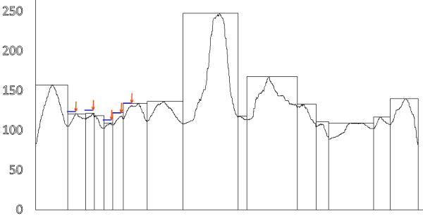
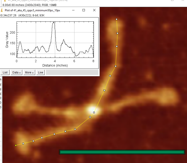
I have examined this particular AFM image of SP-D (which i call 41_aka_45 (an image of am SP-D dodecamer from a publication by Arryoy et al) — the name is given here so it is possible to relate this post with many previous posts on this image)for hours, literally, using more than half a dozen image processing programs and dozens of image processing filters, as well as signal processing using two excel templates for finding plot peaks (by Tom O’Haver) and peak finding functions which use Octave. The purpose is to find the best (and easiest) method(s) for determining peak number, peak width, peak heights of grayscale plots (made using ImageJ) of this type of image and similar images. I was really pleasantly surprised when Aaron Miller added a function in one of the excel templates that displayed the valley points in the excel plot. This provided a second plot which, when exported as a metafile, could be used to quickly define peak widths as vertical lines. While not using peak slope to calculate peak width in a more sophisticated way, it does allow for easy comparison of peak number, width and height obtained as signal processing, with those parameters obtained with image processing and plotting in ImageJ.
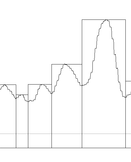
Below are two plots, top identifies peak valleys (peak width) and height (on an image that had been filtered with a 5px gaussian blur, but no signal processing), and the lower plot was defined using signal processing on the same image, in this case the PeakAndValleyTemplate for excel (by Tom O’haver) with a smoothing factor of 11 or 9 – i need to check.

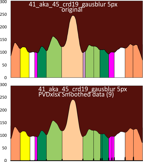
crd= corelDRAW 19; gausblur 5px-gaussian blur 5px; PVDxlsx (PVDxlsx=PeakAndValleyTemplate  for excel); (compare colors and widths in the two plots: dark orange outer peaks=CRD, yellow= possible neck domain, white, pink and darker green represent as yet undefined domains likely in the collagen-like dolmain, the light green the named glycosylation site (glycosylation appears to cause a lumpiness (perhaps relating to glycosylation of 1 – 3 molecules in the trimer) a small peak (purple) just before the N termini junction(light peach color), with the latter often divided at the center with a valley).

Most conservative estimate for number of brightness (LUT) peaks along an arm of a dodecamer of SP-D

Most conservative estimate for number of brightness (LUT) peaks along an arm of a dodecamer of SP-D is shown in this plot, with color coding from CRD (orange) inward to the Ntermini junction (peach). The recognized peak (glycosylation site(s) are light green. Other peaks are not generally know but consistently divide out into height and width (nm) as shown here, cascading downward in height but varying in width from center (N) to CRD). In most plots the CRD are composed of two, even more, peaks as the CRD fall into irregular places during processing. In this plot however, they show up as one. My impression gained by using less “blur” and more edge detection is that the consistent number of peaks is more like 15, with tiny peaks beside the Nterm central peak. This will, I hope, show up in analysis of all the different processing filters, and with more than a single molecule, as shown here (this is SP-D dodecamer 41 aka 45 (named by me, from publication of Arroyo et al), seen many times before on this blog).

Each peak width and height has been measured, hopefully a summary of all different image and signal processing will confirm this pattern.

My hope is also that somehthing specific about the degree of glycosylation (light green peaks) can be determined, as seen here with different peak heights for that area. It is also clear that the peak area that has been shown to be glycosylated is rarely a single rounded peak, but more often multiple peaks within a general peak. This is vaguely demonstrated on the light green peak shown on the right hand side of the plot. Differences in the length of each trimer of this hexamer are most likely due to how the molecule was spread during preparation. This can be partly overcome by adjusting the trimer plots to the same widths.
minimum of 13 peaks along one hexameric arm of an SP-D dodecamer

Verge of a Dream: Vinca

The vinca, un-bloomed, ready for
Its’ planting, cupped in the hand.
Knees bent to the ground, the same
from which the roots will sift for
food. The white, as your skin
would be had not the sun saw fit
to freckle and darken it. There is
no reminding me of you in the red,
no rouge from the finger, so few
adornments you choose. The name
of the color, lilac, not violet, paired
with lace beneath the neck, will
be this summer’s dress.

RLB 02/09/2022

Peak drag

Just looking at some grayscale peaks in a plot of a surfactant protein D dodecamer and noticed that one hexamer, plotted in ImageJ, of this molecule (AFM, 41 aka 45 – sorry for that id i have given this dodecamer) with a CorelDRAWx5 photopaint program and a 50 percent-10px minimum filter shows a drag on the peaks which I dont think i have noticed before. These occur on one trimer (left side, minimally on the first peak with the red arrow, then on the next four peaks more prominently) of the hexamer plotted (see actual dodecamer – bottom image) of this dodecamer, but not on the second trimer (right side of the plot).

It looks like a “nice” demonstration of a drag artifact.  A displacement from left to right seen on the LEFT half of this plot (horizontal trimer), but not the right side of the plot (vertical trimer).

Original image used to make this plot is below. It is interesting that the drag did not appear on the trimer which is more vertically oriented, i.e. the right hand trimer (closer inspection of the image also shows a smearing of that trimer which till now I had not paid any attention too, but it certainly translated into a change in the plot). bar=100nm

Peaxilated

Forgive – LOL:  While working on an image of surfactant protein D plot (from a screen print of an AFM image of a surfactant protein D dodecamer (Arroyo et al’s image) plotted in ImageJ) applying an image processing filter (specifically CorelDRAW’s Photopaint lowpass_100percent_10px setting) to establish peak height and peak width (with the overal purpose of establishing which image processing filters and signal processing algorighms work best for smoothing AFM images without distorting, removing or increasing the number of peaks along a plot line) i noted that this was a particularly pixelated image.  While marking the peak height I came up with this very silly word and laughed to myself —   “peaxelated” where pixelated images create more peaks. Too silly for more effort. That said, gaussian and median and limit range filters are really nice for this process.