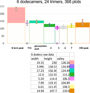
EDIT: the plot shown below is what I think describes the data. It has the mean peak height, peak width and peak valley from 6 molecules. No smoothing or blur or anything else, just the numbers. It might be as useful as anything that some algorithm can invent. Peak width is x, mean for the six molecules (the number of peaks per trimer and hexamer was determined by signal and image processing data early on) (15) and per trimer ( 8) respectively.
Number of peaks from each program depended upon various parameters, lag, threshold, influence, smoothing, and many I dont understand, but the separation of the signal and image processing graphs into the 8 peaks (color coded) was was performed by me, which, in my humble opinion, is just as good, if not more “learned” than any AI app.
The separation of each hexamer (or trimer) into peaks is reasonably consistent in terms of peak width, height and valleys. THus I have means for all tracings, means for individual molecules, plus SD for widths, heights, and valleys, all of which can be given in table form shown below.
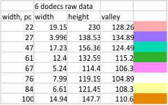
Means of all plots, and individual trimers dodecamers can be shown in the style of graph below, with SD of each parameter. The top image here is just a quick graphic of what that kind of plot would look like, and are close to the actual numbers below but not exact, as this is a draft. Peak width is in nm, peak height and valley are in grayscale 0-255.
Anyway, it is the format that I will use for collecting data on the remainder of the SP-D molecules.
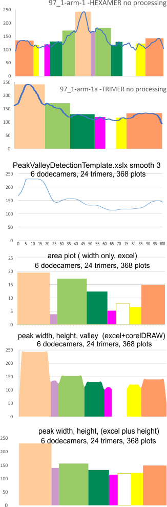
Other options that I worked with for plots are below –
I have extensively looked for peak width, valley, height plot apps and cannot find one that works for me…this doesn’t mean they dont exist, but i have not made the effort to get on the chats in scipy and octave to find them. The basic set of numbers is super simple, there is the possibility that i have not collected them in a way that is useful for making automatic plots. They are perfectly useful for constructing a plot using a graphics program however.
Height and valley values are in grayscale (0-255), width (has variable measures (pixels, inches, cm and is not consistent) is changed to percent (left column).
Basic numbers for the width, peak height, and peak valley (data from the valley closest to the N term side) are here. Help is certainly welcome. Data below was accumulated from image and signal processing one hundreds of plots of the AFM images of surfactant protein D. Previously it was determined that the mean number of peaks per hexamer was 15, that means in counting the trimer peaks, the N center peak gets counted once for each trimer, but also, only once per hexamer, thus the number of peaks per bilaterally symmetrical hexamer which is comprised of two trimers (but the N term blends into a single very bright peak) is an odd number.
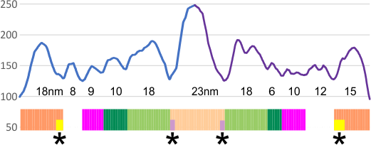
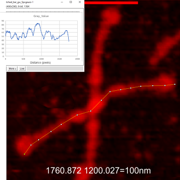
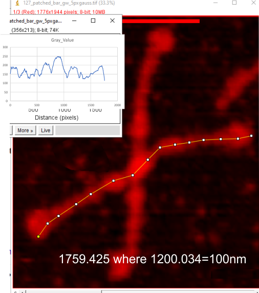
Example of a real plot of a SP-D molecule as a hexamer is top… below that is the same plot trimmed keeping the N term peak (light orange) as a whole, not dividing it into have – part for each trimer.
Rhe trimer plots below assembeled in various ways with various problems and various programs (but mainly excel and corelDRAW). From top to bottom, beginning with the pinkish peach color N term composite peak (peak1); tiny peak, purple (peak 2);blue-green, glycosylation peak (peak 3); darker green, peak 4; narrow peak 5, pink; unknown peaks, white, coiled coil neck domain yellow, seen intermittently, and not seen when it is likely to be behind the yellow, and last peak equals CRD peak.
 I dont think this is rocket science, i just need to find the right program and certainly the data are consistent with the numbers in each case, just not “pretty plots”. In the case of Peak Valley Detection Template xslx, there was no value between 1 and the next highest smoothing function (3) that would do a better job of keeping the peaks but smoothing the corners. So this is a “taste” thing, not important.
 So the issue becomes how better to collect the data.
Here is a cute thing — actually not so funny… the summary plot .csv file plugged into octave, I was hoping to smooth the plot, and here i find that the corners of the line plot count as extra peaks…. Clearly, this plot has 8 peaks… not 12, and it didn’t bother counting the “tiny peak” (purple in above plots) or peak 5 (pink in above plots).
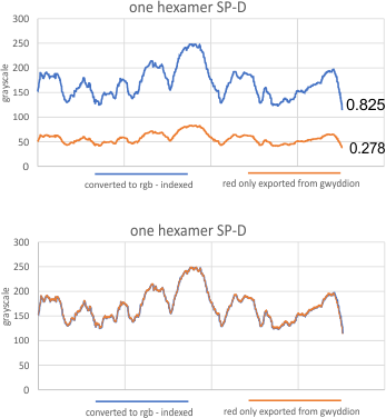
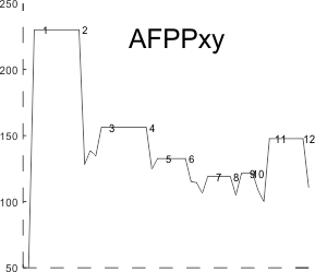 I found a link to an online converter of svg to matrix called Coordinator. I put in an actual plot (see top image below) and used this open source app to create a plot. It was not exactly what I had thought (smilie face below)– as i had been thinking for a couple years that I would really like to use the graphics flexibility of corelDRAW on the excel plots, then convert the vector graphics back into a matrix…. didnt work that well the first time…???
 Just for comparison with the plots of this same molecule, several years ago before signal processing was in the picture, here are the number of peaks per hexamer (11), and the additional 4 peaks, not present 100, or even 60% of the time, are four peaks (two pairs) which show up consistently enough to be considered something to work out.