Not all illustrations make it to the journal covers. Going back half a dozen years I found this illustration (requested by Aziz Sankar) about biological clocks, UV exposure and cancer. My illustration did not make it onto the cover of proposed journal (at this point I cannot even remember which journal it was submitted to) but when I saw it i thought… what a cute attempt. So here it is anyway.
This was a failed cover submission, but I found it in my Journal Cover Art folder and thought I liked it better now than I did in 2015. Oh well. Sometimes the “old boy” thing gets the cover — to be expected.
I have looked at literally dozens of diagrams of SP-A and they just are repeats of the initial diagrams put out by the labs that investigated surfactant proteins early on. I am assuming the earliest came from this institution, Whitsett’s lab, but I am not going to spend the time to check. Owing to the basic premise, certainly not unique to anyone in this institution alone, that the diagrams don’t matter as much as the science… i think that the dimensionality of the SP-A bouquet has been lost, most likely due to the lack of care in the production of the “diagrams” which accompany papers. In fact the angle of the neck – CRD portion of the bouquet trimers has two configurations, open and closed, according to some researchers. I will post the mean+/-SEM of the angles typically used in diagrams, vs what is actually measured in transmission electron micrographs.
Just a word to those preparing scientific illustrations – one does a huge disservice to perpetrate erroneous diagrams.
While on the topic of diagrams, why on earth do people keep representing the CRD of SP-A and SP-D as ovals, arranged like little tulips. THis is just lazy. The CRD of both proteins have been so well worked out that from a protein database one can actually provide the entire structure (that is the neck and the CRD) and it looks absolutely nothing like the typical tulip. See a couple tulips below. They are just not representative of actual molecules.
I am trying to write a comment page about innate immunity proteins and the possibility of nano-superballs being used to configure and distribute such immune proteins (which, by the way is a logical next step in that research since at least two of the C-type lectins that are important for innate immunity actually do have fuzzyball multimer structures. Those would be SP-D and SP-A. When I saw this cute dimer of surfactant protein D I just laughed to myself, such a happy dancer. This particular image of a surfactant protein D dimer came from a portion of an AFM image published by Arroyo et al, JMB, 430:1495-1509, 2018. Thanks to them for the laugh, and the inspiration to keep up the exercise program for the sake of good health. This guy (girl) is just about to cross the half-marathon finish line.
What is interesting is the light and airy feeling, arms outstretched, legs in the air and the perfectly positioned ball (likely a loose CRD, ha ha) for a head.
I have scoured the literature to find any images, and even diagrams, of rat native and recombinant surfactant protein D, hereafter called SP-D. There are some very nice images (perhaps the best) by Crouch et al, published in JBC, (also using recombinant SP-D) which I have cut and pasted into this video, counting all the trimeric arms with “attached” carbohydrate recognition domains. Crouch et al indicated that about 5% of the structures are multi-assemblies, that is something around 12 arms? or more is what they show. Actually two authors have commented on the fuzzyball rarity in shadowed images for microscopy. Other images came from google searches for SP-D diagrams, and many of these are from McCormack, and from others in the lab here at Cincinnati’s Childrens Hospital.
The three dimensional structure (multimers) of SP-A and SP-D have been shown to be important for function. Vieira et al 2017“In conjunction, these data demonstrate the critical role of oligomeric and tridimensional structure of surfactant protein A and surfactant protein D for proper function.” and also say “SP-A and D can target pathogens by simple aggregation, without a direct interaction with the cell. Similar to complement C1q, SP- A can function as an “activation-ligand” which facilitates particle uptake once it is coated by Immunoglobulin G”
SP-A and SP-D have distinct functions though both are quite easily given the “title” of multivalent innate immune proteins. What is interesting is that under some circumstances and not others, they may adopt a more spherical and highly oligomerized state, or they may remain trimers, hexadecamers, dodecamers and in lower oligomerization states. For some reason the bouquet for SP-A as an 18-mer is most frequently cited in the literature when in fact the electron microscopy might show full fuzzyballs of SP-A, and other forms (periodicity in flat sheets, under other circumstances. In the same micrographs of type II alveolar cells, SP-D fuzzyballs really havn’t been encountered, but in vitro SP-D makes great fuzzyballs.
https://thankuscience.com/wp-content/uploads/2018/09/SP-D.avi (cut and paste) SP-D .avi link
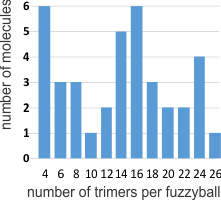
I was curious whether there was a pattern to the number of trimers in any given fuzzyball and for SP-D there were numerous articles which actually had pictures of oligomers. The number of arms (trimers) for each fuzzyball of SP-D, randomly encountered in publications (not to be confused with randomly photographed under the microscope… as i am quite sure there was selection bias in photographing these) is shown on x axis of this quick summary graph. Incidence is on the Y axis. I could have counted more (and may do that) in some images where there was indication that perhaps there were arms and CRDs that had been displaced during collapse of the fuzzyball onto the grid. Image below is taken from Crouch et al mentioned above and used without permission.
Here is a short videoclip of SP-D fuzzyballs — you can see where I have counted the carbohydrate recognition domains, as I overlayed them on the existing micrograph with red dots. There are places where I might add or subtract one now and then from what is pictured, but in general you can see that top number is something around 26 arms (each a trimeric molecule) in some fuzzyballs. I think more than 32 (a multiple of 4 is likely) arms in any given fuzzyball is going to be pretty uncommon. It is very apparent in some that groups of 4 arms persist. While the orientation of SP-D arms is probably end to end in those groups of 4, I am thinking that SP-A fuzzyballs are going to be four groups of 18-mers. Whether such is found in the literature I will soon find out.
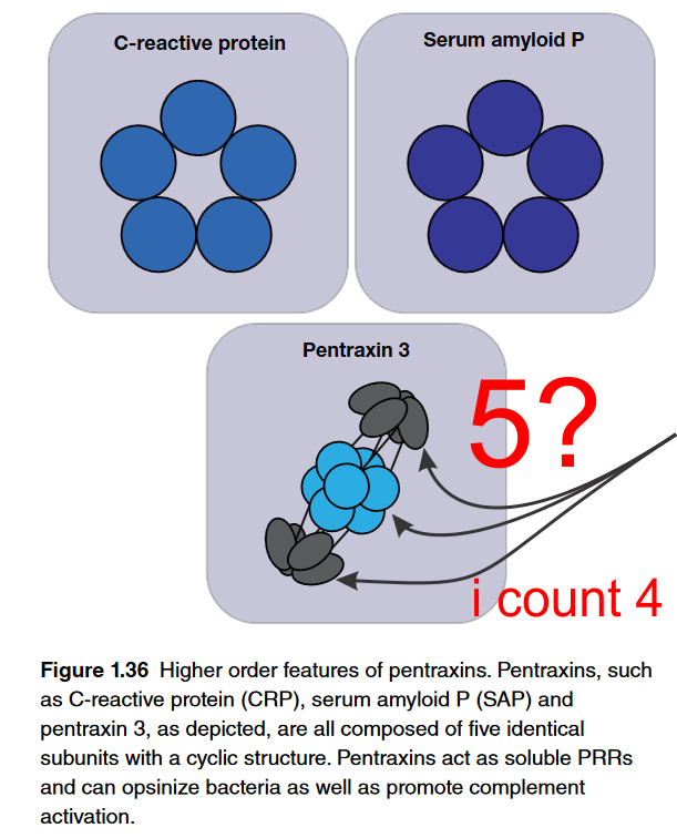
Here is why i wonder if scientists in general have much in the way of “visual capacity”. Here is a terrific example of a diagram which i find totally confusing. Please determine if i am the confused one or if this author and/or their diagrammer? The figure is part of an chapter: Fundamentals of Immunology – which is really a nice chapter but this just is funny. Figure below is cut and pasted from their pdf file, I added the red text and the arrows pointing to an attempt at perspective for 5 semi-spherical structures…. at the top, bottom and the two rows of 4, making 8 in the middle (which apparently should have been two rows of 5, with 10 total. So this is not a dig at the chapter as there is lots of great information there and the molecular reconstructions sare very nice. Its just this one, on pentraxin… pent for five, shows four structures in the lower half of this diagram. Too cute. I would have to call this a visual typo. I read this great article on the cost of typos…. it is nicely written and makes me wonder whether not capitalizing the letter I when i type is keeping my websites from doing well in google searches (not so LOL). At any rate, most expensive typo blog is worth reading and it is kind of funny. What is below though is something that doesn’t often get “proofed” sadly, I don’t know why. Scientific publications get substantial review… but so many scientific diagrams go to press with blatant mistakes that it is alarming. These have significant impact on understanding principles and concepts yet are not really even investigated as “typos”. So i get that the side view might just show two bumps, but there is 3Dimensions to the lowest diagram below, and in this perspective, five round areas shojld have shown up somewhere. Again, what is a great name for a diagrammatic mistake? BTW i am not listing the authors of this chapter, that just isn’t the point.
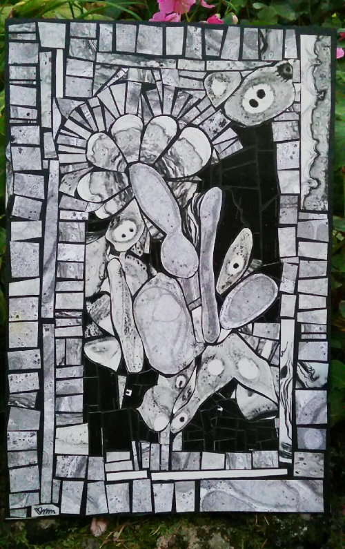
I have used this technique before, maybe decades (more than 3) ago when faced with the very real necessity of pitching my beloved black and white prints from the microscopes I have used in the past, that is light microscopes, electron microscopes, and dissecting microscopes. The tesserae in this picture (which was made expressly for one of my two grandsons) are made from a combination of TEM and LM micrographs. The big-“eyed” structures are keratinocyte nuclei with one or two nucleoli, and one in particular has an apoptotic keratinocyte nearby. There is mouse back skin, and thin layers of keratin present, and some wacked-out cristae formation in mitochondria from liver of genetically engineered mice, and/or rats exposed to toxins for the sake of determining whether we are poisoning ourselves with chemicals and stuff, and whatever else I have saved in the box of potential cut-ups. One mitochondrion in the center has peripheral parallel cristae and the one below that has a collection of protein in the intracristae space. If you look closely you can see the little pale KODAK letters which were on the sides of prints that we used to make of film strips…. that was indeed a long time ago. I actually have saved enough of the extra prints to make a large abstract…. maybe someday I will get to it. In the meantime, identify all the structures that you can.
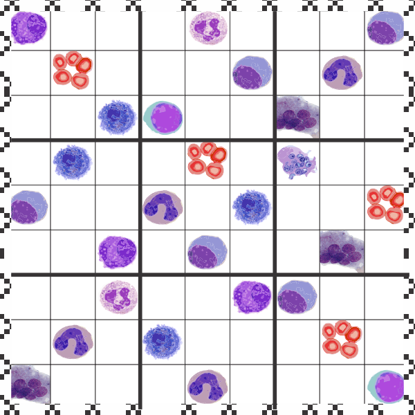
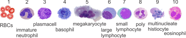
Eosinophils, basophils, osteoclasts, multinucleated histiocytes, red cells, band cells, plasma cells, large lymphocytes, small lymphcytes and polymorphonuclear leukocytes.
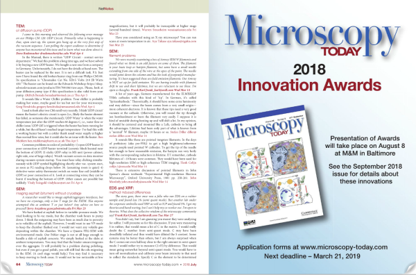
“Lookie there, my cover inside the July 2018 edition of Microscopy Today”
I was looking up the editorial staff of Microscopy Today to see if they would be interested in considering a short editorial (which i would love to name Ecc 1:9, but will probably not use that for reasons of pseudo “separation of church and science” LOL). And filling through the online pages of the July 2018 issue i ran onto my own cover on one of the inside pages. Awesome. I made a link to that issue, but i don’t know if it will be held in perpetuity or whether it will rotate with new issues.
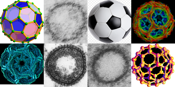
This is a wild goose chase looking for structures which explain and identify those which I have seen repeatedly in hepatocytes (and other cells), this time including clathrin coated vesicles and COPI and COPII vesicles. I am continually amazed how certain motifs repeat themselves in the microscopic, molecular and modern world. Stability in structure seems to transcend size. So image below is a collection of fullerene diagrams, some from my own electron micrographs, one from a widely republished electron micrograph (credits to the author if i knew who it was) and some from various wikipedia posts and of course the most widely recognized fullerene structure… the soccer ball. Just for fun but also tying in the concept that nature made it first. There is a difference in magnification from the upper left (i think around 1 nm – which actually sounds too big to me) — to the soccer ball 22 cm in diameter — well you can do the math 2,200,000,000 nm.