Monthly Archives: March 2024

Parallel plots of a trimer of SP-D, AFM and shadowed TEM

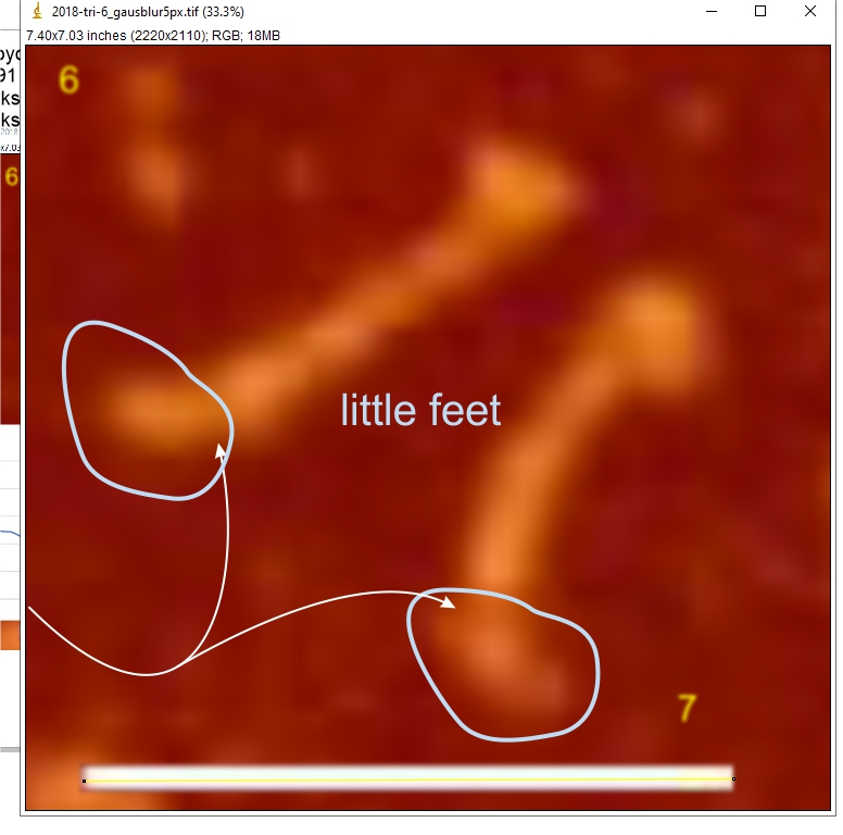
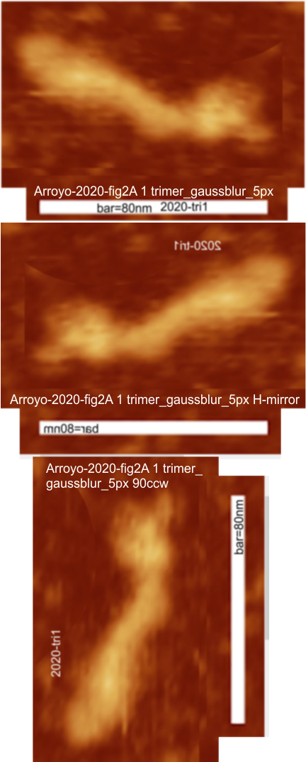
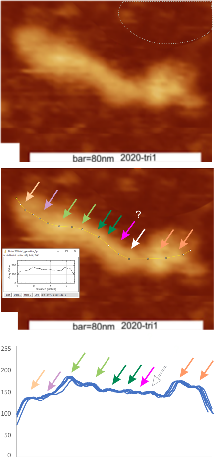
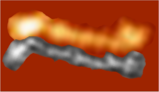
Parallel plots of a trimer of SP-D, AFM and shadowed TEM, took me about three seconds to pick two arms of SP-D, one from an AFM image one from a shadowed TEM image. No problem seeing similarities, the similarities in peaks were immediately apparent and similarities were pretty striking.  Even though shadowed images have that typical lumpy background and it is a little difficult to ‘swallow’ the possibility of there being structural information in from both methodologies, the images confirm the number of peaks in a trimer of SP-D.  i think the evidence which is just an observation here might be substantiated with more samples. The bottom line is that it is very clear that there are many more than the reported 3 peaks along the AFM and the shadowed images. The three known peaks ( N termini junction, glycosylation peak(s) and the CRD peaks).

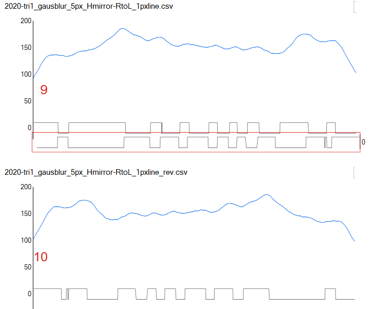
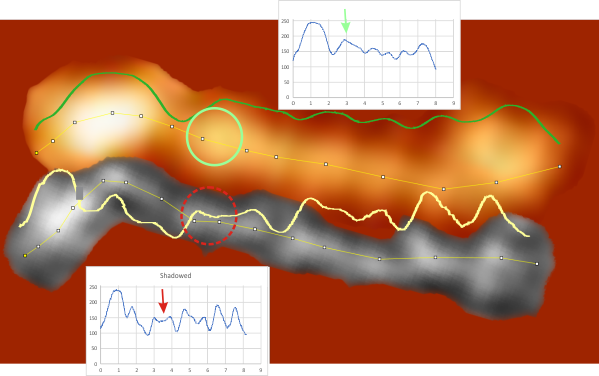
Images were adjusted so that these “cropped out trimers” have the N terminus peak on the left, CRD peak(s) on the right and a grayscale plot was made to compare peak heights widths valleys, and of course peak number. Top image AFM, bottom shadowed TEM.  In the two trimers below the N terminus peak is very bright since I cropped the trimers from dodecamers (where the N term peak is x4 where the four trimers are joined.

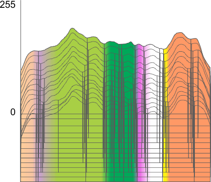
The difference between the top AFM image and the bottom that is immediately noticeable  (and confirmed in other plots) is that the trimer in the AFM is glycosylated, so next to the N peak on the left, the bright peak is the glycosylation peak.  The SP-D used for cropping out a trimer for the bottom part (shades of gray) of the shadowed image has not been shown to be glycosylated, so a glycosylation peak is not expected…… therefore that bright spot in the AFM denoting glycosylation is NOT that bright, more like a “low peak” in the gray shadow-cast image. Other peaks along the respective plots are very similar.

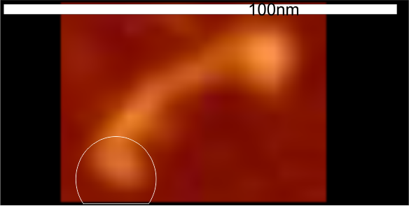
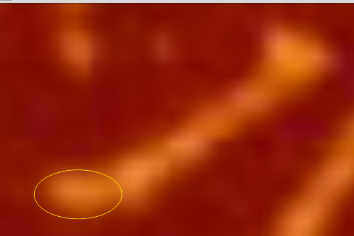
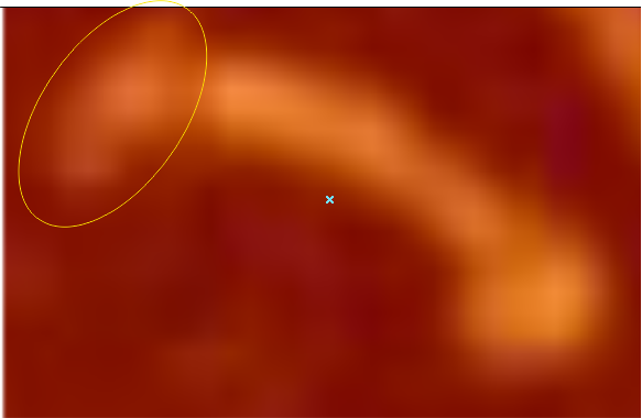
The biggest differences are 1) the tiny peak in the valley between the N term peak and glycosylation peak is prominent in the gray shadow-cast micrograph, 2) there is likely no glycosylation (or minimal) in the SP-D preparation that was shadowed (i have an AFM of that and will compare). 3) See the red circle for glycosylation peak on AFM image and not that bright peak where glycosylation would occur on the shadowed image (dotted line circle). There is a definite “foot” bend in the N term portion of the shadowed image, but also somewhat seen in the AFM image . The plots are very comperable 4) and the low brightness between the N and collagen-like domain is really prominent, and means something important in my opinion.

A new plot and set of images (3 this time) are below.

Since the biggest difference between these two arms, besides the methods of imaging, is the peak that is supposed to indicate glycosylation is different in all three.  The top image below is definitely glycosylated (Arroyo et al, 2018) the AFM image at the bottom of the figure below is “possibly” partly glycosylated from the same authors.  There is only ONE image of their deglycosylated SP-D dodecamers that I could find, from which the bottom SP-D trimer was cropped for comparison. The other three arms of that particular dodecamer labeled as deglycosylated SP-D had varying peak heights at the alleged glycosylation site. Whether one, two or three strands of a trimer are glycosylated seems to be an open question, and all the AFM images seem to indicate this since there is consistent peak brightness (height).

The particular trimeric arm of the deglycosylated SP-D molecule (so not a separate trimer, hence the high N term peak brightness), was selected not because of the glycosylation peak absence just because it had similar angles and would fit nicely one above the other. So the orientation was the primary selection bias, not the glycosylation peak height.

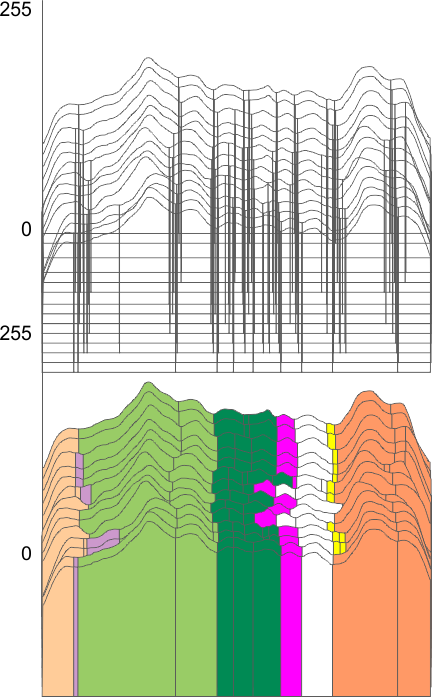
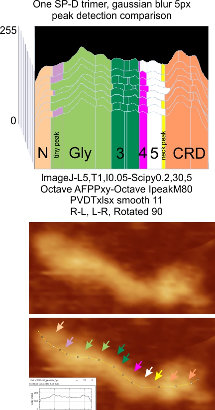
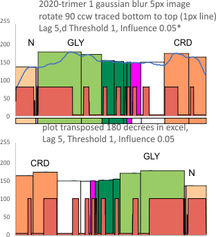
An assembled graphic (below) was prepared with molecules with an approximate shape, size and curvature to show three things: 1) the deepness of the valley between the N term and collagen like domain peaks, 2) the difference in the shadowed image (for which dodecamer the glycosylation state has NOT been determined, but it appears as if it is NOT glycosylated) and 3, the similarities of the peaks (excepting the variable glycosylation peak(s) of the three trimer sections of dodecamers with the two methods, and two separate preparations of SP-D.  The grayscale plots on the right hand side of this image below shows the exact tracelines and the resulting plots for each trimer (obtained in ImageJ, exported to csv, plotted in excel).  The exciting thing is that the peaks in the two prep methods (AFM and shadowed) are just really wonderfully similar.

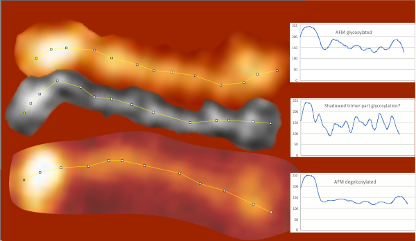
I had been skeptical of cropping out any SP-D arms to trace for grayscale levels in the shadowed image and just gave it a try… lest anyone accuse me of “doctoring” data…. no data have been changed, just the outlines.   AND one really nice results is that the tiny peak that i have mentioned hundreds of times, that lies in the valley between the N terminus peak and the glycosylation peak is prominent in the shadowed image.  If you look at the middle plot left hand side, you see the first tall Nterm peak, and in the shadowed image, a smaller peak on the downslope shoulder.

Little “feet” at the N term side of SP-D trimers

I have looked at these image for years, just now thinking that the bend that is sometimes seen on the N terminus side of the SP-D trimer has an impact on how those multiple N termini junctions might assemble to make multimers with different attributes at that junction: whether end to end, one top the other, or bending for form a ring as is seen more often in multimers with many trimers. So while the flexibility of the CRD regions of a trimer, which are easily seen in AFM image of SP-D are pretty obvious, finding a low spot, a reasonably “thin” part of the molecule seemingly just between the N and collagen-like domains, I have seen on hundreds of plots, however, that it has a “flexibility” is certainly something to think about (per image below).

Two trimers from the same AFM image are shown below, rings are drawn around the “bend”, arrows point to a very low point in the grayscale scan which is a very common feature of SP-D near the N term bright peak.

AFM images of SP-D trimeranother image with an N term “foot” like bend

another trimer with an N term “foot” like bend

…and another one

I looked up all images in Arroyo 2018 and totalling up 50 trimers, only 5 had that little crooked hook at the junction of the N term domain and the collagen-like domain.

Peak number (grayscale plots) in SP-D trimers

19 SP-D trimers (AFM images from several published articles) were counted many different ways to determine peak number. These methods have been described many times in previous posts.  135 plots (129 of which were images that had NOT been filtered, and one image (trimer – 1) which had an additional plot from a gaussian blur (5px)).  The three columns below represent (left) my count of bright peaks directly from the image, (center), my division of the grayscale plot (done in imageJ),  and (right) the 5 signal processing apps applied with consistent functions over the images. The data show “more” peaks found in the signal processing group which also showed a larger standard deviation, also a few more peaks found observing the csv plots, and the fewest (though not significantly fewer than the hand counted peaks from plots) as they are seen in the image. The mode and median from the image and the ImageJ plots are the same. There are differences in each of the signal processing apps, enough so that the peak finding in the whole dataset does not make a normal distribution.
peak detection along a trimer of SP-D
When each of the 5 (plus my counts)=6 peak finding apps were analyzed separately  the difference was seen below.  On the left, my peak determination from grayscale plots obtained from ImageJ, and right, each individual peak finding apps  (the same apps used previously in this blog) applied to each of the 19 trimers, so the total n of plots is still 135, but the n of 6 is the number of different apps used to detect peaks.  The distribution of means and SD from the 6 individual signal processing apps does form a normal distribution.  The difference between the mean of the peaks i count from plots, and the peaks found using signal processing is significant with a 1-tailed t test, (p=.032) but not with a 2 tailed t test (p=0.065).

The next step is to apply image filters to each trimer, and to each of those, apply the signal processing apps to find concensus.  Seems to me that the data will fall inbetween ….  not 7 not 9  but “8” which would be predicted from the similar assessment of dodecamers (plotted as hexamers)… of which I have plotted hundreds and hundreds  (LOL).

I couldnt resist plotting every peak count for these 19 trimers so far…. also, not a normal distribution. The outliers (15 peaks to 21 peaks) all arise from signal processing the plots (yes i could manipulate the functions and make them all 8 peaks, but it seemed to me to be a more honest approach to find a setting and stick with it).  The highest peak counts came from Scipy, and iPeakM80 (Octave). I wonder about the efficacy of changing those parameters to fit my “idea”.

PeakValleyDetectionTemplate.xlsx, smooth 11 for peak identification on SP-D trimer

Using the PeakValleyDetectionTemplate.xlsx from Tom O’Haver, I ploted a single SP-D trimer, forward blackward, mirrorred, reversed using excel, as well as bottom to top and reversed.  (PeakValleyDetectionTemplate.xlsx, smooth 11. Peak identification on SP-D trimer shows very little change in peak number, width, height and valley (as determined by grayscale plots made using ImageJ) no matter how I enter the csv file. This is good in a way, as it means the high peaks next to the low peaks, at (smooth 11) pretty much are read the same way, front to back and back to front.

The greater variation comes from image processing and variation in my trace through the center width of the molecule from N term peak to CRD peak(s) at least that seems to be true with this template at smooth 11.

In the graphic below columns on the right hand side are “image” (= my peak count), “plot” (=my peak count from the ImageJ grayscale plot). “peak finding” (= peaks found using signal processing apps – mentioned many times in previous posts). the center row of data for peak numbers is derived JUST from the PVDTxlsx peak numbers.

Rows 3 and 6 are plots of the same trimer using the unprocessed image and gaussian blur (5px) image respectively.

I do think the number of peaks per trimer will turn out to be “8” as these numbers are an n of 1, just to determine whether the peak finding xlsx plots are influenced by direction of the plot line…  The image used for these plots was particularly nice and that would be selection bias toward more peaks.

11 peaks found in a single SP-D trimer plotted 14 times, 90o ccw, left to right, right to left, and as a horizontal mirror

11 peaks found in a single SP-D trimer plotted 14 times, 90o ccw, left to right, right to left, and horizontal mirror (see AFM images below).  The plot app was an excel file for finding peaks and valleys (PeakValleyDetectionTemplate.xlsx, the initial traces were done with a segmented line at either 1 or 5px line width using ImageJ.  (Credits for the AFM of the SP-D trimer image, the excel file and imageJ have been given countless times in previous posts).

The ridge plot here shows the “alleged 8 peaks in a trimer”(found in previous data from plots of hexamers) as a backdrop to the “actually detected peaks for this single trimer by the PeakValleyDetectionTemplate.xlsx where I tried to use the actual plot lines (and their deviations) as a correlation with what has been seen with previous studies.  N peak on the left; tiny peak=purple; glycosylation peak(s) typically more than one), bright green; peak 4 as yet undescribed with about 3 peaks or ridges, dark green; low and thin peak 5, pink; broad and low peak 6, white; neck domain peak infrequently seen, yellow; CRD domain peak typically multiple peaks (in this image 2 peaks) distinctly large and bright, orange.

It becomes apparent that the concensus peak number for this single SP-D trimer is 11 (top ridge plot). My designations for why peaks could be sorted “down to 8 peaks” was  made on the basis of hundreds of plots of hexamers (within dodecamers) where concensus was 15 peaks per hexamer, This creates trimers with 8 peaks, the N term peak being blended in higher order multimers.

The divisions of the colors from the actual plots (two of which I should obviously re-sort in retrospect but were made looking at the plots at the time they were traced (these being the dark green, pink, white columns aka peaks 4, 5 and 6 in the fifth and eighth plots up from the bottom).


SP-D trimers: peaks measured in a single molecule by many programs, and tracing variations

Tracings through the center width of a single SP-D trimer were assessed for peaks (grayscale – 0-225). The data,  gathered using many programs and tracing variations, show just about the same peak pattern as similar measurements of trimer peaks gathered measuring SP-D multimers (hexamers and dodecamers, primarily). The same programs and apps were used for both trimers alone, and trimers within multimers. There were a couple things that I actually had hoped to determined by just measuring trimers.

The image from which the summary data of the single trimer is derived is shown below (one which has been posted before). The new visual presentation is the ridge plot from 8 different plots of the peak number, height and width of that single SP-D trimer. Arrows pointing to the places where peaks are found in the AFM image (Arroyo et al, 2018). In addition, an actual tracing shows how the segmented line travels through the center width of the molecule (screen print from ImageJ).  This image was processed with a 5 px gaussian blur before peak finding apps were applied. Data (not shown) was also obtained from the image as it was retrieved from the publication without image filtering.

NOTE: The top plot in the ridge plot has a narrow “pink peak #5” this was my sorting division and in comparison to other apps, I should have have included the part of  the peak to the right) in that group. Color divisions are always my interpretation of the plots. Vertical divisions are those determined by peak finding apps.

Only the “tiny peak” and the ” neck peak” are not detected in all the plots all the time (i.e. by the concensus criteria established for each program). Peaks 1, 3, 4, 5, 6 and 8 (left to right) in this group of plots, are detected 100% of the time. The number here is 8, but in hexamers and most dodecamers, the total peak number is 15, this is because the N term peak becomes one with the other trimers in the multimer, which then makes the N term peak the brightest and widest peak in the plots.

The glycosylation peak is often a multiple lumpy peak, as is peak 4, and certainly the CRD peak often shows the separate three parts of that trimer as different bright spots.

1: does the lower height and lesser width of the trimer’s N term peak change the frequency of detection of the small, but (obvious to me) tiny, low, narrow peak on the downslope of the N term peak, and valley between the N term peak and the Glycosylation peak, and I think the answer is “not as much as expected”.  In addition, the N term peak is less in width and lower in height when not joined to another N term as occurs in hexamers,  dodecamers,  and other multimers. N term seems to be the only peak that is very different when analysed without a junction with another N term peak.

2: is the peak number (and sorting) any different when traced from trimers, vs hexamers, and I think the answer is “not really”.

3: is there a consistency in peak detection? among the various image and signal processing functions that guides different divisions among the peaks detected, and I think the answer here is also “not really”.

4: are all the various peak detection programs and functions better than just looking at the peaks plotted in ImageJ, also,  “not really”.  Concensus is nice, but a conservative estimate using those plots seem to provide a mean peak number that is no different than the apps.

All in all, little new came from using right to left, left to right, vertical mirrorred tracings, bottom to top tracings on image rotated 90o ccw.

9 plots compared for SP-D trimer peak number

A single image (from Arroyo et al, 2020, that I named trimer 1) with bar marker and nm value was plotted nine times. This means tracings right to left, in original images and images mirrorred and image rotated 90 ccw. These plots were traced in ImageJ opened in excel without adjustments (so the x and y values were not changed) and the multi-blue-line plot at the bottom of the graphic below is the result of superimposition without any editing. The plots are virtually identical. The peaks counted from individual plots was 10.5 peaks, ranging from 9 to 12, there was no mode. The top image is the original image, screen printed from the publication. The dotted line in the upper right is where I cut and pasted background over an identifier in the original publication (just to clean up the image). The image was filtered with a gaussian blur of 5 px.

Some of the tracings were made with a 1 px line, and others a 5 px line.  There are slight differences, but 1 px line was chosen for hundreds and hundreds of tracings in this study.

The image of the trimer just below is an example of the tracing, which I began at about a medium grayscale into the molecule and ended similarly at the other end of the molecule. The tracings varied from right to left, and right to left and each plot was also transformed in excel when applying peak finding.  Plots were mirrored so that the N term is on the left, the “tiny” peak and the large glycosylation peak(s) are next.  As yet unidentified peaks have arrows pointing to them, and where peaks were detected in the plots but not by “eye” i put a question mark. The two peaks on the right are the CRD peak(s).  I have kept colors of peak identifiers consistent throughout all the posts in the last two years, so previous blog entries can be compared.  I am convinced that little variation exists in the way I execute these tracings, or in the way (direction, mirrorred or rotated) ImageJ processes them.


Reverse? plot peak detection

I am not sure why the transposed excel column (first line becomes last line) was plotted like this in the stackoverflow app for peak finding. ?  The rows were mirrored vertically in excel, but i didn’t expect the peak widths to be mirrored when i plotted the transposed data into the stackoverflow peak finding app.  (see red box below the original excel plot. I cut ans pasted the bottom part of the reversed rows just below the peak detecting series in the top plot (RED BOX).  something very un”right” here.  Suggestions are welcome.

It seems to me that the height of the tallest glycosylation peak when plotted at the end of the tracing influences the detection of the smaller N term peak on the trimer.   Plotting a trimer within a dodecamer (which makes the N term peak about the tallest peak on the tracing, there is the possibility that after passing that peak the influence on the detection of the tiny peak and glycosylation peak has changed.  I think looking at the left and right trimers in a dodecamer this could be uncovered.  I actually think i did that early on.  So on the plot reversed, peak width and height of the glycosylation peak  influences the rest of the tracing.

Using 8 similarly collected tracings 1px thick line and 5px thick line plotted in ImageJ,  of SP-D, with images mirrorred and rotated,  then peaks counted in the LagThresholdInfluence mode from stackoverflow, the mean peak count in a this particular trimer is 10.5, all values appear twice, no mode, however if the forward tracings (that is from N to CRD, peak number is counted it is 10 (min=9 max=12), while if the reversed data is plotted the mean is 10.75 (min=10 max=12)  maybe not an important difference.

This is an assessment of a single peak finding funcion….in addition  I have used Octave’s iPeakM80,  and AFPPxy, Scipy Peak Finding,  PeakValleyDetectionTemplate.xlsx, and my own two non-signal processed assessments, one from the image itself, the other from the plot generated by ImageJ (that plot used by all other functions).

I compared the use of a five px line to trace the moleule, and a 1 px line. I am revisiting that choice but it seems that the 1 px line works fine.

RCSB (as of march 2 2024) still doest not give a full structure for a surfactant protein D trimer (nor did i see hexamers, dodecamers). This means to me that the collagen like domain and the N term junctions are still not really known, in terms of 3D structure…. thus, as has been for years, when one looks up SP-D they just see the neck domain and the CRD domains…

Varying the trace and the direction of “peak finding”, may change the peak count in trimers of SP-D

Varying the trace, may change the number of peaks, and whether this is relevant or whether sheer number of plots of peaks (grayscale 0-255) along a trace of a surfactant protein D trimer (or hexamer) negates these small differences.
There are many ways for peak numbers to change, 1) noted above, the way the segmented line is traced in the AFM images of SP-D, 2) the image processing filters, enhancing or reducing peak brightness, blurs, median and limit range filters, and 3) the specific values for each filter applied in peak finding programs.
I have examined one trimer plot, mirrored and rotated, with separate traces, and each of those transposed 180o in excel and reapplied peak finding programs.
There is some variation, yes, but pretty small, not the big changes like i expected to see. Plots below are a sample comparisons of how peaks are detected in a “stackoverflow” method for peak detecting.

top image shows the plots, bottom image shows how the plots have been ordered (according to countless plots determining that the peak number in a hexamer is about  15, and in a hexamer half that, except for the fact that the N term peak number does change.  That is something that will be interesting to figure out.  Changes are small…  but my purpose was to see whether the “tiny peak” on the slope of the N term peak would be more prominently identified if plots did not have the large N term peak just prior. That has worried me for a long time….. that tiny peak is clearly there but rarely counted.  (it is marked by purple below). The reversal of this plot did not change the detection of the “tiny” peak.