 “Back in November, presumptive GOP nominee Donald Trump revealed his conviction that he has “the world’s greatest memory,” a declaration he announced is “one thing everyone agrees on.” Now, he can’t remember saying that.”
Monthly Archives: October 2017
Happy with this model of SP-A?
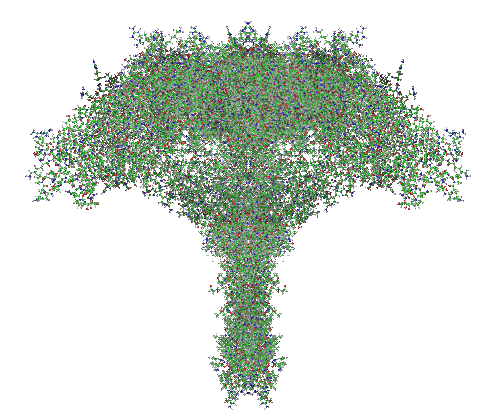
Here is a model of SP-A after weeks of trying to figure out which species (of the 7 looked at) to use, and where they are different and why the two programs I have used fail to predict the structure of the collagen segment… so i confess i am not a protein scientist, but seeing the really poor diagrams presented for this molecule (rather this octadecamer) by some very hefty scientists right here in this same University (no names mentioned here, though it would be my misguided pleasure to do so) I was determined to craft something that really might look like the real thing. Thus… the diagram below. The whole top part (mostly the carbohydrate recognition domain and coiled coil neck) was easily found as a pdb file and rotatable as a ribbon diagram too, and worked using the sequences for mouse, ferret, guinea pig and dog…. they are very similar, with a few pointy and craggy places along the top (presumably those places for recognition of organisms in the lung) and other immune functions. Coiled coil regions modeled particularly nicely, almost like rhythmic segments , and aptly called a neck…three or so bumps. These were also pretty similar among species. No problem there. But where the neck region meets the collagen-like stretch it just didn’t model the way (literally ALL) the diagrams represented it– except when i used it in the protein structure databases without the neck and CRD domains and part of the N terminal. Even then, most often that stretch of collagen-like sequence, even with the N terminal region added or subtracted, did not align with the suggested diagrams. Where, and how kinky the kink is IN THIS DIAGRAM is “speculation, and information from other diagrams” used here rather than the protein modeling (which didn’t model a “kink”).
So I pieced together a separate prediction for the collagen-like and N terminal sequences, and then “cut and pasted” the single protein into trimers and octadecamers, giving them the perspective that I was hoping to get by modeling the molecule as a “whole” and using the 3D options to rotate. Take this model as something synthesized from available models protein modeling software and available published diagrams.
The octadecamer is likely about 25-35nm across the top, and a similar height (which apparently changes with the spread of the CRD depending on open or closed conformation. These measurements are according to references found in the literature.
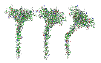
Top diagram, the perspective provided for the three angles that the trimers might be found in if they are as orderly (as indicated by the transmission electron micrographs i have posted. (Remember this is a partial-reconstruction and a partial diagram). Left view, kink facing forward, middle view, kink slightly rotated to side, right view is SP-A CRD top, neck slightly wider than the collagen and N terminal segments below.
 And here is the whole octadecamer, ordered with the three braided collagen-like domains aligned at the N terminal (as the literature suggests) then mirrored (from three above images) to make a total of 18 individual molecules of my generic SP-A).
Smile begins
A smile might cross your face
With something to dare not
Think about behind it.
A hurried tapping of your heel
With a place headed to that
It is not fair to ask about.
A few words seem lost in
The air. Still a message
within those breaths,
Comes clear.
As though a cape had
Drawn, across the life
Going on, an open coat
Waving behind in the
Wind. Another night
Until the smile begins
To hide that life again.
RB102602010
Mouse hepatocyte: mitochondrial desmosomal connections
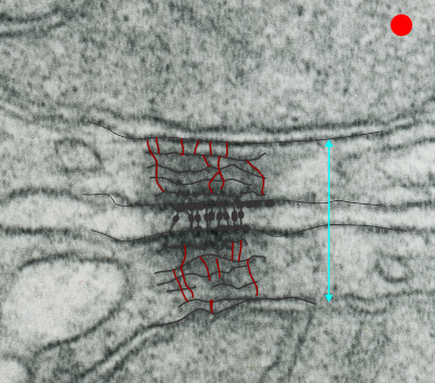
https://www.ncbi.nlm.nih.gov/pmc/articles/PMC2211412/pdf/nihms34115.pdfI have marveled at the mitochondria and their propensity to connect with both desmosomes and nuclear pore filaments. These little “bridges” in density and substructure connect them very often. Here is an hepatocyte sample just to show the point. Boxed area has mitochondria in one hepatocyte and mitochondrion in adjacent hepatocyte bridged by a desmosome on both sides. There is great “order to the connection, first a lucent band (disk) then a dense and then a less dense, then a more dense and one more lucent band with little periodicities and a very dense and then lucent band and the plasmalemma. So this is a total of 10-11 gradations in electron density x 2, one on each side of the space between the hepatocytes, and within that space is of course the density pattern therin that is typical for desmosomes. The rigidity of the desmosomal “disk” or “round weld” is quite noticeable, on the plasmalemma side and the mitochondrial membrane side, and the thickness of the whole complex (from the membrane of the mitochondrion in one cell to the membrane in the adjacent cell is pretty fixed as well. I am pretty sure if you search PubMED you will find at least two publications where I mention this phenomenon. I don’t know why it has received so little attention.
This particular mitochondrion also has another connection with a desmosome about half a micron distal to this site.
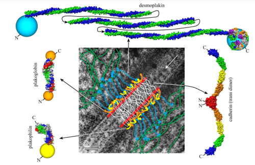
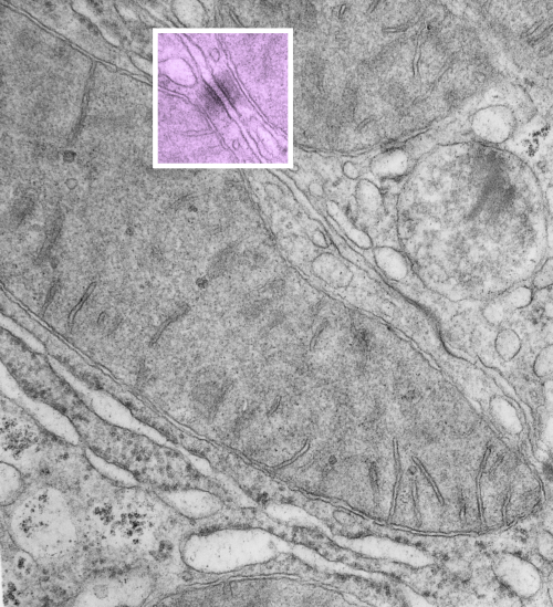 Making just a line diagram over top of the desmosome-mithcondrial connection i used just lines. Below that is a real great diagram of a desmosome with link to the publication. Ribosome=about 27nm depicted as a red dot. Blue arrow is about 200nm.s
This one scares me! Herpes zoster virions
Similarity in carbohydrate recognition domains and neck of SP-A: guinea pig, ferret, dog and mouse
I have had a lot of fun with this website Phyre. I have entered at least 2 dozen sequences into this program in an effort to figure out how different the SP-A might be among the species that I have been investigating with TEM for a couple years now.
Below is a photograph which i modeled the carbohydrate recognition domains and neck regions to compare. Hey are remarkably similar, just a few juts and points are different. When i modeled the entire sequence, the neck region got deleted from dog.
Job
Job 5:7 Yet man is born to trouble as surely as sparks fly upward.
Job 7:9 My days are swifter than a weaver’s shuttle, and they come to an end without hope.
Job 9:25 My days are swifter than a runner; they fly away without a glimpse of joy.
Great prose on life’s miseries, and every bit as beautiful as Shakespeare.
Little pointy part of CRD in guinea pig SP-A
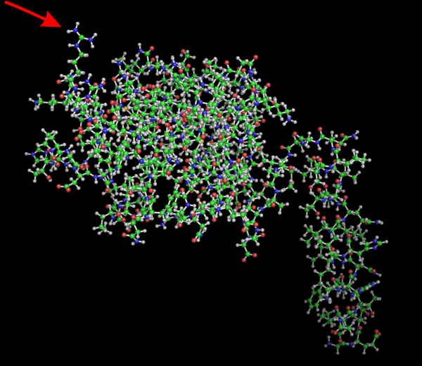
No laugh here, but I bet this little amino acid has a lot to do with some of the function of the carbohydrate recognition domain. Here is a Pymol view of guinea pig SP-A from residue 51 to 347, rotated to show this AA. Someone out there knows exactly which on it is… i will try to find out. In addition, I will post the ferret sequence from the same location (also residue 51 to end) to see if there is a similarity. RED arrow points to the spike.
How funny is this?
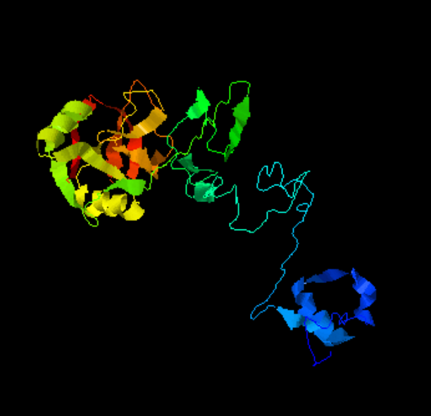
Modeling surfactant protein A has been a fun journey. Me, wellllll, this I had never done before last week. But I leaned by error that there is a FASTA statement that needs to be used in some programs. I guess I must not have typed this in correctly when I used the program at UMich either written by or run by Yang Zhang. FIND IT HERE: Yang Zhang. I-TASSER: Fully automated protein structure prediction in CASP8. Proteins, 77 (Suppl 9): 100-113, 2009. BUT in this case it incorporated my statement into the AA sequence, ha ha. and here you have what SURFACTANTPROTEINAGUINEAPIG looks like as a protein. The structure itself is wonderful, but the blue part at the bottom is the “monster end” read as an addendum “SURFACTANTPROTEINAGUINEAPIG” protein… ha ha… too cute, made me laugh. So just snip off the blue, and you have the real modeling of guinea pig surfactant protein A.
Scientific illustrations — Artistic vs Accurate
I googled erroneous diagrams in science and came up with a series of articles in Scientific American, but the link was broken. In case the repair the link here it is, but it seems that a paid subscription is necessary.
This blog just is another attempt to make individuals who write articles for scientific journals aware that they do a great disservice to our knowledge base when they carelessly use inaccurate and lazy renditions of data, just because they feel (or the editors feel) there should be visual content does not forgive “junk graphics”. If there is going to be visual content, then it needs to be accurate.
Scientific publications are not the place for “artistic” renditions unless they have basis in real fact. Artistic license is NOT an excuse for poorly made illustrations. I wont spend the time to detail errors in the diagram about which I am thinking at this moment, but it was so poorly drawn as to be laughable. An attempt to avoid asking permission for use of graphics from previously published works, or better diagrams from other publications, perhaps, or just trying to turn out another manuscript at warp speed, may have been the problem. I did in fact email the first author (who is at my same institution) and mention how sad it was to include “fake diagrams” in scientific works. I got a response but it was sadder still. Does the use of “fake diagrams” mean that there are “fake data” and “fake interpretations” in the publication as well. This all fits right in the “fake news” and “fake accomplishments” mentality rampant in our world.
What is even worse is that the reply from the lead author seemed to point to the idea that the bad diagram was justified by calling it “artistic”. This was an excuse, and it means to me that many in the scientific community think that “made up diagrams” are ok, even when good evidence says that what they “made up”, the depictions are erroneous. How egregious, especially when there is easy access diagrams with honest content of the same material.
It is a perplexing issue.
