There is a lot of organization here, about which I know almost nothing, but it is fun to look at old micrographs and see pattern. This is only a view of a portion of a nucleus which has some very nicely defined chromatin (right side of the image, overlay is yellow, which measures not that different than a ribosome (middle and left portion of image, pseudocolored purple, and red dot, taken to be about 27nm) of which there are several in the nearby cytoplasm. Bar=approximately 100nm, and the spacing between nuclear chromatin bodies is less than 3/100nm.
Category Archives: Ultimate order, the cell
RNP along the inner nuclear membrane
When i encounter electron micrographs where there is such obvious order i just marvel at the detail and complexity of life. Here on the inner nuclear membrane of an alveolar type II cell, in between the nuclear pores, there are little RNP particles, neatly and tidily spaced at about 41 per 100nm, and at about 24nm diameter (slightly smaller than the ribosomes from this same micrograph used at a measure of 27nm diameter. These are organizationally (that is, the RNP and inner nuclear membrane, and the ribosomes on the RER membrane) and with such similar but not identical sizes, shapes and arrangements, that it becomes almost silly not to see an evolutionary structural relationship.
Picture on top has NOT been altered, but the identical picture on the bottom has had the distinct areas of RNP burned using photoshop just to show you what i see. Red circles are ribosome size, relative to the enlargement of the images (taken at 27nm) and blue circles are RNP granules, which are apparently closer to 24nm diameter. Point here is the rigidity of the inner nuclear membrane, and flexing of the outer nuclear membrane at sites where the ribosomes on the outer nuclear membrane are actively producing protein.
Four adjscent inter-nuclear pore distances have been measured and RNP counted. Mean+/-SEM is given at 40.5 ribosomes/100nm and all ribosomes together with all nm is 40.6. A tangential area of the inner nuclear membrane and many RNP forming a grid like network is seen about midway-top of both micrographs, but accentuated in the lower micrograph.
Lysosomal granule with three visible zones
I have cropped three boxes from the image and changed the contrast (75Lysosomal response to the presence of perfluorodecyl iodide is kind of unique. After a 3 month hiatus (working on putative SP-A granule) it is nice to be looking at these crystal structures. I think I have posted this lysosome before, but am posting it again in reference to the three zones of texture and electron density that I am pretty sure I can see in this particular granule (not including the perfluorodecyl iodide crystals themselves). I took three areas of the crystal and changed the contrast (up 75 in photoshop) and also various levels of brightness to see whether a manipulated image would enhance any pattern present. So beginning, and certainly an obvious “overall density” change exists in these lysosomes. In top figure below, red dots represent noise . Below that, the differently contrasted images were vectorized using the same criteria for each so a difference in hos this renders beings more credibility to thought that there is a difference in protein density and likely protein organization in these separate crops from la single lysosome. The pattern, not yet found, just a hit that it exists.
if you are diligent, you will be able to match the textures to the exact places I cropped (yep i should have made boxes on the original so you can easily see them), but i can see the pattern in the images below and where they came from on the original top micrograph without the need for boxes.
Hexagonal pattern in protein granules in alveolar type II cells of the ferret
Hexagonal pattern in protein granules in alveolar type II cells of the ferret — yes still working on this. This image is from new sections, new microscope, but the results are the same. Image on top is unretouched, image in bottom i have burned what i see as a hexagonal pattern in this layered intracisternal granule.
Mouse hepatocyte: mitochondrial desmosomal connections
https://www.ncbi.nlm.nih.gov/pmc/articles/PMC2211412/pdf/nihms34115.pdfI have marveled at the mitochondria and their propensity to connect with both desmosomes and nuclear pore filaments. These little “bridges” in density and substructure connect them very often. Here is an hepatocyte sample just to show the point. Boxed area has mitochondria in one hepatocyte and mitochondrion in adjacent hepatocyte bridged by a desmosome on both sides. There is great “order to the connection, first a lucent band (disk) then a dense and then a less dense, then a more dense and one more lucent band with little periodicities and a very dense and then lucent band and the plasmalemma. So this is a total of 10-11 gradations in electron density x 2, one on each side of the space between the hepatocytes, and within that space is of course the density pattern therin that is typical for desmosomes. The rigidity of the desmosomal “disk” or “round weld” is quite noticeable, on the plasmalemma side and the mitochondrial membrane side, and the thickness of the whole complex (from the membrane of the mitochondrion in one cell to the membrane in the adjacent cell is pretty fixed as well. I am pretty sure if you search PubMED you will find at least two publications where I mention this phenomenon. I don’t know why it has received so little attention.
This particular mitochondrion also has another connection with a desmosome about half a micron distal to this site.
Making just a line diagram over top of the desmosome-mithcondrial connection i used just lines. Below that is a real great diagram of a desmosome with link to the publication. Ribosome=about 27nm depicted as a red dot. Blue arrow is about 200nm.s
Similarity in carbohydrate recognition domains and neck of SP-A: guinea pig, ferret, dog and mouse
I have had a lot of fun with this website Phyre. I have entered at least 2 dozen sequences into this program in an effort to figure out how different the SP-A might be among the species that I have been investigating with TEM for a couple years now.
Below is a photograph which i modeled the carbohydrate recognition domains and neck regions to compare. Hey are remarkably similar, just a few juts and points are different. When i modeled the entire sequence, the neck region got deleted from dog.
Scientific illustrations — Artistic vs Accurate
I googled erroneous diagrams in science and came up with a series of articles in Scientific American, but the link was broken. In case the repair the link here it is, but it seems that a paid subscription is necessary.
This blog just is another attempt to make individuals who write articles for scientific journals aware that they do a great disservice to our knowledge base when they carelessly use inaccurate and lazy renditions of data, just because they feel (or the editors feel) there should be visual content does not forgive “junk graphics”. If there is going to be visual content, then it needs to be accurate.
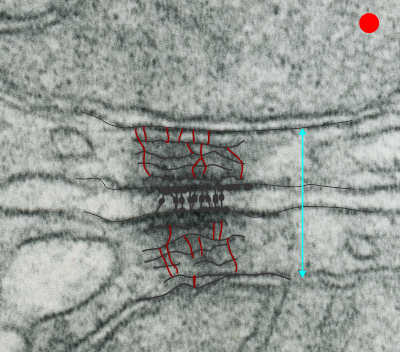
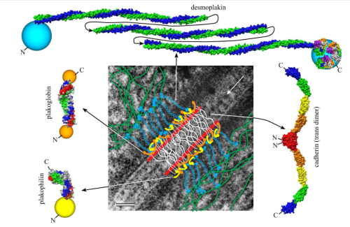
Scientific publications are not the place for “artistic” renditions unless they have basis in real fact. Artistic license is NOT an excuse for poorly made illustrations. I wont spend the time to detail errors in the diagram about which I am thinking at this moment, but it was so poorly drawn as to be laughable. An attempt to avoid asking permission for use of graphics from previously published works, or better diagrams from other publications, perhaps, or just trying to turn out another manuscript at warp speed, may have been the problem. I did in fact email the first author (who is at my same institution) and mention how sad it was to include “fake diagrams” in scientific works. I got a response but it was sadder still. Does the use of “fake diagrams” mean that there are “fake data” and “fake interpretations” in the publication as well. This all fits right in the “fake news” and “fake accomplishments” mentality rampant in our world.
What is even worse is that the reply from the lead author seemed to point to the idea that the bad diagram was justified by calling it “artistic”. This was an excuse, and it means to me that many in the scientific community think that “made up diagrams” are ok, even when good evidence says that what they “made up”, the depictions are erroneous. How egregious, especially when there is easy access diagrams with honest content of the same material.
It is a perplexing issue.
Price reduction!!! ha ha still too much?
“In 1990, Congress established funding for the Human Genome Project and set a target completion date of 2005. Although estimates suggested that the project would cost a total of $3 billion over this period, the project ended up costing less than expected, about $2.7 billion in FY 1991 dollars.”
“But the price for genome sequencing has been in continuous free fall since the beginning. In 2006, Illumina’s first machine could sequence a human genome for $300,000, and in 2014 the company announced it could do the same thing for $1,000.”
“BGISEQ-500 Service Human Whole Genome Sequencing from $600, data delivered in standard industry formats”
Wedding cake crystals: perfluorodecyl iodide
These crystals are certainly odd. I have for many years wondered at their layered cake appearance, and today just found it so funny that i had to make a spoof about it. So here are a few images taken from within a single hepatocyte phagocytic cell (like a resident macrophage) and these layered cakes ‘so to speak’ are oriented with the largest layer at the base and stacked vertically. The crystals appear to be stacked round layers, but probably not always, maybe with a chance orientation of smaller layers “up one”, I have not done any counting to see whether they might be “reducing in size as they stack”. The rounded bottom layer (not shown in these images) is seen in cross section sometimes as a full circle, other times as a tangential cut with one straighter edge and one rounded edge, just as one would find in a tangential cut of a layer cake.
At any rate, these are clues about the structure of perfluorodecyl iodide crystals in vivo.
Spleen of a mouse receiving perfluorodecyl iodide emulsion–
The spleen, an immune organ, initiates immune reactions to blood-borne antigens and filtering out foreign material and spent circulating cells. It comprises at least 2 primary cellular compartments: the white pulp with its “periarteriolar lymphatic sheath, marginal zone and follicle” and the red pulp with its “reticular fibers, reticular cells, and associated macrophages”. These compartments have different vascular and cellular architecture.
Looking at mouse spleen after the infusion of a 10% IPFD 5% F68 emulsion at 100CC/kg, 55 days post, I had expected spleen to be completely packed with macrophages full of IPFD particles and yet I dont think (this is an estimate) that the volume density of crystals would be any more than 1-3% of the whole spleen. It is also clear that white pulp is pretty much devoid of cells with IPFD crystals, and IPFD crystals were pretty much limited to the red pulp. A quick look says that megakaryocytes don’t take up IPFD, red cell production, mitotic cells dont have IPFD inclusions (or much of it) that areas that are most likely to have cells with IPFD inclusions are around blood vessels. I have spleen tissue from infusion of many other prerfluorochemical emulsions…. spleens with IPFD are going to have to go to the back burner till I can figure out some fun stuff about liver.
It looks like IPFD does exit the liver after a period of 200 days or so, the crystals in the liver macrophages have largely disappeared, but what is left in the wake of the crystals is a host of cells that are in the interstitial and periportal spaces which should not really be there. The macrophages that were multinuclear remain that way with many dark areas (organelles) likely remnants of the massive lysosomal structures that were present during the IPFD occupation.