Monthly Archives: December 2018

Fun and colorful plots of LUT tables in three SP-D dodecamers

Sometimes it is nice just to have fun. Here are some LUT plots for dimers of SP-D, colored differently and also aligned at the brightest N terminal associations and the peak lightness of the CRD. I picked out some areas where there appeared to be consensus in terms of peaks in the plots.  Certainly there are at least 5 peaks in each, and maybe 7 or 9.  More images analyzed will tell for sure. In this image below the yellow band is probably needs to be narrower, maybe it is some element before the neck and CRD.  Using these few plots it seems (as is noticed in the micrographs) that one can document  a distinct N terminal dimension but an additional light area which includes part of the collagen like domain.

The center (Nterm+?) in many images measured with different techniques works out to about 25nm, give or take. so this measure is a little on the small side. The CRD is on the small side as well (but not by much). This is likely due to the fact that there is “space” between the peaks here which is left out, where on the original micrographs, the measures are inclusive of the grey areas between bright spots.

This technique might actually be valuable across other TEMs of similar molecules

This process is easy now. I think it has broader applications. Can’t wait to find some other types (not just the c-type lectins but more complicated polymers).  Anyway, here is dodecamer I named d-80, with densities along the whole dodecamer noted in the two LUT plots below.  I see, also, the next step would be to analyze the multiple plots together. I think that requires stretching fixing the number of pixels analyzed in ImageJ so that the databases can be combined.

Better LUT tables for densities along SP-D dodecamers

This set of figures makes it reasonably clear that cutting and centering horizontally 40 or 50 segments of an SP-D dodecamer destined to be analyzed for grey scale densities along its arm makes for a smoother plot. Compare the bottom red and orange plots, the orange one made without cutting but after orienting the arms more or less to allow for a horizontal line or rectangle to be drawn, and the red plot, where the cuts have been centered. The results show a smoother and more informative plot in the latter process.

It seems now that the procedure just uses CorelDRAW to produce the images and then imports an RGB (these were just 72ppi — and the input and output image size was not changed) into ImageJ to provide the LUT numbers and dataset to export to excel. It seems to work well and is easy.

This particular image (not mine) is AFM, and produces a smooth plot with about half the number of bright peaks as a shadowed molecule. Determining how many blips are present, and perhaps distances between them, from the N terminal to the carbohydrate recognition domains is a goal.

Top red plot superimposed upon the dimer arm of SP-D is shown (i named it d-81a) and the bottom red plot is the dimer of SP-D from the same dodecamer (i named d-81b). I am not sure how to combine plots.  ha ha.

New Health Sciences Building for faculty and students who have not yet learned to recycle? Why bother?

Construction is well underway for a 64 million dollar  Health Sciences building at the University of Cincinnati. Is it supposed to make us better at living in our environment, preventing disease, helping the ecosystems of the planet?  Maybe some of this money would have been better spent on educating our current students (and faculty and department chairs, even in the Department of Environmental Health) that we are NOT alone in this world, and our actions have consequences millenia after we are dust.

Why, right in the middle of the Medical Campus and only one building away from the Department of Environmental Health, would the trash cans be filled with recyclable plastics and metal, and replete with empty cigarette packs and plastic bags?

Is no one at HOME here? Is no one educating the students how to be good stewards of the earth.  I have worked here for 50 years and have watched the decline in the last 20 years (yes — decline) of any semblance of concern over being leaders in saving the environment (NOTICE I AM NOT TALKING GLOBAL WARMING OR PETROLEUM PRODUCTION BUT JUST PERSONAL AWARENESS OF OUR FOOTPRINTS). This is just common sense awareness about which I am complaining — where is it.

Were I to rank this University (which I consider myself to be a pat of) on a scale of  5 stars for earth-awareness my ranking would be less than 1 star. Sorry UC, you get the raspberry buzzer.


One SP-D dodecamer LUT tables for bright spots

I have to assume that the changes in the look-up-tables (or the grey scale measures) mean something in SP-D shadowed TEMs and AFMs. It is interesting to see the different techniques and how they identify and highlight the different molecules. Here is a published (not by me) image of an SP-D dodecamer (which i have labeled d-82 just to keep it as a distinct entity) and applied the easiest technique that I have developed so far to plot out the differences in intensity along the arms. I have made the assumption that the arms are basically intertwined dimers that are held together at the Nterminals and some initial sequence of the collagen like segment (maybe up to C2 exon). The micrographs show a long distance where the dimers are close… longer than one would anticipate from the AA sequence number for the N terminal.

Two arms of this particular dodecamer were rotated in photoshop so that as straight as possible line encompassed both. There is some foreshortening of the arms where there is an arc to the arms. Previously measured this really didn’t amount to a huge difference in most images, but in some (not this one) it does… i will have to figure out how to deal with that later.

Different plots for each of the dimers was calculated in the following way. Image rotated, background erased, grid (equating to about 500 pixels) overlaid and used to “cut” the image. The image cuts are ungrouped and then centered horizontally. That image is exported as a tiff and opened in ImageJ, and a single line through the center (hopefully catching all the light spots) is drawn, and Analyze/Plot Profile applied, saved to excel and plotted. The plot is imported as a metafile in CorelDRAW and distance matched to the image.
In the image below, the red plot is the bottom dimer arms, the blue plot the top arms. Now learned, the whole process takes about 5 minutes… ha ha… but two weeks to figure it out.

Little to choose: LUT tables on SP-D dimers

Using all the cuts and centering I can think of with CorelDRAW and Photoshop, there really doesn’t seem to be much difference in the LUT tables IF the molecule is more or less straight when cut apart from the image. If it is very crooked, then cutting and centering the cuts really does help.

Using ImageJ to determine the LUT from a single line versus a 15 or 18 pixel high rectangle, again doesn’t seem to make a lot of difference.  The example is a pretty lumpy shadow cast image of a dimer taken from a published image (bottom) and top is a line from an AFM image. The bottom line is that there are several regular “light” areas, and to estimate their distance from the center (N terminal of the dimer) is a current objective.


Manual assessment of the same curved and cut out molecule is similar, but too time consuming to do on very many images.


And a blend of the graphs from three samples with points and lines indicating agreement more or less suggests that the methods are pretty equivalent. That said, the easiest may be the best choice.

Maybe the difference in side peaks between AFM and shadowed molecules is important and telling. The AFM has about half the side peaks as the shadowed images. In addition, each shadowed image set has a different amount of coating, and that changes the light dark scale, and also the size of each of the areas that are “light” or “elevated”.

SP-D dodecamer center area LUT tables summary

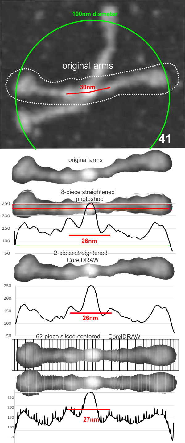
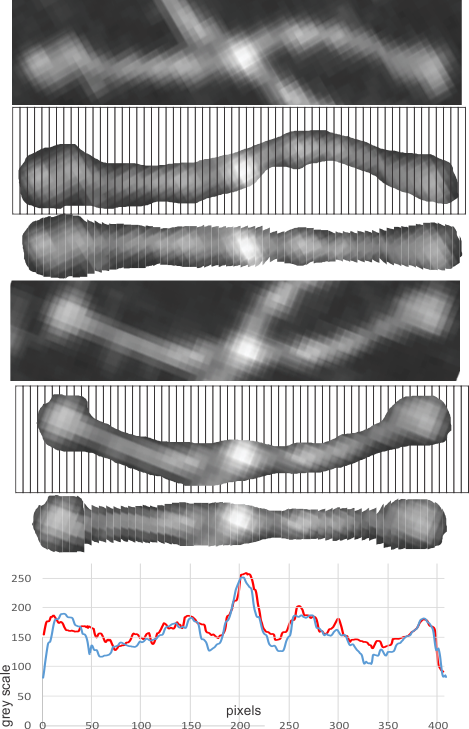
Dodecamers of SP-D can have arms that are arched. Trying to calculate the grey scale for curved objects is not straightforward. Below is a summary of several attempts to “straighten” the arms and provide an image where a sample of several pixels (in this case about 70 pixels in height) can be drawn through the center and capture the spots along the arms that are highlighted during the shadowing (or other) procedure.

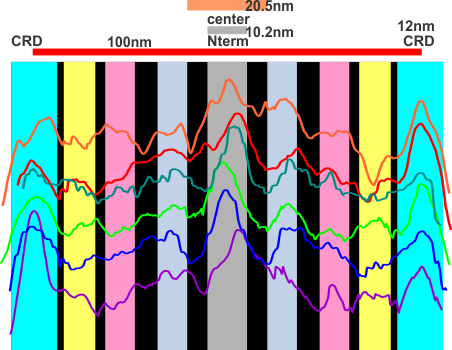
At least two of the reasons for doing this are 1) to determine whether the extent of the central area where the arms are knit together in a bundle encompasses more than the N terminal region (that is: does it include some of the collagen like domain) and 2 whether that central region that is knit together includes a “bend” or other element in the AA sequence that could be used to predict how the fuzzy balls are joined at the center, whether a ring, or a wad (haha).

The techniques below include using three programs,  photoshop, CordlDRAW and ImageJ, the first two were used to even out the arched arms, and the latter to create a LUT table for the grey scale (across an area of about 450 pixels (or 120+nm).

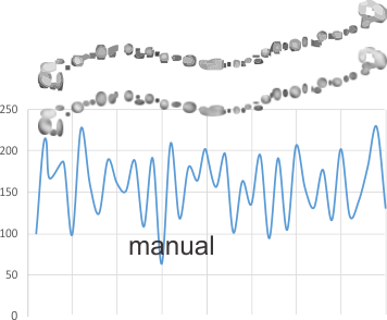
The procedure that I think is the most accurate, produces the least amount of “noise” and is the quickest to produce is as follows: The image (a dodecamer comprising mirrored monomers attached at N terminals) is opened in photoshop. A single set of two monomers (a right and left set) are cut in photoshop into a new layer.  The lasso tool is used to isolate and copy vertical segments of the dimer which are systematically adjusted to be central in the length of the dimer.  The image is flattened, exported as a tiff then opened in ImageJ where a 70 pixel wide rectangle is drawn the full length of the image.  There Analyze and Plot Profile are applied.  The grey scale lists are saved in excel and plotted as a line graph. The excel plot can be stretched lengthwise to fit the length of the original image thus the peaks and valleys can be measured against a dimension of 100nm.

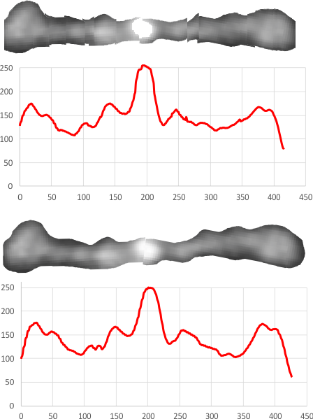
The demonstration (middle images) here is just a cut and rotate of two halves of the selected dodecamer. Each half was rotated to create a relatively straight molecule.  This only works on some opportune images. You can see the plot generated is almost identical to that produced with photoshop.

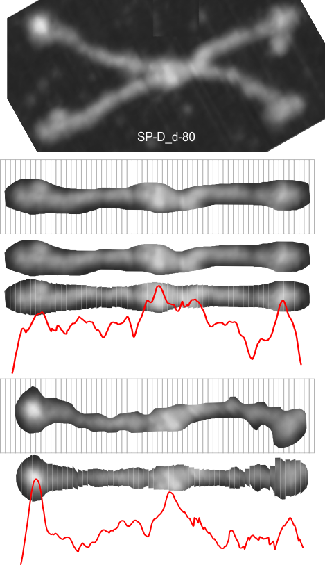
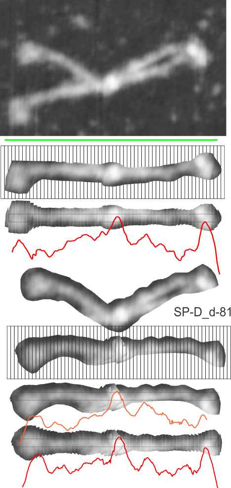
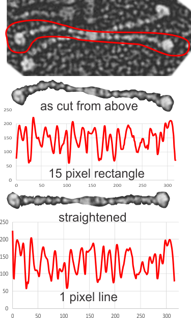
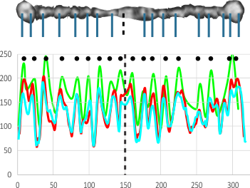
The third option didn’t work out that well, though it is the fastest. There are about 62 cuts in the image and each individual cut in the tiff file can be centered in one click.  The problem with this method is that CorelDRAW actually eliminates some of the pixels at the cut line, thereby adding a lot of “noise” to the plots (see bottom plot).  While the measurements remain valid and it appears to be the most accurate (because it points out most clearly that there is a second peak left and right of center from the N terminal of the dimer) it is surely ugly.

The best of all would be to find a way to use a grid to slice up the photoshop images. I guess I will have to figure that out.

Just for the record, the newest in  today’s nanotechnology was invented by “life” a long long time ago, and the complex assembly of namomachines like surfactant fuzzy balls is a great model to use. While many think that they have invented something new… nope, this is not new.  What will be fun to watch is the use of natures own innate immune inventions show up in the new molecules created through nanotechnology and their use in disease treatment.  Just a step away.

A little surfactant song: SP-D

MLLFLLSALVLLTQPLGYLE
AEMKTYSHRTMPSACTLVMCSSVES
GLPGRDGRDGREGPRGEKGDPGLPGAAGQAGMPGQAGPVGPKGDNGSVGEPGPKGDTGPSGPPGPPGVPGPAGREGPLGKQGNIGPQGKPGPKGEAGPKGEVGAPGMQGSAGARGLAGPKGERGVPGERGVPGNTGAAGSAGAMGPQGSPGARGPPGLKGDKGIPGDKGAKGESGLP
DVASLRQQVEALQGQVQHLQAAFSQYKKVELFPNGQ
SVGEKIFKTAGFVKPFTEAQLLCTQAGGQLASPRSAAENAALQQLVVAKNEAAFLSMTDSK
TEGKFTYPTGESLVYSNWAPGEPNDDGGSEDCVEIFTNGKWNDRACGEKRLVVCEF


(MLLFLLSALVLLTQPLGYLEAEMKTYSHRTMPSACTLVMCSSVESGLPGRDGRDGREGPRGEKGDPGLPGAAGQAGMPGQAGPVGPKGDNGSVGEPGPKGDTGPSGPPGPPGVPGPAGREGPLGKQGNIGPQGKPGPKGEAGPKGEVGAPGMQGSAGARGLAGPKGERGVPGERGVPGNTGAAGSAGAMGPQGSPGARGPPGLKGDKGIPGDKGAKGESGLPDVASLRQQVEALQGQVQHLQAAFSQYKKVELFPNGQSVGEKIFKTAGFVKPFTEAQLLCTQAGGQLASPRSAAENAALQQLVVAKNEAAFLSMTDSKTEGKFTYPTGESLVYSNWAPGEPNDDGGSEDCVEIFTNGKWNDRACGEKRLVVCEF)

This is a sequence which i believe I have correctly identified as human Surfactant Protein D from van Eijk’s publication (https://doi.org/10.1165/ajrcmb.26.6.4520). ( Green above is the signal peptide, the blue is the N terminal, the black is the collagen like sequence with proposed gycosylation site in light blue beginning the 70th aa) and the purple the coiled coil neck, and the red the carbohydrate recognition domain.

This is pretty relaxing music in my mind…..and it was interesting to be able to hear the music quality change in each of the domains.

The very first part is quite melodic (signal peptic sequence and the N terminal domain.  The coiled coil neck and the carbohydrate recognition domain are melodic as well….

The fun part is to try to identify the low “drone” of the “A” in the central part of this clip which represents the glycine amino acids and their recurring theme. This is in the collagen-like domain within the surfactant protein D molecule: on paper it is written usually as G x x  which are repeats:  a glycine, then another amino acid, and another, and then back to glycine…. )

It would be interesting to line up similar order of tones for a collagen molecule to reinforce the importance of the “drone” in identifying the collagen-like domain.

I didn’t not invent a really good way to assign the single letter codes for the amino acids that match notes on the 12 tone scale, so I just listed the amino acids sort of alphabetically. as is done in many text books and publications. There would be other ways to assign pitch, on charge and hydrophobicity or hydrophilicity, or some other property, that would be informative, and might work as a second or third track.  One could list those with letter assignments that match the piano scale using the duplicate first letters, e.g. alanine, argenine, asparagine, aspartic acid in different octaves but that is also just arbitrary… the more intelligent thing would for me to have arranged them according to physical properties rather than random.

And while it looks like a waste of time…. It helped me memorize the single letter nicknames for the 20 amino acids …as well as hearing the differences in the variation in amino acids incorporated into each of the four domains of surfactant protein D, and reminded me of how to use FLStudio.