Monthly Archives: April 2019

Inner vs outer lysosomal membranes

This is a quick observation perhaps meaningful (well i think it is relevant to the interaction of perfluorodecyl iodide within the lysosome). It appears to me like the inner lysosomal membrane is quite a bit thinner (meaning probably 1) a difference in the lipid membrane constituents or 2) the loss of some of the intrinsic membrane proteins.  I measured just one area of such a lysosome, and the outer lysosomal membrane seems to be about twice as thick as that which abuts the perfluorodecyl iodide crystalline inclusion.

blue perfluorodecyl iodide “footprint’, ribosome=red dot, green bar is the thickness of the inner membrane of the lysosome, dark blue is the thickness of the outer lysosomal membrane. Insert area is shown by white box, and red ribosome is shown with in the inset and the original box. liver (hepatocyte), neg 9716, block 3775, IPFD 100cc/kg (mouse) 9 months recovery

Tired of figuring out faulty scientific illustrations ?

The LAMP family is characterized by a conserved domain of 150 to 200 amino acids with two disulfide bonds. While reading this I looked up one of the references to see what they had pointed out as the morphological differences between endosomal membranes and lysosomal membranes and found this diagram in the publication linked here. While is seems trivial in a sense, it is not really, since visual depiction of facts needs to be as accurate as verbal depiction of facts… otherwise it is “fake science news”.  The diagram below goes against everything I have learned about cell biology…. with the arrow on the bottom pointing FROM the lysosome, TO the early endosome….  what? The early endosome is the beginning, by their own words  statement the early endosome is created de novo at the cell membrane.  So then I ask, why is the arrow not pointing in the other direction? and here is a quote “Endocytosed material tends to flow vectorially through the system, proceeding through the early endosome, the endosome carrier vesicle, the late endosome and the lysosome.” speaking to this subject.


This is not progress

“ Only at UC can one walk the entire half a mile from the parking garage to an office in Environmental Health (even where one of the previous Directors studied hazardous chemicals in lawn care products) so overwhelmed with the odor of pesticides and herbicides that they make one sick to one’s stomach” This is not progress. Not everyone will agree, but everyone will be affected. Shame on the current Director of environmental health for not standing up for the health of all the Med Campus workers.

Students sit on the lawn during the spring and fall, the grass offgasses the chemicals into nearby buildings. The walk to a from the buildings is outright unpleasant and potentially dangerous.

To spray on a Tuesday morning when there are people coming and going to work and class (and there are hospitals nearby — including Children’s) was just thoughtless –who is on deck here…. who is on deck.  No one with any sense, that is for sure. And think of the health affects of the people doing the landscaping (lest UC hired offsite, which begs another discussion).

This Med Center landscaping is grass rich…. which means that while grass is a CO2 consuming plant, the resources required to maintain it (mowers, blowers, fertilizers, water) have been reported to make it NOT that great an investment in CO2 reduction anyway. Again, here we are in Environmental Health department and making absolutely NO impact on our local environment, let alone the global environment. Makes me embarrassed to have worked in this field, haha, this department, this university for 50 years.

Iodoperfluorodecane (perfluorodecyl iodide)

Previous comments about some kind of order – periodicity – linearity? in the micrographs of hepatocytes which contain inclusions of perfluorodecyliodide (IPD   )  and there are others that I noted. (nb. quote)Ubiquitous, highly glycosylated, integral membrane proteins of largely unknown function, called lysosome-associated membrane proteins (LAMPS) or lysosomal integral membrane proteins (LIMPS), account for about 50% of the protein in the lysosomal membrane.

1. the trilaminar membrane has an exaggerated density on the outer membrane, and a very smooth (maybe no integral or surface proteins) on the lamina of the membrane in contact with the IPFD. See picture below, blue arrow inner trilaminar membrane (maybe few proteins) outer trilaminar membrane (red arrow) with maybe lots of membrane proteins. It would be interesting to nkow for sure if the IPFD causes this lack.

Another interesting thing is that there is a substructure to the lysosomal protein matrix — in fact at least three different organizations that I can detect, and this one just happens to match up in terms of size with LAMP-1…. for which there are shadowed images by Carlsson and Fukuda of the dimer found here which i have sized using their micron bar marker and the size of a ribosome (used 25nm) and superimposed over a giant lysosome found in the liver of a mouse that had been infused with IPFD (perfluorodecyl iodide). (see below) Tiny red box (enlarged in inset) is their image of the rotary shadowed dimer of LAMP-1, which i have placed into the textured density of one portion of a large lysosome containing IPFD crystals.  Red dot is an aproximate size of an hepatocyte ribosome (25nm used).  Wouldn’t that be a fun thing to spend some time figuring out, since I have only suggested it, not verified it.

LUT tables for a single SP-D dodecamer centered horizontally and vertically

Luminance plots of SP-D dodecamers (from other researchers AFM images) vary widely, due probably to preparation, chance arrangement of the arms when plating, bouncing of the cantilever of the AFM microscope,  quality of the digital image and at least a few hundred other factors.

I am however convinced that usable information can be gained by looking at these images closely. In the process, there are a bunch of steps that need to be taken (in my opinion) to make the outcome easier to interpret. I don’t think this adds bias because it is done to all images, not just the ones i “like” or think look like I would want them to look.

1, this is likely a bilaterally symmetrical molecule, with unequal arm angles.
2, there is seemingly some arm arc angle as well.
3, the dimensions given in micrographs vary widely and therefore an exact dimension is not really known, even if the bar markers has been placed accurately, there still would have been wide variation in the size therefore 100nm is used to control that variable.
4, there is variation in the way different AFM record these same images (bouncing and skipping, focus, resolution
5, there is no consensus on how much of the N terminus is responsible for the bilateral symmetry
6, there is no consensus on the shape of the collagen-like domain
7, there is no consensus on what comprises the coiled coil neck region in the AFM images
8, individual arms in any dodecamer can be longer or shorter (curved etc) than the other arms which changes the LUT tables therefore each arm is adjusted to a 50nm length beginning at the N terminus
9, the position of the 2, 3 or 4 and even sometimes 5 peaks along the collagen-like domain are not centered, but a depth of a valley which is equal to 10 (out of 256) luminance units is used to call a blip a “peak” or not, in an effort not to bias results.

Below is a sample of two LUT plots (look up talbe = luminance plots) where two trimers – as a bilateral set from four dodecamer arms have been cut into one single-adjusted-100nm length. The image was cut at 1nm segments and centered horizontally (second AFM image from top). This image has the N terminus bright spot slightly off center, and the bottom AFM image it was centered (each of the two trimers now equivalent to 50nm in width. Plots show centered and non centered luminance values for the two images and it can be seen that they do not vary otherwise. In ImageJ the plots were derived from a rectangle of approximately 500nm x 15 which was drawn in the center (full length) of the images.

Some images are much more skewed, and so centering makes a bigger difference, this one is pretty close to center anyway but the technique is offered up here.


Line or rectangle? best LUT plots using ImageJ

RE: Do lines or rectangles produce better LUT plots using ImageJ when the tiff file is an AFM of surfactant protein D?

I think maybe rectangle (something on the order of 500×15-25nm produces the smoothest plots (not the plots with the highest peaks though). Using a rectangle seems to eliminate some of the fake lines produced by cutting, centering and exporting to png (images which have been processed and manipulated to set dimensions but it also just lowers by a tiny bit the height of the luminance.   — Below are pairs of plots taken from the same images — marked by color, and it is also obvious which plots are pairs by looking at the LUT plot lines as they are nearly identical whether using a single line or a rectangle to assess luminance.  In summary, i think the LUT plots are best made using as wide a rectangle as possible cutting through the artificially straightened (see previous posts) and artificially centered plots.

Adjusting the size of SP-D images to known characteristics about the trimeric units

This is a dilemma which i am thinking could be solved easily, that is: how to adjust the size of the arms of SP-D dodecamers that appear in TEM and AFM images to fit what is understood currently about the protein. The protein is trimeric but occurs, according to publications, most commonly as a dodecamer, that is four trimers linked in the center of the X by the N terminus domains.  The measurements of the trimer are given mostly as slightly under 50nm, and the whole can be assumed to be about 100nm (at least this is the consensus number which shows up in publications.

When the SP-D molecules are prepared for microscopy they don’t always fall in optimal positions and this leads to errors when calculating the luminance values since the peak luminance is the N terminus region…and it doesnt always turn up in the very center of the dodecamer (case in point is this published AFM image of a SP-D dodecamer (cant remember whose image it is, but it is not mine – I am calling it image 49 for my own convenience).

two images below are one pair of arms (one complete line of the X – so to speak) cut out from the whole and sliced into 1nm slices and centered horizontally (to allow for use with ImageJ). The top image was NOT adjusted for center (which included delimiting the right and left halves through the N terminus bright spot (orange asterisk) and adjusting each half to 50nm to compensate for the distortion when the molecule was prepared for AFM,) and the bottom image is one which had the two opposing trimers adjusted to 50nm per each using the N terminus (blue asterisk) as center.

This might appear to biased manipulation of the data, but in fact it is the preparation which presented the bias, and this aims to undo that bias with data that is already known. It certainly helps to uncomplicate the LUT plots.

Nanoparticles and surfactant proteins: nice article, great pictures: valid concept?

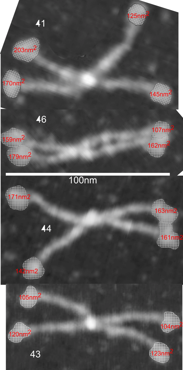
This is kind of a nice article that helps to increase awareness that when we (humans) inhale particles (any particles not just nanoparticles) that we engage those proteins (surfactants initially, both the SPs and the lipids), and the decoration (corona as called in this paper) determines to a degree, where those inhaled particles (nano – man made, or nano natural) will end up… here is their image and a link to the article ., and their legend for this figure: Figure 1. CGMD simulations of pulmonary surfactant (PS) lipids without (a) and with (b) surfactant-associated proteins self-assembled in the bulk aqueous phase. The PS system contains 1400 DPPC (in green), 600 POPG (in yellow), 500 cholesterol (in silver), 4 SP-A fragments (in violet), 10 mini-B (in orange), and 10 SP-C peptides (in purple) in a cubic space of 40×40×40 nm3. For clarity, water and ions are not shown. The lipid contents correspond to a weight concentration of 0.044 mg/mL. Inset in (a) shows the detailed structure of a micelle.  What interests me is that they dont mention or show SP-D? and the relative ratios of surfactant SP-A,D and B and C are not reflected in this particular image (i could quantify it with a method of Weibel et al from decades ago). nb, an linked article puts the nm2 of lung surface at something around 100-140nm (not too far off the ones published by the early researchers using TEM to estimate alveolar space.

After skimming through this article i realize it is a but of a summary of meaurements, and a computer simulation.


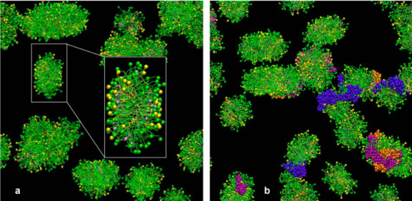
At least in the second figure (not really reflected in the first) is a size ratio of the three surfactants they chose to model (SP-A (they colored dark purple) , SP-B (they colored orange), SP-C (they colored violet (pink), with SP-A being the larger proportion of the micellar soft corona.

Just wish SP-D had been in their study.

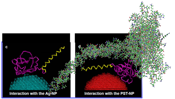
But do you see here an obvious “switch” in the models used for SP-A. In the diagram below they have pictured the whole of the surfactant octadecamer (not just a single trimer) and this model includes all four domains (Nterminus, collagen like, coiled coil neck and carbohydrate recognition domain).  It looks on the surface to have the same angular dimensions as the model they give next to it on the right, which is really NOT a good visual correlation and deceiving.  Instead the portion of the SP-A molecule they have modeled with their computer algorithms is comprised of just two of the four SP-A domains… thus has nothing to do with the image on the left.  I have edited out the coiled coil neck and the CRD from the SP-A octadecamer in the relative magnification that it should be (using their own blue diagram) in the bottom image.  The dark purple could actually have been modeled to represent the full SP-A…. it was maybe at least as convincing visual approach.

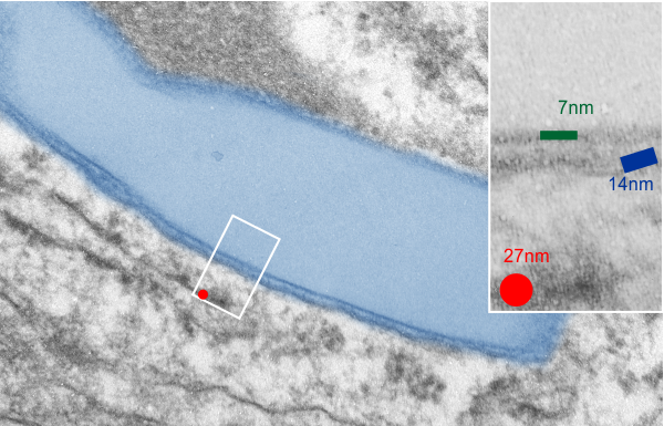
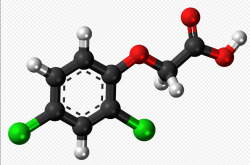
What is missing to me is their identification of the scale… but according to images posted online SP-B is about 60% as big as SP-A (as the octadecamer) but that is a similar length as would be measured by a single trimer (maybe something around 50nm.  The polystyrene and silver nanoparticles in this article really are not clearly marked with a bar marker and not easily found in the text…. i have to assume they are something on the order (in relative scale) of 5 to 10 nm which is completely out of scale with SP-A, and would be dwarfed by SP-D (which they did not measure) so this is an enigma.

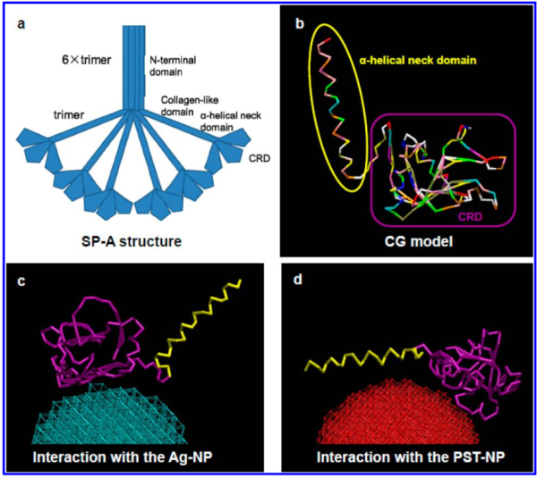
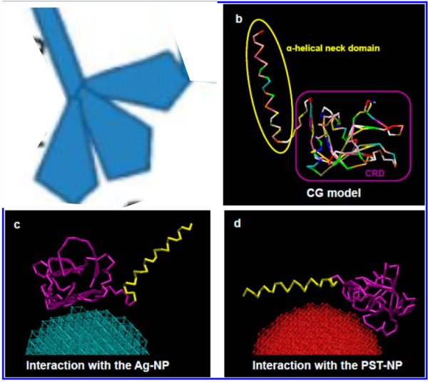
A model of SP-A (which includes an artistic addition of the collagen-like region and N terminus since nothing has been found online that is a model for the whole of SP-A (or SP-D for that matter, and also likely why there is a lot of misrepresentation  of both SP-A and SP-D in the literature as to its structure). haha…  So if their little red polystyrene nanoparticle is 5nm in diameter, and if a surfactant protein A trimer is 20+nm then the relative ratio of the two would look more like what is below model in green and grey and blue and red superimposed over their image  (btw it is the full SP-A, which i diagrammed using the RCSB AND TEM and AFM images posted on line but which has not completely been modeled by RCSB but to me makes sense.

5 SP-D dodecamers – measurements of AFM images

To certainty as to whether four or three  (or five) peaks occur along the dodecamer arms on either side of the N terminal. I wonder if this is just the bouncing of the tip…..  but against that argument is the fact that a large peak next to the N terminal is most dependable…..  next most dependably seen is peak II also in the collagen-like region.  the size on either side of the N terminal is also mostly symmetrical.  I think there are at least 3 maybe 4… you decide.  If you need to see the individual LUT plots… they are given below… nb… per SP-D dodecamer image there are two plots CRD to CRD which means there are twice as many (mirror images) of the peaks and CRD than there are measures of the Nterm.

LUT plots of SP-D images taken with AFM