Monthly Archives: September 2020

Segmented line traces of AFM multimer arms – does enlargement of the image matter

Segmented line traces of AFM multimer arms – does enlargement of the image matter? See image below and check for yourself whether the plots of a routine view size (top two plots are replicate of an image imported into ImageJ and traced along one of the many arms of this protein). Third plot and image are one ctrl+ increase in magnification, and fourth plot and image are two ctrl+ increases in image magnification in ImageJ. The differences in the trace are so small, just as likely due to variations in the mouse or pen excursions as to to be meaningful differences in plotting details of the brightness.

Just by way of identification of the processing (in gwyddion) of this multimer  it is a 300ppi remake of a tif, opened in gwyddion and filtered from 25 – 255 range  – 7.

Hearts — not by chance

It is fun when examining structures in biology (probably also true in physics, math, etc, its just that my experience is with biology) one finds little circumstances which are very likely frequent happenings with real significance, but show up relatively obscurely, and are difficult to quantify.  So is the case with this multimer which has an unusual crook to its arm, and yes,  different places along the arm tend to gravitate to other places on the arm.  THUS THE FORMATION OF HEARTS… LOL.  While this is a post in jest…. it also is NOT a post in jest.  Left images are cropped from a 30-36 arm multimer image (AFM) and processed with photoshop high pass 250 filter, then range limit of 100-255 in gwyddion.

Right hand images are rotated cropped and vectorized and trimmed in CorelDRAW.

SARS Cov 2 aka COVID 19 jokes pg 5

Home school monopoly called “Pandemonium” or perhaps “Pandemic” using corona bucks (made by kids) and a board that has  “GO ON VENTILATOR” instead of “GO TO JAIL” do not pass “GO” do not collect “200 corona bucks”.  In the corona bucks there is the virus, with its spike 1 and 2 proteins, the transmembrane protein, the envelope protein, the nucleocapsid protein and the single strand RNA.

Important steps in image processing

    1. ALWAYS keep the micron marker visible in the image when processing
    2. USE YOUR EYES to see changes if changes are visible, beneficial, detrimental
    3. ALWAYS measure the background LUTables and look for debris scratches dirt drif, skew, outliers, vibration lines, shading
    4. Measure the micron marker with each image after the processing step (in this case each time an arm of the long multimer is traced (see figure below)
    5. Quantify the variation in the micron bar measurements accumulated for each image and apply that mean to your individual LUT plot peaks and peak widths for that specific image.
    6. Distance measures can be equalized (normalized) to a mean arm length measurement (in this case 15-20 independent measurements of the multimer’s arms for any given type of image processing) so that both an adjusted peak height and width can be obtained, and as well, an actual peak height and width can be obtained
    7. Spot check your segmented (or hand drawn) lines for repeatability using duplicate tracings
    8. Standardize the widths and heights of the plots graphically to show areas of peakj width, height, and nm2</sup under the peak, consensus

There are great similarities in LUT plots from each of these image processed methods and ultimately it becomes a matter of comparing data. In this case, pooling all these separate plots will likely be the best way to determine just how many peaks lie along the individual molecules of this multimer and their relative heights.

Image processes used are named at top of images (too small to read). The list of processing commands is shown below as text beginning at the left column of the diagrams starting at the top of the columns and moving down.

Begin left top column:
multimer-long-1 no processing
multimer-long-1_300ppi no processing
center left top of column:
multimer-long-1_smart_blur_2px
multimer-long-1-300ppi-gwyddion-red
multimer-long-1-300ppi-gwyddion_2DFFT
multimer-long-1-300ppi_photoshop_high_pass_250px
center right top of column:
multimer-long-1-300ppi_photoshop_high_pass_250px_gwyddion_red
multimer-long-1-300ppi_photoshop_hi_res_smart_blur_10px radius 10 threshold, high quality
multimer-long-1-300ppi-radial_smoothing_linear
multimer-long-1_300ppi stepline_correction
right top of column:
multimer-long-1_gwyddion_red_limit_range_25-255
multimer-long-1_gwyddion_red_deconvolve
multimer-long-1_gwyddion_red_correlation_averaging
multimer-long-1_gwyddion_red

LUT peaks, but just as obvious, the deep valleys

Looking at this interesting multimer (linear molecule here but sometimes it is a ring) I have tried to use Gwyddion to process the image to have a better view of what is happening in terms of height and width along each of the many arms, plotting luminance from a point just before each of the central bright peaks in the spine.  There are a lot of interesting ways to enhance, eliminate, adjust, straighten, and transform images in Gwyddion and some are more useful in this particular application than others.  At the moment, the smart blur in Photoshop seems to work just as well as any i have found so far.  This is the case with the image below which was taken from an ordinary output from an atomic force microscope, then the ppi was enhanced to 300 and size increased to 10 inches.  That file shows that the arms of this molecule have peaks, yes, but very prominent constructions typically occurring on either side of the fifth peak when plotted from the center bright spine.

I had noticed the valley and measured it in several other images (processed by 2DFFT, radial softening, range limit, and also with smart blur of 2px in photoshop) so it was evident but not so striking as seen with the 10px radius and 10 threshold (high quality menu selected).  So that is a nice tool to have.  The constrictions are so easy to see, they are on either side of the rounded bright spots (not the spine bright spots but on either side of the 5th peak along the arms).  Bar marker=100nm.  “THINK SAUSAGE links” The width of the arms are narrow at the points of the valleys as well.

If i were to compare this multimer with a dodecamer of surfactant protein D i would say the LUT plots going from one CRD to the other in SP-D are bowed, with the highest area under the curve also at the highest central peak (which in the case of SP-D is where the N termini are joined).

What does image processing add to LUT table data?.

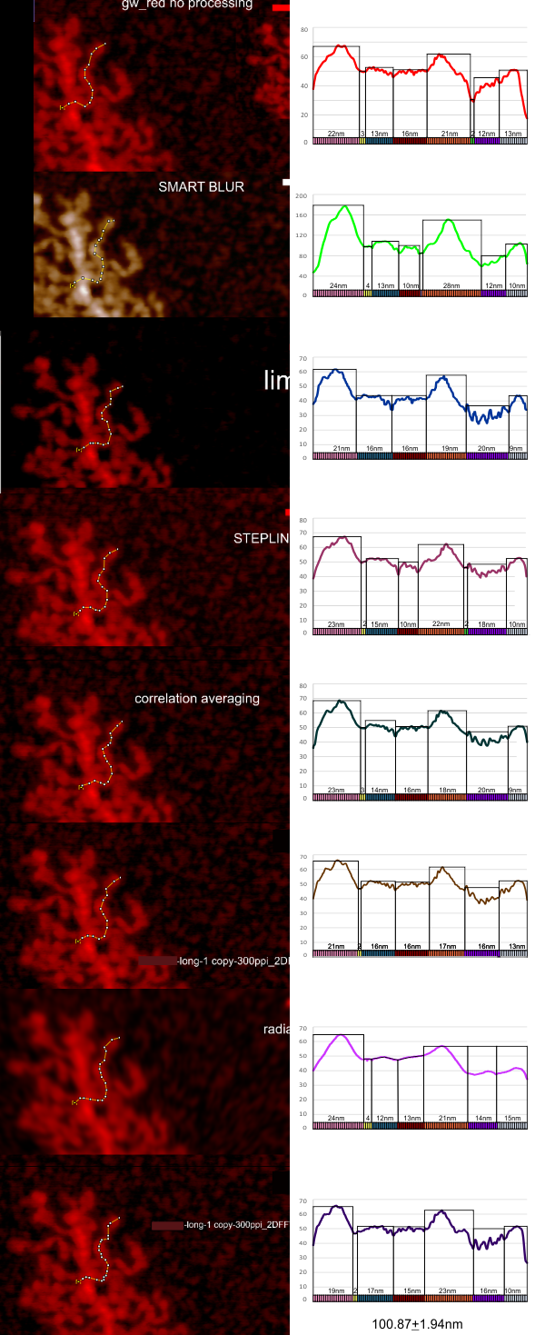
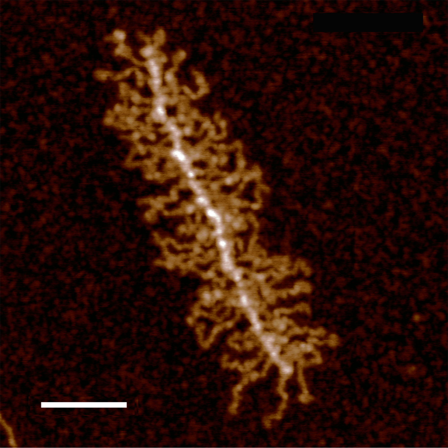
THis is a summary of my own measurements of a really interesting molecule, in which I initially saw (without image processing) a couple of brighter peaks along each arm, the latter radiating either from a ring or a linear multimer.  I do think that processing images with different algorithms can help, but certainly one type of processing does not benefit all the nuances of each molecule (in this case each variations in a single arm).

The images below are cut and pasted from whole images of this molecule that were processed in gwyddion (type of processing named in each image) and imageJ used then to create luminance peaks (brightness peaks). You can see that subtle differences in the length that is digitized with a segmented line causes some variation, but processing causes other variations.  The bold and easily recognizable peaks persist, regardless of processing.

To date my favorite is just the standard Photoshop “smart blur”. I guess each can choose the plots, for smoothness, or exaggerating peak heights (which one can do with a vector program like CorelDRAW and then adjust the labels.  Combinations and permutations are infinite.

The process used here was 1) to convert the images in photoshop (imported as is from the original images from AFM) 2) increase ppi (from 72 to 300ppi) export to tif, open in gwyddion, choose processing menu, save as tif, open in ImageJ, measure barmarker, measure arm (screen print), export plot data to excel, open in excel, plot height, paste (metafile) into Coreldraw, normalize the plots to same height – luminance value, normalize plots to mean arm length (from measurements of the segmented line in imageJ) measure peak widths in CorelDRAW (see colored 1nm bands beneath the 100.87+1.94nm (mean of 1 measurement of the same arm in 8 images, processed with different algorithms).

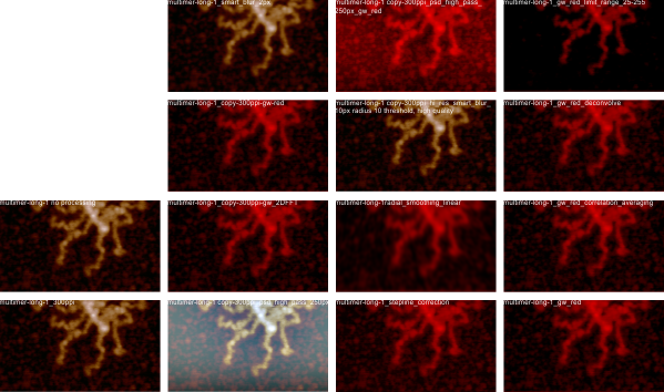
Processing includes, top, none; second, photoshop smart blur; third, limit range 25-255; 4th image, stepline correction; 5th, correlation averaging; 6th, one pass 2Dfast fourier transform; 7th, radial smoothing; 8th, second pass 2DFFT.

These images are all plotted with the left (beginning) segmented line at a low point to the left of the bright central spine peak and following the course of the arm till the contrast (background luminance) drops off.  Peaks were then adjusted to begin at 40% luminance.

COMMENTS:

  1. three prominent peak widths beginning at the spine: (pink (22.12nm+1.6nm, orange 22.1nm+3.2, and gray 11.12nm+2.1)
  2. a small flat line just after the first bright peak (yellow (about 2.5nm, present 7/8 plots)
  3. 2 low level peaks with the following widths: second and third peaks (blue 14.5nm+1.65 and 14nm+2.5)
  4. prominent (second highest peak)(orange 22.12+3.2)
  5. Infrequent small flat line between peak 4 and 5  (green)
  6. low level irregular peaks – (purple) (16nm+3)
  7. terminal peak, 11.12nm 2.08 (gray)